
Roman Love Story Font Free Download
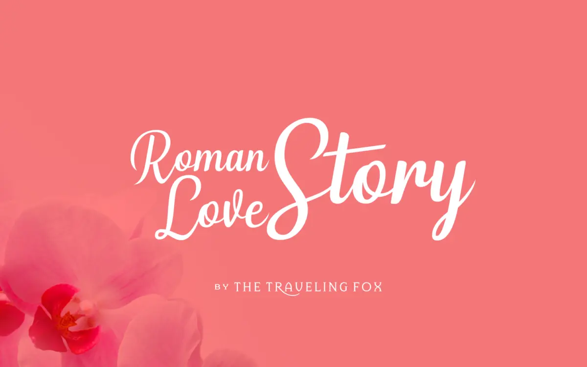
Is Roman Love Story free to download?
Roman Love Story is a commercial font sold on Creative Market, so the full version needs a paid license. Get it from the official listing: Roman Love Story font download.
Need something free? These script fonts from Google Fonts are free for personal and commercial use:
Design style
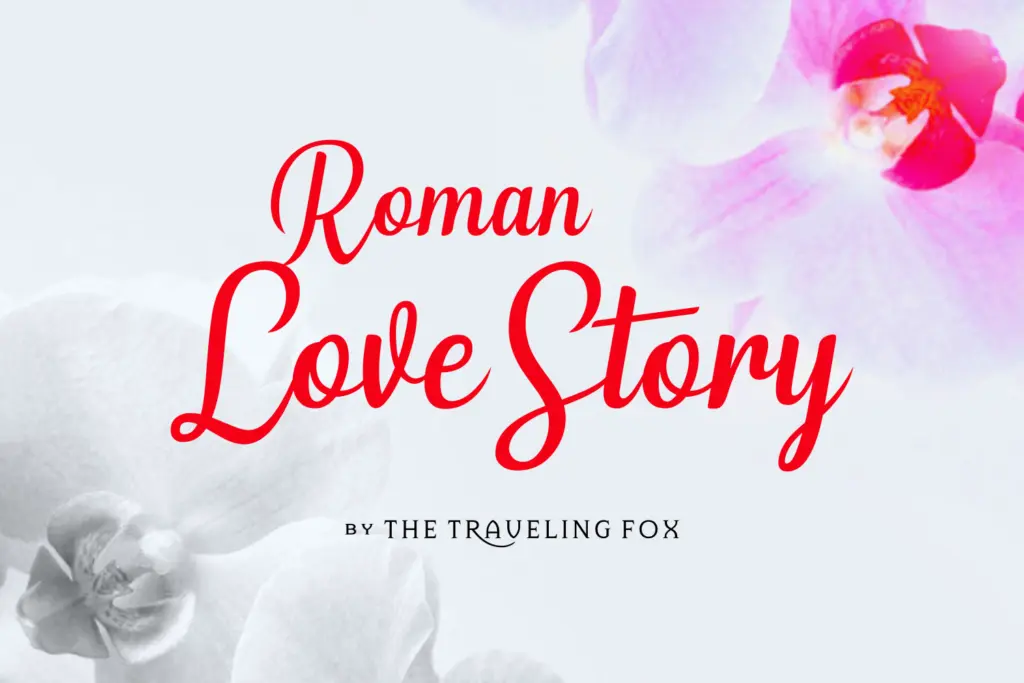
Roman Love Story sits in the well-populated field of casual connecting scripts, the kind built around a monoline or near-monoline stroke that links letter to letter without much fuss. The joins are the main event here: strokes carry through at a consistent angle, and the baseline has a gentle, handwritten wobble rather than the ruler-straight rhythm of more formal calligraphic scripts. There’s no dramatic contrast between thick and thin, which keeps the overall texture soft rather than showy.
Where it earns its keep is in the letter construction itself. Ascenders and descenders are kept relatively restrained, avoiding the wild loops that make some script fonts unusable outside of a single hero word. Terminals are rounded and unfussy. It reads as friendly rather than luxe, closer to a handwritten note than an engraved invitation. That’s a deliberate trade-off, and it’s worth knowing going in: if you want a script with real drama and swash, this isn’t it. If you want something legible and warm, it delivers.
Character set and features
The connecting-script format means the lowercase is the workhorse, built to flow from one letter to the next with minimal awkward collisions. The uppercase is more restrained in comparison, functioning mostly as a quiet lead-in letter rather than a flourish-heavy capital, which is sensible given how busy oversized script capitals can get.
Because it’s marketed as legible for longer stretches of text, the spacing has clearly had some attention paid to it — letters sit close enough to read as connected without smashing into each other or leaving gaps that break the flow. That said, connecting scripts of this type are still best used with some restraint. Set in all caps, or forced into a rigid grid, most scripts like this lose the handwritten quality that makes them worth using in the first place, and this one is no exception.
Use cases
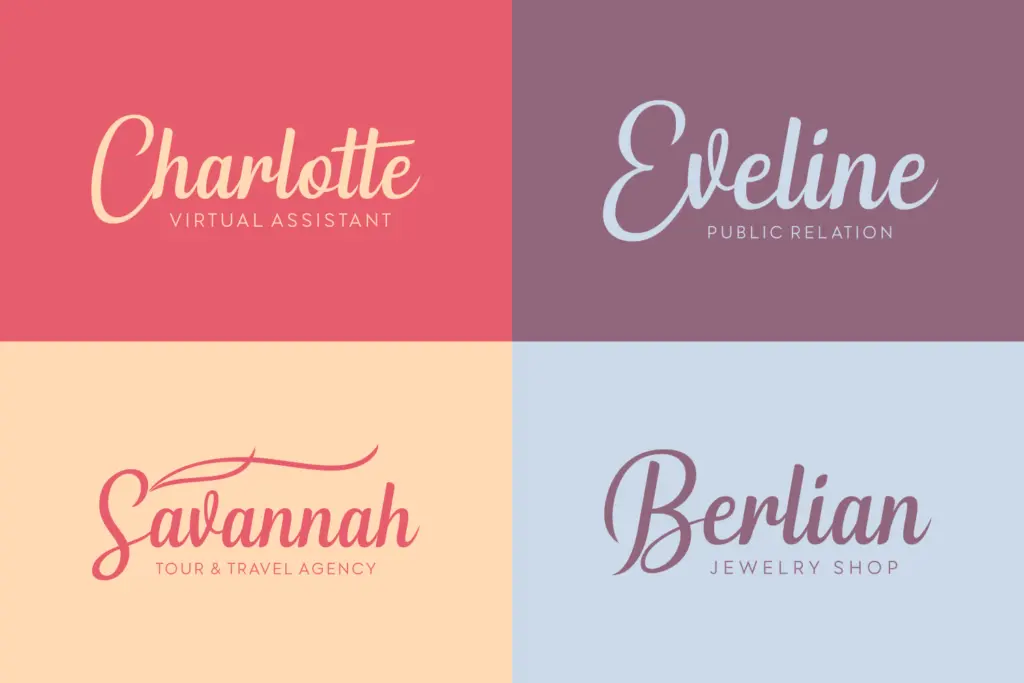
This is a font for short-to-medium pieces of text where warmth matters more than formality: wedding invitations, greeting cards, quote graphics, logotypes for small businesses with a personal or handmade angle. The claim that it holds up in longer body copy should be tested on your own project before you commit to it — scripts almost always ask more of the reader than a sans or serif does, and even a well-spaced one benefits from generous line height and a larger point size than you’d use for a text face.
Pair it with a plain, quiet sans or a restrained serif for supporting text; the script should carry the emotional weight of a headline or a name, not compete with itself across a paragraph. It’s a solid choice for anyone who wants a script that reads as personal rather than ornate, and who’s willing to keep body text in something else entirely.
What we liked, and what we didn’t
Strengths
- Restrained ascenders and descenders keep it usable at smaller sizes than most scripts
- Consistent joins give it a genuinely handwritten, unforced flow
- Rounded terminals and soft baseline make it feel personal rather than formal
Trade-offs
- Lacks the dramatic contrast or swash work that gives some scripts real presence
- Claims of strong legibility in long body text should be tested before relying on it
Roman Love Story is a competent, warm connecting script that avoids the excess flourish of louder scripts in its category. It's best kept to headlines, titles and short romantic copy rather than trusted with long passages, despite the seller's claims. A reliable, unshowy choice rather than a standout one.

Tmfonts writes independent reviews of typefaces: what each font does well, where it falls short, what it suits, and where it is sold.