
Amalfi: A Bold Retro Script for Coastal and Summer Branding
Design style
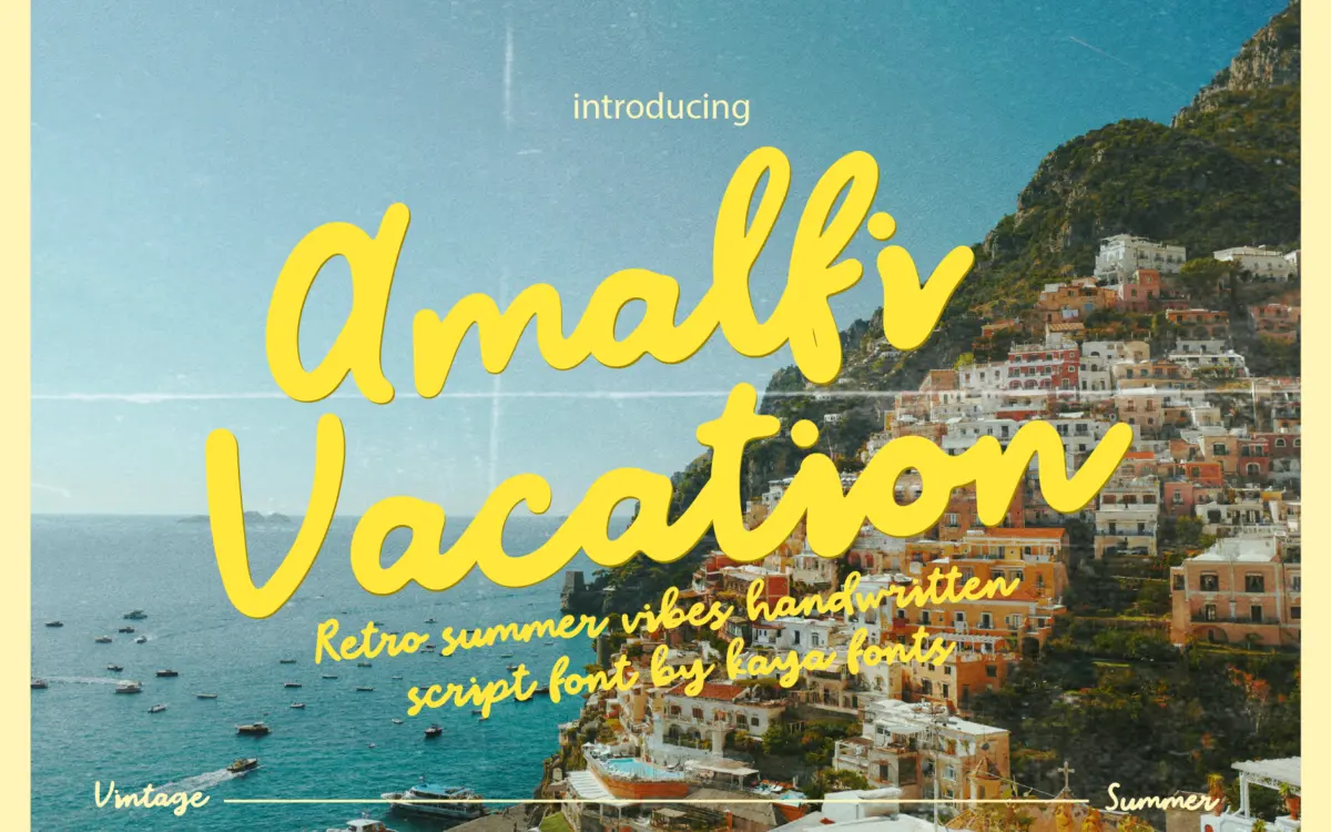
Amalfi is a bold handwritten script built around thick, confident strokes rather than the fine hairline flourishes common to wedding scripts. The letters lean forward with a loose, brush-like rhythm, and the joins between letters favour energy over precision — some connections swing wide, others tuck in tight, giving the baseline a slight bounce rather than a straight run. This is a script that wants to look written quickly with a fat marker, not engraved.
The retro reference comes through in the rounded terminals and the slightly inflated bowls on letters like a and o, which recall mid-century Italian signage lettering more than contemporary calligraphy. It reads as warm and a little playful rather than formal. If you’re after the delicate, tapered strokes of a bridal script, this isn’t that font — Amalfi’s whole personality sits on the bolder, blunter end of the script spectrum.
Character set and features
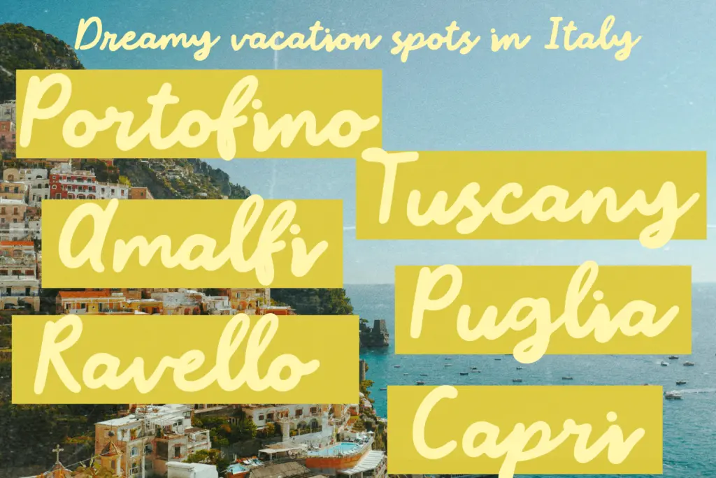
The letterforms carry the accents needed for the supported Western European languages, including French, German, Spanish, Portuguese and a few less commonly bundled sets like Galician and Low German, which is a reasonable spread for a display script aimed at branding work. Because the strokes are thick and the letter spacing is generous by necessity — thin scripts can afford tight kerning, bold ones can’t without clogging up — expect the font to want room to breathe, especially at smaller point sizes.
Ligatures and connecting alternates aren’t detailed in the source material, so treat any swash or alternate-letter claims with caution until you’ve opened the character map yourself. What is consistent across the glyphs is the weight: strokes stay heavy and even, which keeps the face legible at a glance even though scripts of this weight can start to look like solid ink blobs if set too small or too tightly tracked.
Use cases
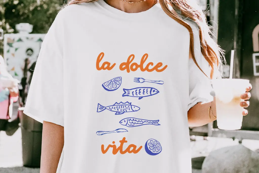
Amalfi’s natural home is short-form display work: a logotype for a beach café, a headline on a travel postcard, a T-shirt graphic, a sticker pack, packaging for a summer product line. The bold stroke weight means it holds up fine printed on textured surfaces like kraft paper or fabric, where a lighter script would lose its finer lines. It also photographs well at large sizes on social graphics, which matters if the end use is Instagram posts as much as print.
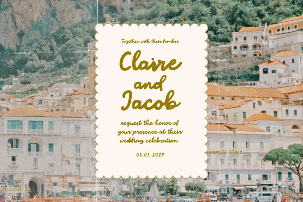
Where it struggles is in long-form or small-size settings — a paragraph of body text set in Amalfi will fight itself, with the thick strokes and irregular joins making sustained reading tiring. It’s also worth pairing it carefully with a plain sans or serif for supporting text, since the script’s personality is strong enough that it needs a quiet neutral partner rather than another decorative face. For wedding stationery, it works better as an accent word — a couple’s first names, a location line — than as the entire invitation copy.
What we liked, and what we didn’t
Strengths
- Thick, confident strokes hold up well on textured surfaces like fabric and kraft paper
- Retro Italian-signage feel gives it a distinct personality beyond generic 'summer script' trends
- Decent accented character support across several Western European languages
Trade-offs
- Not legible at small sizes or in paragraph-length settings due to its heavy weight
- Character set details like ligatures and alternates aren't well documented, so test before committing
Amalfi is a solid, characterful bold script for short bursts of summer and travel branding, not a workhorse text face. It looks best large, on packaging, logos and social graphics, and needs a plain partner font to carry any supporting copy.
Verdict

Tmfonts reviews typefaces in depth — every font is tested in real branding, editorial and screen layouts before a word gets written. 555+ fonts reviewed and counting.