
Aveline: a soft-serif hybrid for editorial and fashion branding
Design style
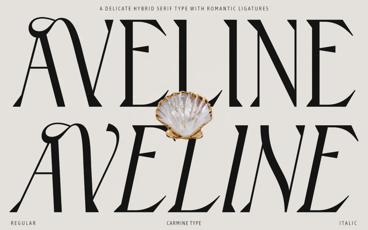
Aveline sits in that hybrid zone designers keep returning to: not quite a sans, not quite a traditional serif. The serifs themselves are shallow and rounded rather than bracketed, which softens the letterforms without erasing the sense that this is a serif face at heart. Stroke contrast is modest — enough to give the type some warmth on a page, not enough to make it fussy at small sizes. Proportions run a little wide and open, which keeps the face from feeling precious even with all the ornamental machinery underneath.
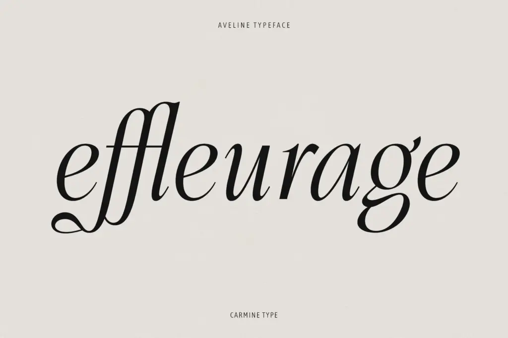
The italic is where the personality actually lives. It leans into a calligraphic slant with softened terminals and a handful of Victorian-flavoured details that read as considered rather than decorative for its own sake. Set the roman and italic side by side and the roman feels almost restrained by comparison — which is probably the point. It’s the quieter partner that lets the italic do the talking on a cover or a headline.
Character set and features
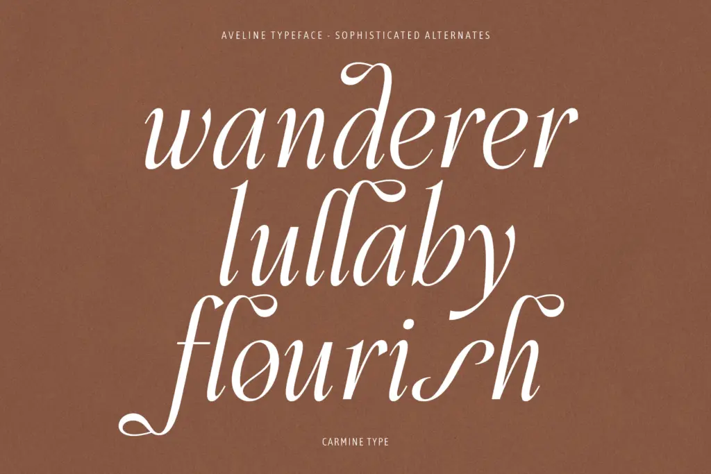
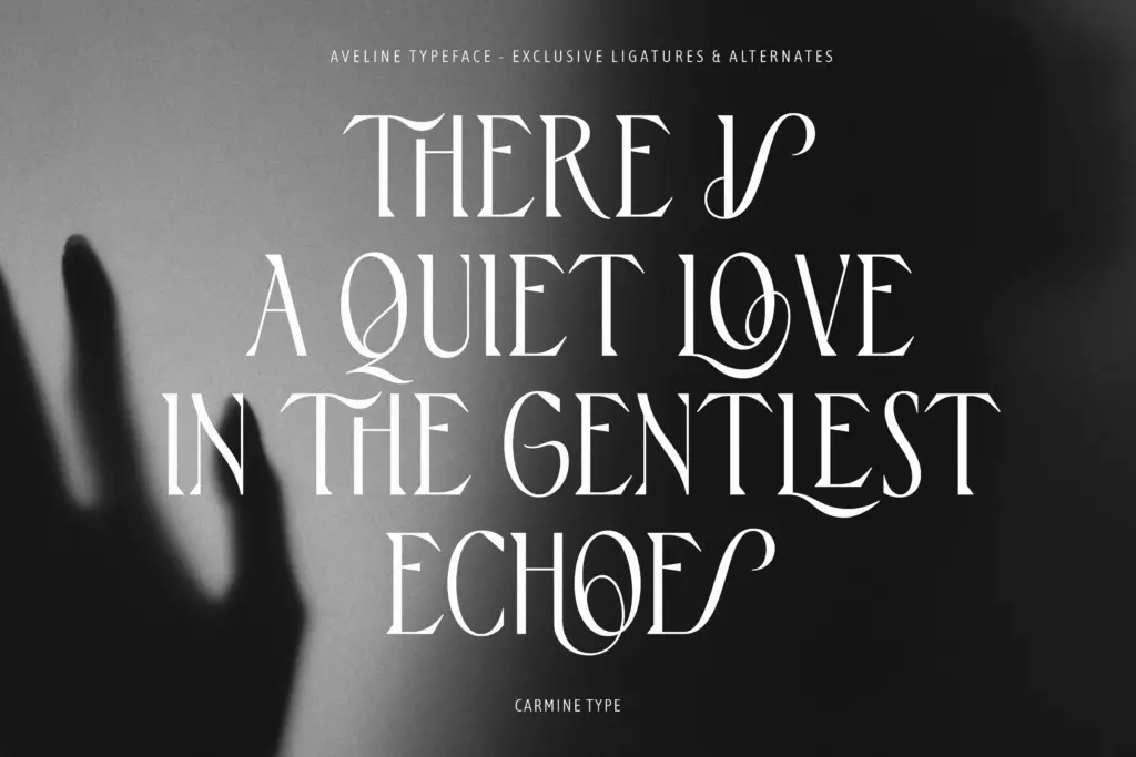
The 170-plus ligatures and alternates are the real selling point here, and they’re worth taking seriously rather than treating as a bullet point. Used well, they let a single word — a brand name, a book title — pick up a bit of flourish without the whole line turning into a wedding invitation. The temptation with a set this large is to overuse it, and a few of the more elaborate swash combinations do tip toward ornamental if you stack them. Restraint is doing real work in this typeface; it rewards a light hand.
Multilingual support across Western, Central and Eastern European character sets is a practical plus for anyone working across markets, and the OpenType feature set gives you the usual controls — standard ligatures, discretionary ligatures, stylistic alternates — for building those combinations without hand-kerning everything yourself. There’s no bold or weight range on offer, which is a real constraint: Aveline is a one-weight family (plus italic), so any hierarchy in a layout has to come from size, colour or a paired typeface rather than from Aveline flexing on its own.
Use cases
This is a display-first face that happens to hold up reasonably well in short text settings — a pull quote, a product description, a few lines of copy on a packaging panel. Push it into long-form body text and the softness that makes it charming at headline size starts to blur a little at 10pt. Where it earns its keep is in fashion and beauty branding, editorial mastheads, luxury packaging, and any identity work that wants warmth without going fully script. Wedding stationery and romantic title treatments are an obvious fit too, given the ligature set, though it reads more editorial than purely bridal. Pair it with a plain, well-behaved sans for body copy and let Aveline carry the headlines and the logotype — that’s the setup where its ligatures and alternates actually get to do their job.
What we liked, and what we didn’t
Strengths
- Large, genuinely usable ligature and alternate set rather than a gimmick
- Italic has real calligraphic character without tipping into full script
- Multilingual coverage across Western, Central and Eastern European languages
Trade-offs
- Only one weight plus italic, so it can't build hierarchy by itself
- Softness that reads well as a headline starts to blur in long text settings
Aveline is a well-drawn soft serif that earns its keep in headlines, logotypes and short editorial copy, thanks to a genuinely useful ligature and alternate set. It's a single-weight display face at heart, so don't ask it to run long paragraphs or carry a whole hierarchy on its own.
Verdict

Tmfonts reviews typefaces in depth — every font is tested in real branding, editorial and screen layouts before a word gets written. 555+ fonts reviewed and counting.