
West Oak Range: a script-and-sans duo built for western branding
Design style
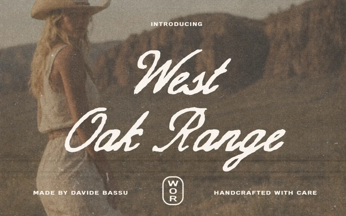
West Oak Range pulls from the same well as a lot of current western-revival lettering: brush-influenced script paired with a workhorse sans, both leaning into the vintage Americana look that shows up on ranch signage, feed sacks and old rodeo posters. The script side isn’t a delicate calligraphic hand — it has some weight and swagger to it, with strokes that feel cut rather than flowed, which suits the rougher, sun-bleached aesthetic the collection is going for. The sans is the quieter half, doing the structural work while the script carries the personality.
The pairing logic is sound. Rather than one script trying to do everything — headline, subhead, body — the brief splits the labour: script for the expressive mark, sans for everything that needs to stay legible at small sizes or in long runs. That’s a sensible way to build a duo, and it shows in how the two families are proportioned to sit together rather than compete.
Character set and features
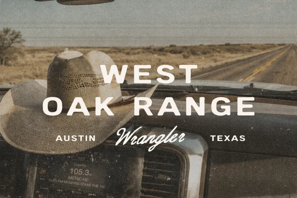
The script comes in four cuts — Regular, Slant, Bold, and Bold Slant — which gives you a reasonable spread of weight and angle without multiplying into an unwieldy family. The sans is the bigger workhorse here, with nine styles covering a full weight range suitable for headline-to-body hierarchies and logo lockups where you need a condensed or bold cut to balance the script mark. Both families include multilingual character support, numerals and standard punctuation, which is the baseline you’d expect for anything sold as production-ready rather than a one-off display piece.
What the brief doesn’t spell out — and what buyers doing serious branding work will want to check before committing — is the depth of the OpenType feature set: whether there are contextual alternates on the script to break up repeated letters, swash variants, or ligatures beyond the basics. A western script that repeats identical letterforms across a wordmark can start to look mechanical rather than hand-cut, so this is worth testing with your own copy before you lock in a logotype.
Use cases
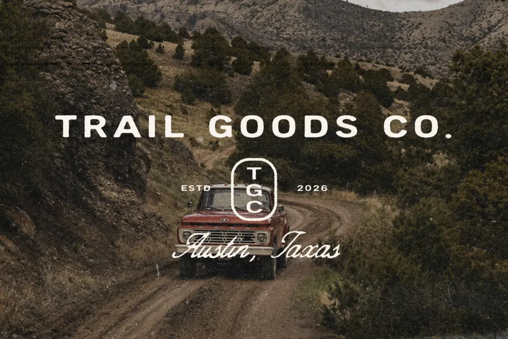
This duo is built for a specific register: apparel graphics, whiskey and coffee labels, outdoor gear branding, rustic packaging, western-themed logos. It’s not aiming to be a neutral, all-purpose script — it wants a brand with some grit and outdoor identity already baked into the brief. Used that way, the sans handles ingredient lists, taglines and body copy while the script anchors the primary mark or hero lettering.
It’s less suited to anything that needs restraint or formality — corporate reports, clean minimal branding, or contexts where
What we liked, and what we didn’t
Strengths
- Nine-weight sans family gives real flexibility for hierarchy and logo lockups
- Script and sans are proportioned to work together rather than compete
- Multilingual character support and standard punctuation across all styles
Trade-offs
- Western script styling is a crowded category, so distinctiveness depends on how it's used
- Feature depth for contextual alternates or swashes isn't specified, so repeated letters may look uniform
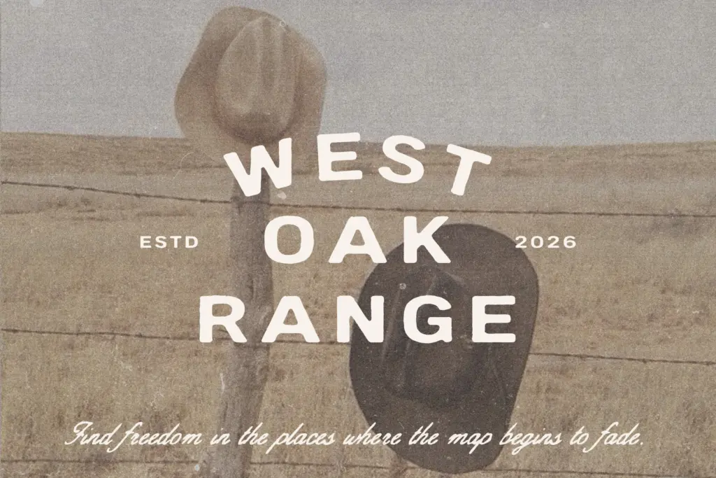
West Oak Range is a competent, purpose-built duo for western and rustic Americana branding, with a script that carries weight and a sans that does the supporting work well. It won't stretch far outside that visual world, and the script's repeat-letter handling needs testing before it goes on a logotype. For the right brief — apparel, spirits, outdoor gear — it's a solid, ready-made toolkit.
Verdict

Tmfonts reviews typefaces in depth — every font is tested in real branding, editorial and screen layouts before a word gets written. 555+ fonts reviewed and counting.