
Cowboy Outlaw: a bold Western slab for saloon signs and rodeo posters
Design style
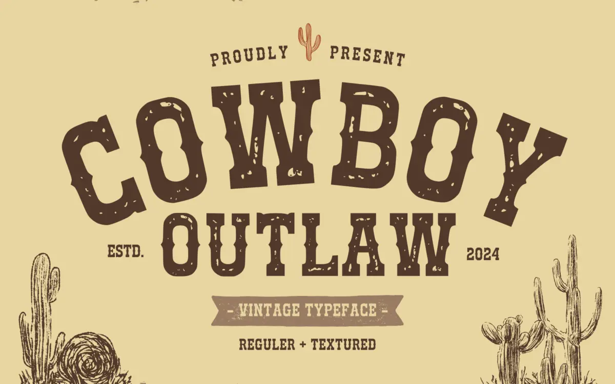
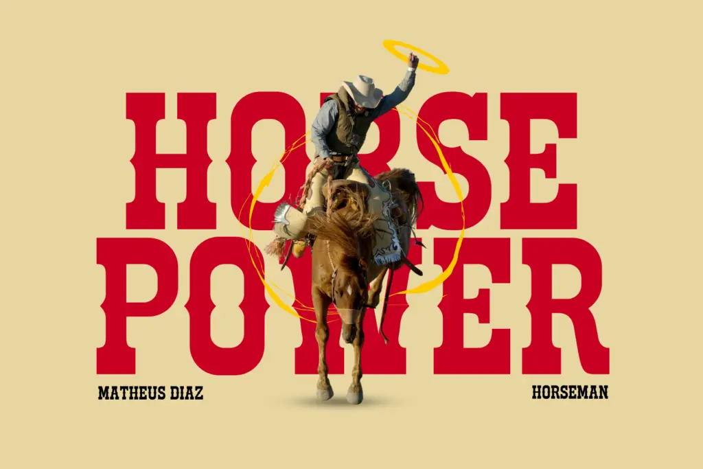
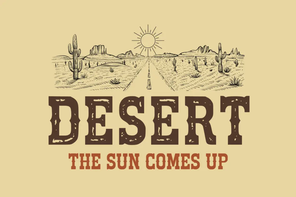
Cowboy Outlaw sits squarely in the well-worn tradition of Western display lettering: heavy slab serifs, thick vertical strokes, and a general air of hand-cut wood type. The letterforms have the wide, plodding stance you’d expect from a wanted-poster face — square counters, blunt terminals, and serifs that read as short stubs rather than refined brackets. It’s not trying to be clever or original within the genre; it’s trying to nail a very specific reference point, and it mostly does. The Regular style is clean and geometric enough to hold up as a workhorse display face, while the Textured companion adds a layer of grain and wear that pushes it toward signage and packaging that wants to look aged rather than new.
There’s a heaviness to the design that limits its range. Every letter carries roughly the same visual weight, which gives the face a consistent, stamped-out rhythm at large sizes but also means it doesn’t flex much stylistically — this is a one-note typeface, and the note is loud.
Character set and features
The package covers numerals and punctuation alongside the standard alphabet, with PUA encoding used to make the Textured glyphs accessible even in applications that don’t support OpenType features properly. That’s a practical touch for buyers using older layout software or template builders where feature panels aren’t available. Multilingual support is mentioned, though the brief doesn’t specify which language sets are covered, so anyone working outside basic Latin should check character coverage before committing to a project.
Having two styles in one purchase — a plain Regular and a distressed Textured version — is the most useful structural decision here. It means you’re not locked into either the clean or the weathered look; you can switch depending on whether the job wants crispness or grime. There’s no mention of an extended weight range, small caps, or alternates, so this isn’t a face built for nuanced typographic systems. It’s a single, strong gesture repeated across the character set.
Use cases
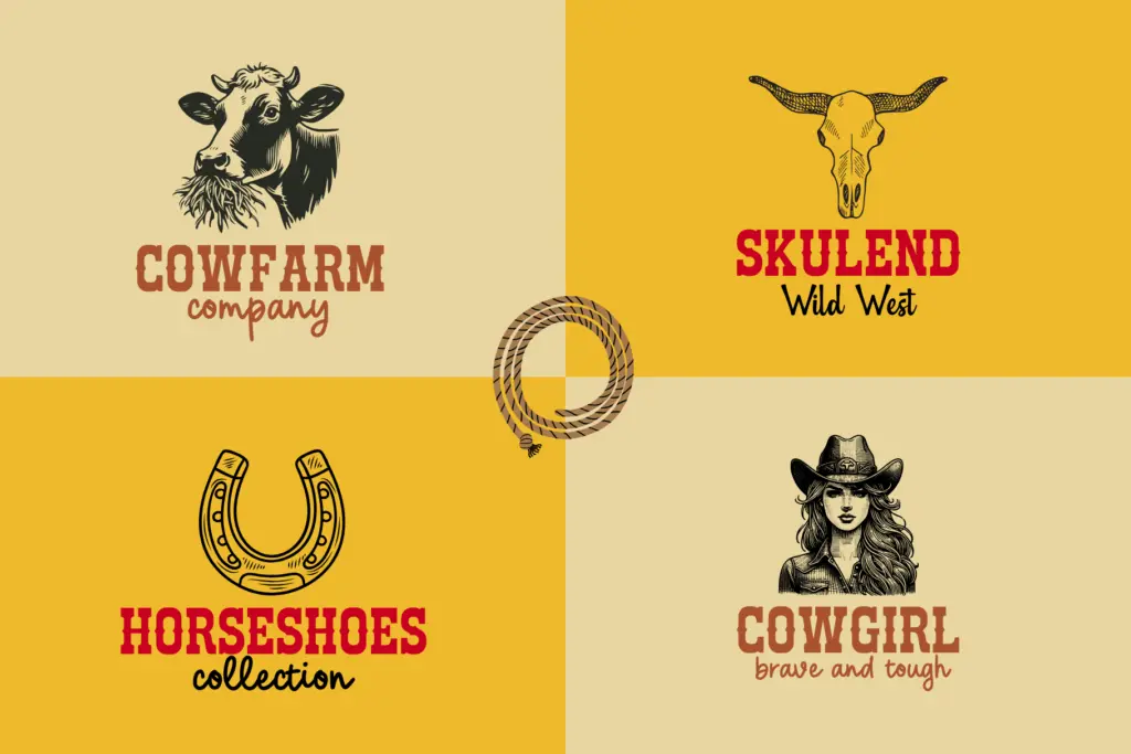
This is a display typeface, full stop — nobody should be setting paragraphs in it. Where it earns its keep is in short bursts: logotypes for ranches, breweries, barbecue joints, rodeo event branding, saloon signage, poster headlines, and themed party invitations that want an Old West flavour without much subtlety. The Textured version works well printed large on kraft paper, leather-look backgrounds, or anywhere a distressed, screen-printed aesthetic is wanted. The Regular version is the safer choice for digital use — logos, app icons, merchandise — where the grain of the Textured style might not survive scaling down or reproduction on fabric.
It’s a narrow-purpose font, and that’s fine as long as the buyer knows it going in. Anyone reaching for a general-purpose serif, or something that needs to sit comfortably next to body copy, should look elsewhere. But for the specific job of shouting “Wild West” from a poster or a bottle label, Cowboy Outlaw does the job directly and without pretension.
What we liked, and what we didn’t
Strengths
- Regular and Textured styles cover both clean digital use and distressed print applications
- PUA encoding makes the special glyphs usable even without OpenType feature support
- Consistent, chunky letterforms hold up well at large display sizes
Trade-offs
- The single heavy weight offers no flexibility for varied hierarchy or tone
- Not suited to anything beyond short headlines — body text or long-form use is out of the question
Cowboy Outlaw is a competent genre piece: heavy, stubby slab serifs that do exactly what a Western display font is supposed to do. It won't surprise anyone familiar with the style, and it has no ambitions beyond posters, logos and signage, but within that narrow lane it works cleanly.
Verdict

Tmfonts reviews typefaces in depth — every font is tested in real branding, editorial and screen layouts before a word gets written. 555+ fonts reviewed and counting.