
Shiny Affair: a dotted, layerable script for glam-leaning branding
Design style
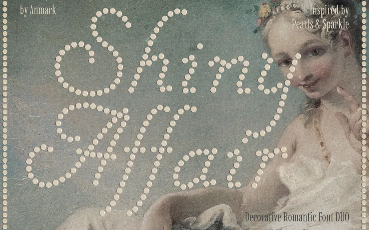
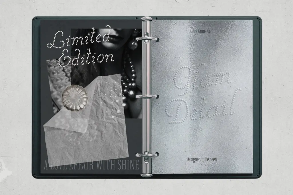
Shiny Affair is a decorative script built from a texture rather than a clean stroke: the letterforms are made up of small dots meant to read as pearls or soft sparkle. It comes as a duo, a Solid style and a Glow style, designed to be used alone or stacked on top of each other to fake a bit of dimension and shine. That layering trick is the whole premise of the font, and it works reasonably well at large sizes, where the dot texture has room to breathe and the Glow layer reads as a soft halo behind the Solid one.
The script itself leans romantic and a little theatrical, with generous swashes and a loose, hand-drawn connection between letters. It’s not trying to be a refined calligraphic script — the dotted construction pulls it toward novelty and party-invite territory rather than restrained elegance. That’s fine as long as you know what you’re buying: this is a texture effect wearing a script’s clothes, not a script with texture added as a finishing touch.
Character set and features
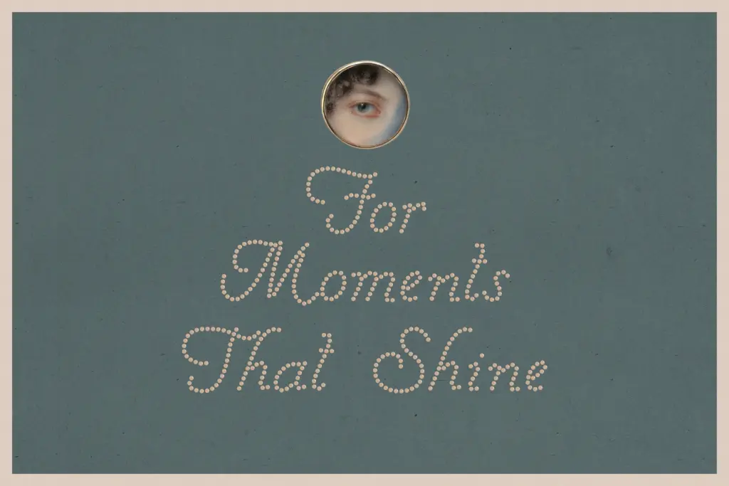
Because the font is built from dots rather than continuous strokes, legibility depends heavily on size and contrast against the background. At headline sizes on a clean background, words are readable and the pearl texture reads clearly as pearls. Shrink it down, put it on a busy photo, or set it in a dark colour on a dark background, and the dots start to compete with each other, blurring letterforms into a shimmer rather than legible type. This isn’t a font for body copy or even long subheads — it’s built for short bursts of text, a name, a date, a single word.
The duo structure is the main functional feature here: two coordinated styles meant to be stacked, which gives you some flexibility without needing to fake effects in software. Beyond that, there isn’t much to describe in terms of alternates or expanded language support based on what’s provided — treat it as a display tool with one clever trick, not a font family with deep typographic infrastructure.
Use cases
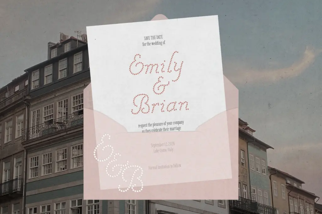
Shiny Affair is aimed squarely at the glam-and-romance end of design work: wedding monograms, save-the-dates, beauty and fashion branding, boutique packaging, party invitations, and social graphics where a bit of sparkle sells the mood. In those contexts, used large and given room, it does its job — a single stacked word in Solid-plus-Glow can carry a whole invitation or a product label without needing much else around it.
It’s less useful anywhere text needs to stay legible at small sizes or in dense layouts — think multi-line invitation copy, packaging ingredient lists, or anything that has to survive being resized down for a favicon or a thumbnail. Pair it with a plain sans or simple serif for supporting text, since the dotted texture needs contrast from something quieter to avoid visual noise. Treat it as a headline accent, not a workhorse typeface, and it earns its keep.
What we liked, and what we didn’t
Strengths
- The Solid/Glow layering gives a genuine dimensional effect without extra software tricks
- Dot texture reads clearly as pearls or sparkle at large display sizes
- Well suited to the specific niche of wedding, beauty and boutique branding it targets
Trade-offs
- Legibility drops sharply at small sizes or against busy backgrounds because the dotted strokes lose definition
- Limited versatility outside short, large-scale display use — not built for body text or dense layouts
Shiny Affair is a novelty script built around a dotted, pearl-like texture and a Solid/Glow duo meant to be layered for a sparkle effect. It's charming at large display sizes on clean backgrounds but loses clarity fast when shrunk or set against busy imagery. Best treated as a headline accent for glam and wedding-adjacent branding, not a general-purpose script.
Verdict

Tmfonts reviews typefaces in depth — every font is tested in real branding, editorial and screen layouts before a word gets written. 555+ fonts reviewed and counting.