
Palmello: a non-connecting script built for market signage and retro branding
Design style
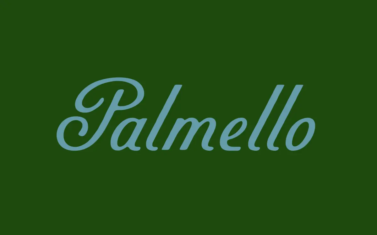
Palmello is a non-connecting script, which is the detail worth understanding before anything else. Each letter is drawn as its own hand-lettered unit rather than joined into a continuous ribbon of ink. That choice pulls it away from the wedding-invitation end of the script market and toward the sign-painted, brush-lettered lettering you see on old European grocery packaging and café awnings from the 1950s and 60s. The influence shows in the way strokes swell and thin without settling into a mechanical rhythm — there’s a deliberate irregularity to the letterforms, as if the pen paused and lifted between characters rather than gliding through them.
Because the letters don’t connect, the typeface avoids the biggest problem scripts run into at small sizes: illegible joins where two curves collide. Palmello instead reads more like confident handwriting laid out letter by letter, with enough looseness in the baseline and letter angles to keep it from looking stamped out. It has personality without tipping into novelty — the terminals are blunt rather than flourished, and the overall tone is warm rather than fussy.
Character set and features
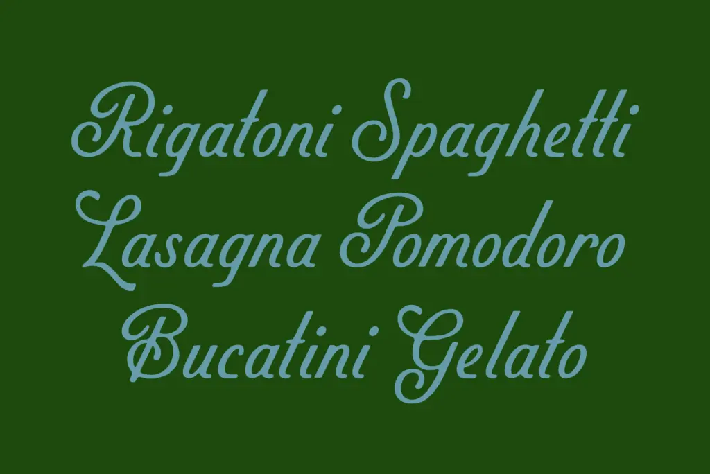
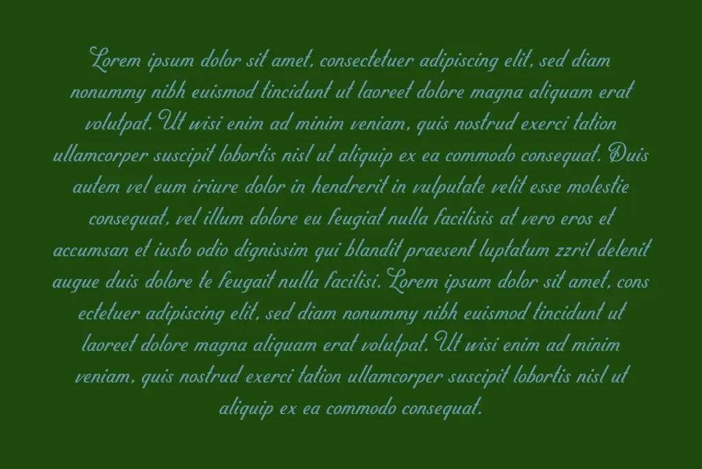
As a display script aimed at branding and packaging work, Palmello’s core strength is that it’s designed to work at more than one size. The brief describes it as holding its own in supporting copy as well as headline use, which tracks with the visual evidence — the letterforms aren’t so exaggerated in their swashes or stroke contrast that they collapse when set smaller. That’s a meaningful distinction from scripts drawn purely for hero type on a poster, which often fall apart the moment you drop them into a paragraph or a product label.
The non-connective structure also means spacing does a lot of the work. Kerning between letters needs to feel intentional rather than default, since there’s no ligature or join to smooth over awkward gaps. Where that’s handled well, it reads as loose, market-stall handwriting; where it isn’t, gaps between characters can look accidental rather than stylistic. Anyone setting this at length should keep an eye on letter spacing rather than trusting the default tracking to carry every word.
Use cases
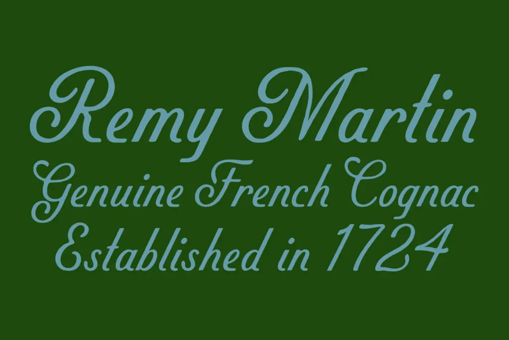
Palmello is built for exactly the kind of work its retro reference points suggest: packaging labels, market and food branding, café signage, editorial headers with a nostalgic tone, and logotypes that want a hand-lettered feel without the formality of a calligraphic script. It suits product names, small-batch or artisanal branding, and any project trying to evoke mid-century European advertising without leaning into full pastiche.
It’s less suited to anything requiring a flowing, romantic script — the non-connective structure works against that mood by design. And because its character comes from irregularity, it’s not the choice for a typeface that needs to disappear into long-form body copy; it wants to be seen, just not shouted.
What we liked, and what we didn’t
Strengths
- Non-connecting letters keep it legible at smaller sizes where joined scripts typically break down
- Blunt, hand-lettered terminals give it a market-sign warmth without tipping into novelty
- Works across both display headlines and supporting copy rather than being a one-size typeface
Trade-offs
- Letter spacing needs manual attention since there are no joins to smooth over awkward gaps
- Not suited to projects wanting a flowing, romantic script feel
Palmello is a well-observed retro script that avoids the usual trap of scripts falling apart at small sizes, thanks to its non-connecting structure. It's best suited to packaging, market branding, and signage rather than formal or romantic contexts. Spacing needs attention, but the character is genuine rather than manufactured.
Verdict

Tmfonts reviews typefaces in depth — every font is tested in real branding, editorial and screen layouts before a word gets written. 555+ fonts reviewed and counting.