
Salty Feathers: A Wet-Ink Modern Script for Branding and Invitations
Design style
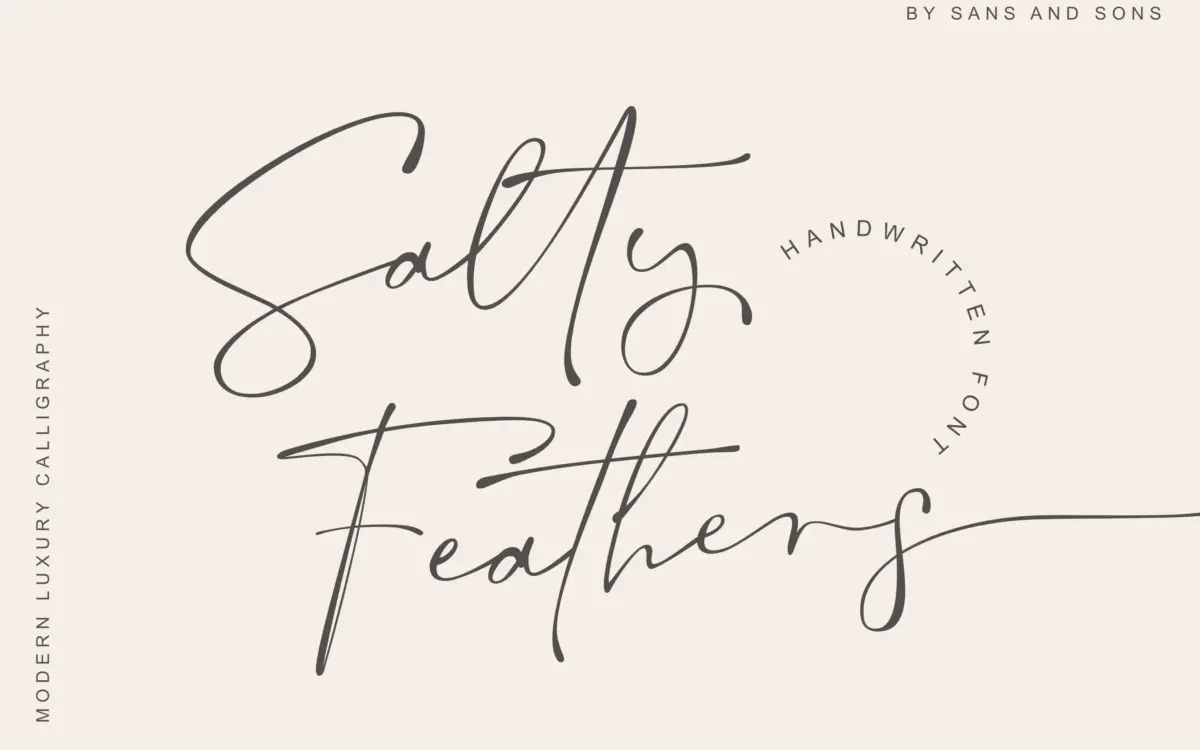
Salty Feathers sits in the crowded field of modern calligraphic scripts, but it earns its place with a genuinely wet-ink feel. The strokes swell and taper the way a brush or flexible-nib pen would, with visible variation in pressure rather than a uniform mechanical contrast. Connections between letters lean loose and casual, avoiding the overly formal, ruler-straight baseline that makes some scripts feel stiff. There’s a slight forward lean throughout, and the x-height sits low relative to the ascenders and descenders, which gives the whole face a loping, informal rhythm rather than a tight, calligraphy-class precision.
What separates it from the dozens of similar releases is restraint in the flourishes. The swashes exist but don’t dominate every letter, so the script reads as handwritten rather than performative. It’s the kind of script that looks like someone actually wrote it in one sitting, not one assembled letter by letter in a vector program — even though, of course, it was.
Character set and features
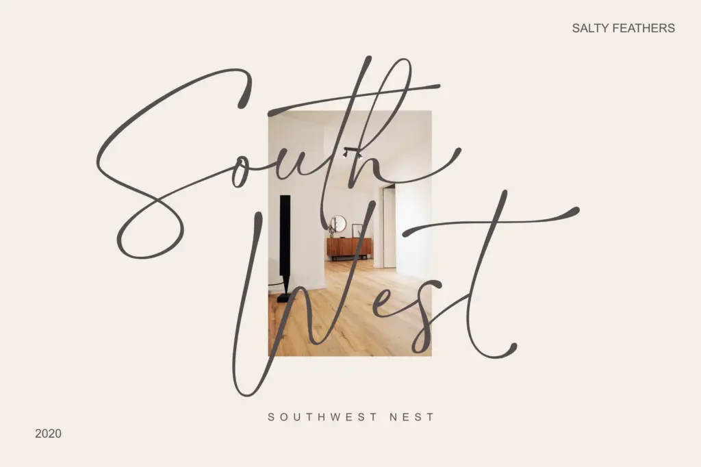
The set covers uppercase and lowercase, numerals, punctuation, and multilingual symbols, along with alternate letterforms, swash variants, and ligatures accessed through OpenType features or PUA encoding for software without OpenType support. This matters in practice: a script like this lives or dies on whether awkward letter pairs can be smoothed over, and having alternates on hand for repeated letters or tricky junctions (double ‘l’s, terminal ‘y’s, capital swash forms) is what keeps a longer word from looking mechanically repetitive.
The ligature set helps bridge some of the more collision-prone combinations, though as with most scripts of this style, getting a full sentence to sit right still requires manual kerning or careful glyph substitution rather than relying on the font to sort it out on autopilot. Designers who skip that step will notice overlaps or awkward gaps, particularly at larger display sizes where every stroke junction is visible.
Use cases
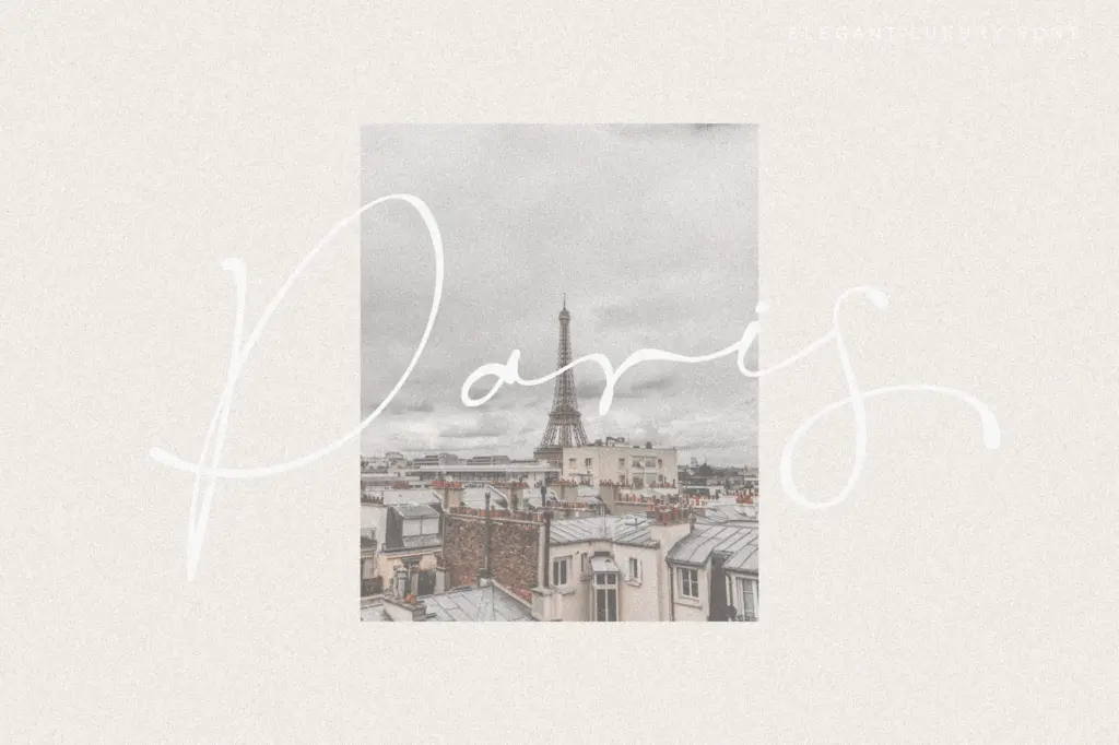
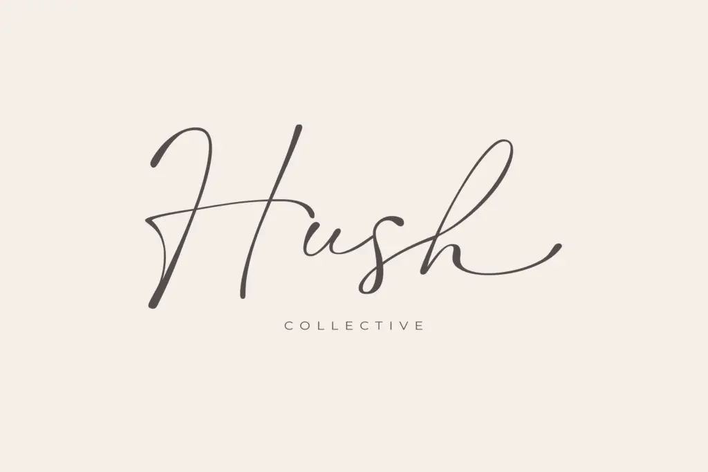
Salty Feathers is built for short-form work: logotypes, wordmarks, wedding stationery, invitation headers, packaging accents, masthead lockups. At those sizes and in those contexts, the wet-ink texture and loose baseline read as warm and handmade rather than illegible. It is not a script built for body copy or long-form setting — the joins and swash weight would turn dense at small sizes, and the low x-height doesn’t help legibility once the letters shrink.
It pairs naturally with a plain sans or a quiet serif doing the supporting text, letting the script carry the emotional register of a brand name or a couple’s names on an invite while a workhorse typeface handles addresses, dates, and disclaimers. For anyone building wedding suites, boutique branding, or product packaging that wants a personal, handwritten signature moment, this is a reasonable, well-drawn option — provided the user is willing to do a bit of manual kerning to make the connections sing.
What we liked, and what we didn’t
Strengths
- Wet-ink texture with genuine pressure variation rather than uniform contrast
- Swash and alternate glyphs are restrained enough to stay legible at logo sizes
- Ligature set smooths several of the more awkward letter collisions
Trade-offs
- Low x-height and loose joins make it unsuitable for anything beyond short phrases
- Requires manual kerning or glyph substitution to avoid overlaps at display size
Salty Feathers is a competent, well-textured wet-ink script that avoids the overly ornate excesses common in this category. It's best suited to short branding moments and invitation work rather than anything set longer, and it needs manual kerning attention to look its best.
Verdict

Tmfonts reviews typefaces in depth — every font is tested in real branding, editorial and screen layouts before a word gets written. 555+ fonts reviewed and counting.