
Folk Fest Font Free Download
Is Folk Fest free to download?
Folk Fest is a commercial font sold on Creative Market, so the full version needs a paid license. Get it from the official listing: Folk Fest font download.
Need something free? These display fonts from Google Fonts are free for personal and commercial use:
Design style
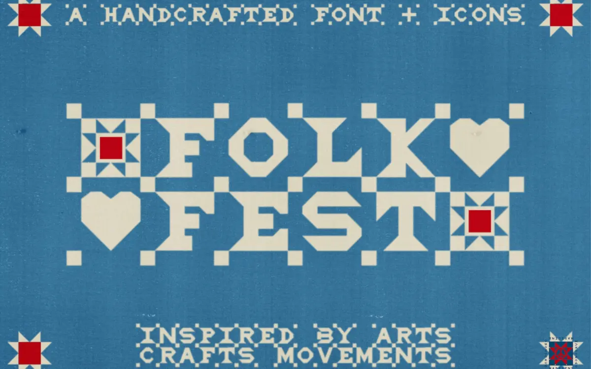
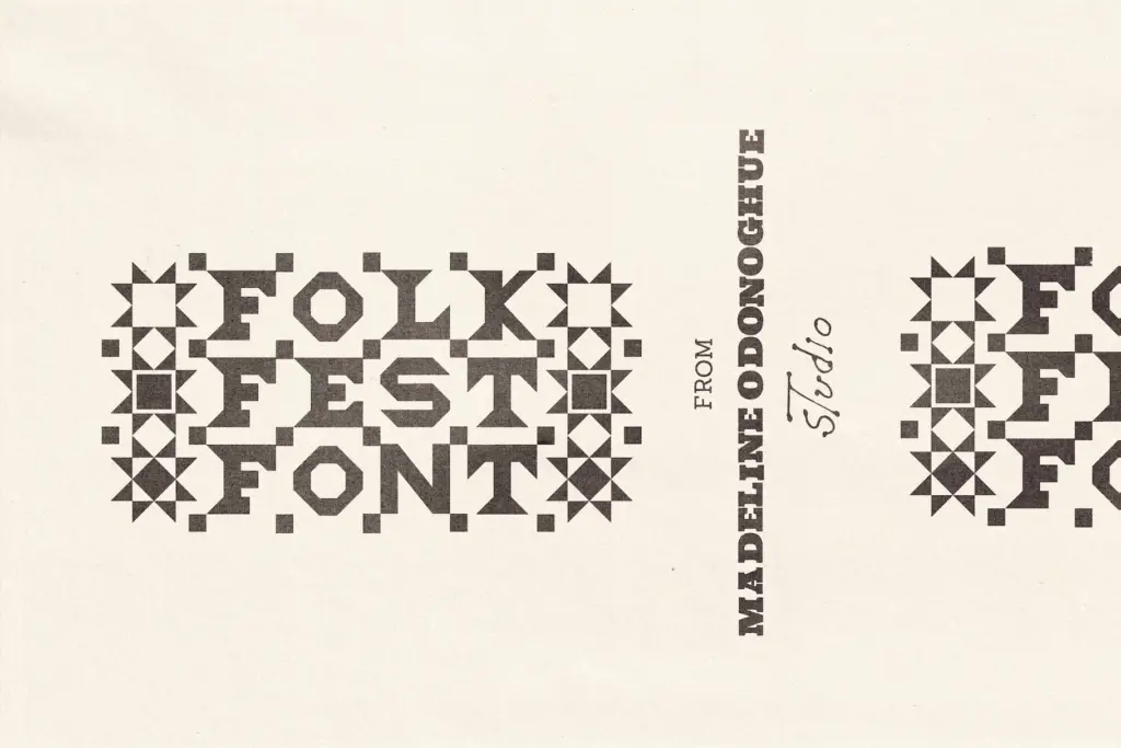
Folk Fest is an all-caps display face built around the idea of stitching rather than drawing. The uppercase letters carry a deliberate wobble — strokes that thicken and thin like thread pulled through fabric, corners that don’t quite square off. It reads as handmade without tipping into novelty clip-art territory, because the irregularity is consistent: every letter wobbles in roughly the same register, so the alphabet holds together as a system rather than a pile of one-off shapes.
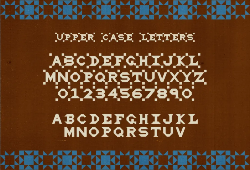
The stitched treatment is the headline feature. Instead of a single weight or texture, each character comes in a marked version — with visible quilting-style perforations along the strokes — and a plain version with the same skeleton but no stitching. That gives you two distinct textures from one design, which is more useful than it sounds: the stitched set does the talking on a poster or label, the clean set can carry body-adjacent text or smaller supporting lines without fighting for attention.
Character set and features
Numerals 0–9 follow the same two-track logic, stitched and clean, so a date or price on a market sign can match the headline treatment exactly. Basic punctuation is included in the stitched version, enough to close out a sentence or a sign-off line, though don’t expect a full symbol set or extended punctuation for dense setting.
The more unusual decision is what happens on the lowercase. Rather than a second, smaller alphabet, a–z is given over to a set of quilt-motif icons — doves, hearts, stars, patchwork blocks. These aren’t glyphs you type as words; they’re a picture library sitting on the lowercase keys, meant to be scattered as borders, used as bullet marks, or dropped in as standalone ornaments. It’s a clever use of the keyboard, but it does mean this isn’t a typeface in the conventional sense of upper and lower working together — it’s a display alphabet paired with an icon set, and buyers expecting normal sentence case in lowercase will be surprised.
Use cases
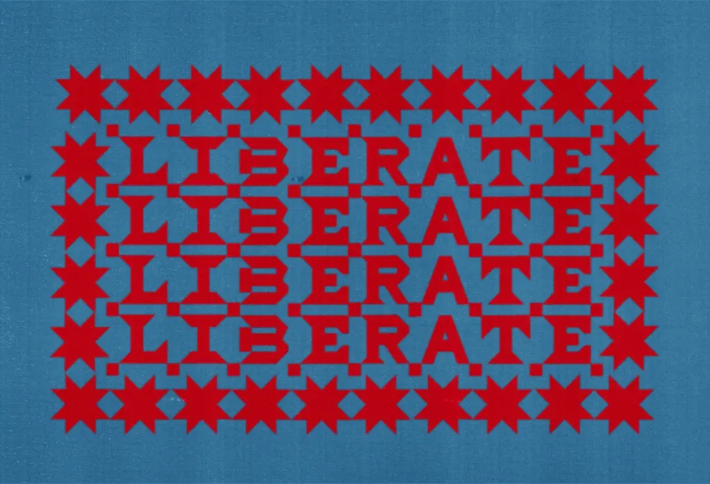
This is a font for short, loud, tactile messages: gig posters, festival lineups, market stall signage, tote bags, packaging for handmade goods, a wordmark for a brand that wants to signal craft and warmth rather than polish. The stitched marks read well at poster scale and on textiles or anything printed with a bit of texture already — screen print, letterpress, kraft paper. At small sizes the irregularity and the perforated stitching start to clog, so this is not a font for running text, captions, or anything below display size.
The quilt-icon lowercase earns its keep as a border generator or a set of one-off illustrations for a logo mark, but it needs to be used deliberately rather than typed as if it were text — treat it as a supplementary asset, not a second alphabet. Paired sensibly with a plain, quiet body font for the actual reading copy, Folk Fest works best as the single decorative voice in a layout rather than one of several competing display elements.
What we liked, and what we didn’t
Strengths
- Stitched and clean versions of every glyph give two distinct textures from one purchase
- The irregularity is systematic rather than random, so the alphabet reads as a coherent design
- Quilt-motif lowercase icons are genuinely useful as borders and standalone ornaments
Trade-offs
- Lowercase isn't a real alphabet, so it can't be typed as ordinary sentence case
- Stitched detailing clogs up at small sizes, ruling out anything but display use
Folk Fest is a well-drawn novelty display face that does exactly one job — tactile, handmade-feeling headlines — and does it with a consistent, considered wobble rather than random distortion. It's not built for reading text or for layouts needing more than one decorative voice, and the icon-based lowercase takes some getting used to, but for posters, packaging and craft branding it delivers real character.

Tmfonts writes independent reviews of typefaces: what each font does well, where it falls short, what it suits, and where it is sold.