
The Mozart Script Font Free Download
Is The Mozart Script free to download?
The Mozart Script is a commercial font sold on Creative Market, so the full version needs a paid license. Get it from the official listing: The Mozart Script font download.
Need something free? These script fonts from Google Fonts are free for personal and commercial use:
Design style
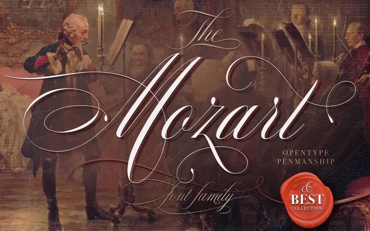
The Mozart Script sits in the copperplate-adjacent family of connecting scripts, drawing on the rhythm of Spencerian and early American penmanship rather than the looser, brush-drawn scripts that dominate the wedding-stationery market right now. The joins are formal: consistent entry and exit strokes, a clear thick-thin contrast that suggests a flexible nib, and looped ascenders and descenders that keep the baseline from feeling static. It reads as trained handwriting rather than casual lettering, which puts it closer to a calligraphy exercise book than to a marker-pen script.
That formality is also its character. The strokes stay disciplined across the alphabet, so the face doesn’t wander into the eccentric flourishes some scripts use to disguise thin design. The trade-off is that it can feel a touch stiff next to scripts built for warmth and spontaneity. This is a script for people who want precision, not looseness.
Character set and features
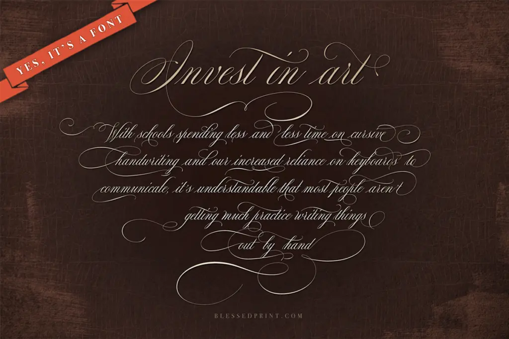
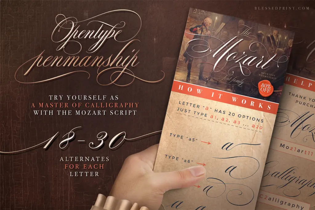
The stated six hundred-plus alternates are the real story here. That’s a substantial set of contextual and stylistic variants, presumably built to avoid the repeated-letterform problem that plagues connecting scripts when the same word appears twice in a layout. Four widths are included, which is a genuinely useful structural feature for a script — most scripts ship as a single width and force you to fight the tracking to make copy fit a space. Having narrower and wider cuts to choose from gives more control over line length without distorting the connecting strokes, which is a common failure point when scripts are condensed or expanded after the fact.
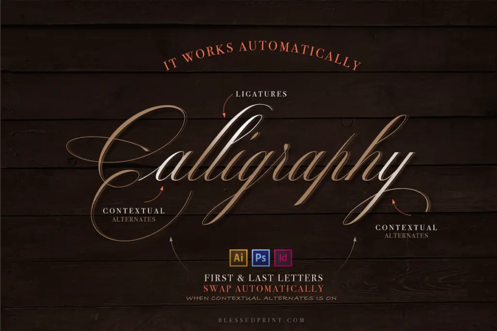
The multilingual claim suggests extended Latin coverage for accented characters, useful if you’re setting names or phrases outside strict English. As with any script this ornamental, the alternates and swash characters need manual application through OpenType-aware software; they won’t activate themselves in a plain text box, so budget time to actually use the feature set rather than just admire it in the specimen.
Use cases
Wedding stationery is the obvious home for this — invitations, place cards, monograms — where the formal penmanship tone reads as considered rather than casual. It also suits certificates, quotes, and short editorial pull-quotes where a calligraphic voice adds gravity without tipping into whimsy. The width variants make it more workable for logotypes and wordmarks than most scripts, since you can nudge the setting to fit a lockup rather than forcing tracking adjustments that break the joins.
Where it struggles is at small sizes or in dense paragraph settings — connecting scripts with this much contrast lose their thin strokes below a certain point size, so keep it for headlines, titling, and short-form copy. It also isn’t the right choice if the brief calls for informal or handwritten warmth; the strictness of the joins works against a casual tone. Used within its lane — short, formal, display-sized script work — it does the job cleanly.
What we liked, and what we didn’t
Strengths
- Four width variants give real control over fitting copy into a layout without distorting the joins.
- Large alternate set helps avoid repeated letterforms in connecting script text.
- Formal, disciplined stroke contrast gives it a calligraphic, trained-hand feel.
Trade-offs
- The strict, formal joins can feel stiff compared to looser, more casual scripts.
- Thin strokes and high contrast make it unreliable at small sizes or in paragraph settings.
The Mozart Script delivers a disciplined, penmanship-style script with genuinely useful width variants and a large alternate set. It's better suited to formal, short-form display work than to casual or dense settings, and its strict joins can read as stiff next to looser scripts.

Tmfonts writes independent reviews of typefaces: what each font does well, where it falls short, what it suits, and where it is sold.