
ED Lavonia Font Free Download
Is ED Lavonia free to download?
ED Lavonia is a commercial font sold on Creative Market, so the full version needs a paid license. Get it from the official listing: ED Lavonia font download.
Need something free? These script fonts from Google Fonts are free for personal and commercial use:
Design style
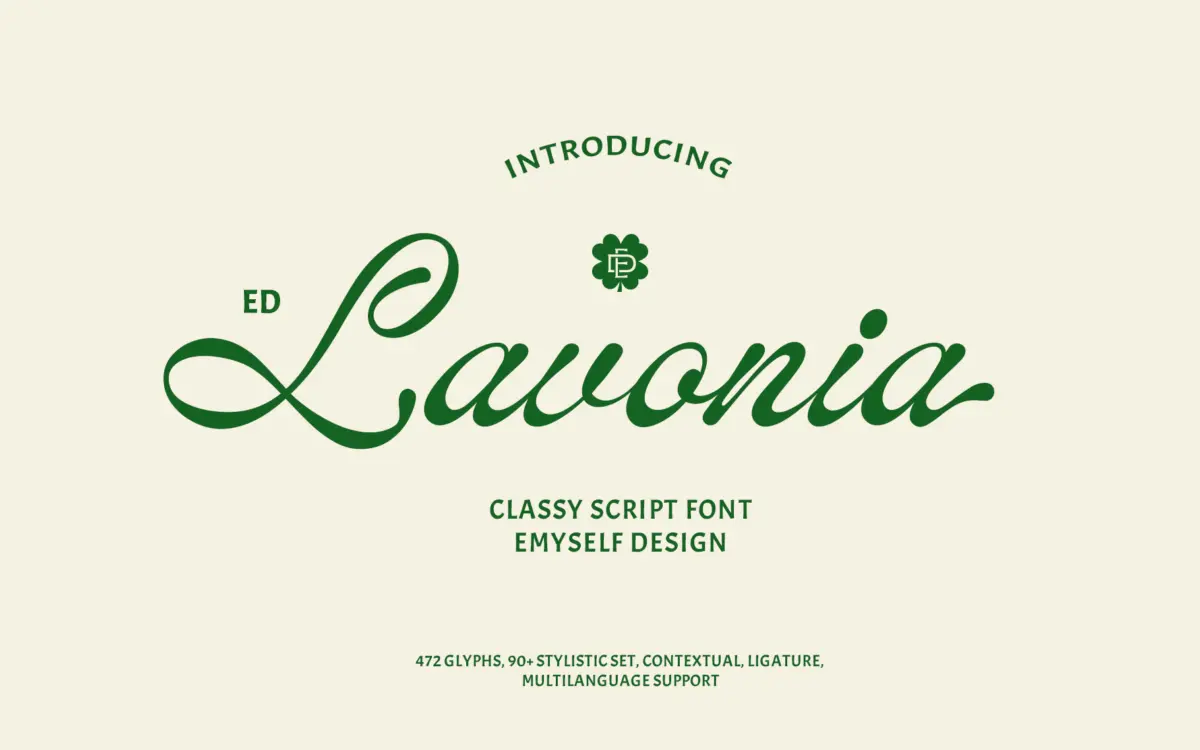
ED Lavonia sits in the well-populated field of connected scripts that borrow their character from old handwriting manuals rather than the brush pen. The strokes carry moderate contrast, with thin entry and exit hairlines swelling into fuller downstrokes, and the letters lean at a fairly consistent angle without the exaggerated flourish some scripts in this category chase. It reads as tidy rather than wild. Nothing here feels loose or improvised — the joins between letters are even, and the baseline holds steady, which is not always true of scripts pitched as “handlettered.”
Where it distinguishes itself is in restraint. Ascenders and descenders don’t loop excessively into neighbouring lines, and the capitals, while ornamented, stop short of the swash-heavy theatrics that make some scripts unusable outside a single wedding invitation. It’s a script built to be read at a glance, not admired stroke by stroke.

Character set and features
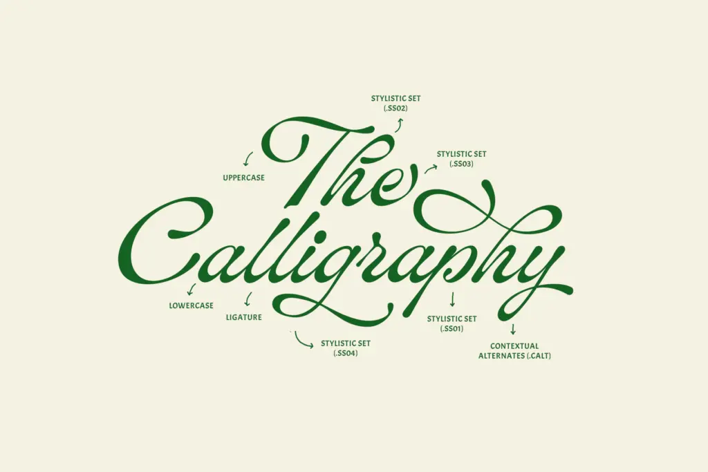
The 472-glyph set gives this font real depth for a script: uppercase, lowercase, punctuation, and a symbol set, alongside contextual alternates and a reported 90-plus stylistic sets. In practice, this means repeated letters in a word — double Ls, double Os — won’t look identical, which is one of the persistent tells of a lower-effort script font. The ligatures do similar work at letter junctions that would otherwise collide or look stiff.
Multi-language support is claimed, though the brief doesn’t specify which character sets are covered, so anyone setting text beyond basic Latin should check glyph coverage against their specific language needs before committing. The stylistic set count is high enough that pairing it down to a usable handful for production work will take some time in a layout program that exposes OpenType features properly — this isn’t a font you can fully audition in a dropdown menu that only shows default glyphs.
Use cases
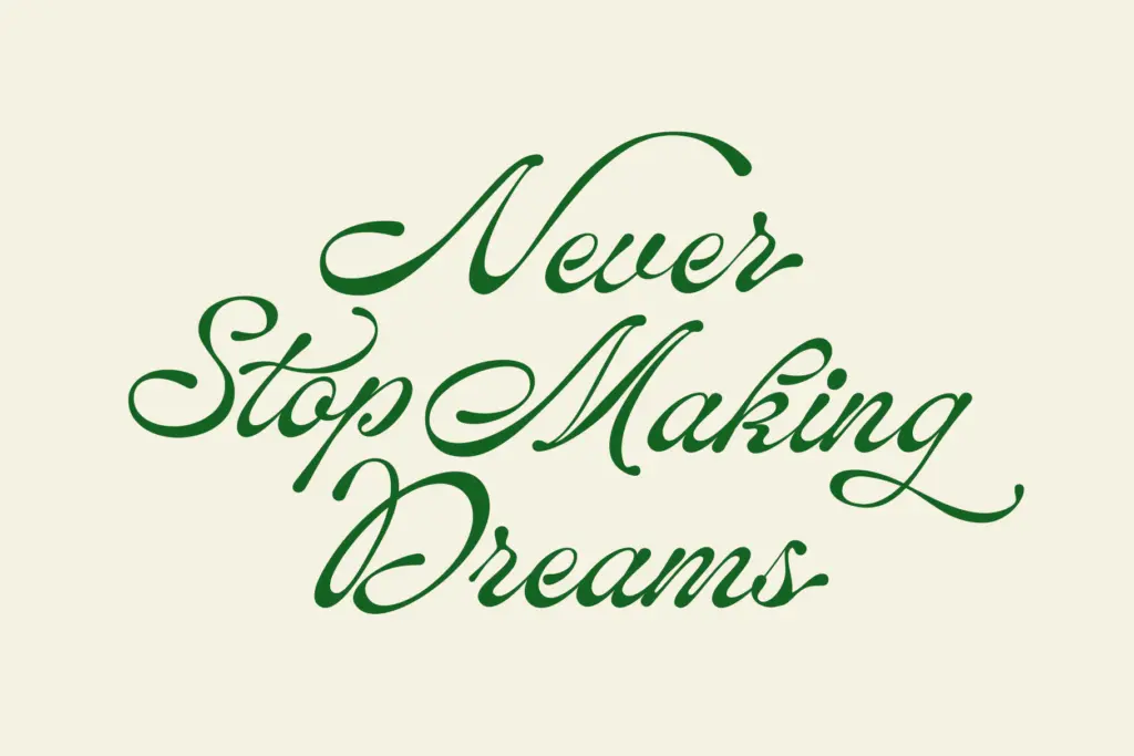
This is a script built for short-to-medium text: logotypes, headers, product names, quotes pulled onto a card or poster, invitation lettering. At display sizes — say 40pt and up — the stroke contrast and joins read cleanly and the alternates give you room to fine-tune awkward letter pairs. It’s less suited to anything resembling body copy; connected scripts rarely are, and this one is no exception. Keep it to a handful of words per line and it performs well.
For branding work, the moderate ornamentation is an asset: it won’t fight with a logomark or clash with a sans-serif companion typeface used for supporting text. Packaging and social graphics are reasonable homes too, provided the brand voice calls for something warm rather than minimal. Where it will strain is anywhere a script needs to read instantly at small sizes — mobile UI, fine print, anything under about 18pt loses the crispness of the thin strokes. Treat it as a display and accent typeface, not a workhorse.
What we liked, and what we didn’t
Strengths
- Even baseline and consistent joins give it a tidier, more controlled look than many classic scripts
- Large stylistic alternate and ligature set helps avoid repeated-letter monotony in real words
- Moderate ornamentation means it pairs easily with plainer supporting typefaces in branding work
Trade-offs
- Legibility drops off quickly below display sizes, so it's unsuitable for body text or small UI use
- Language coverage for the multi-language claim isn't specified, so non-Latin or extended Latin needs require checking
ED Lavonia is a competent, well-controlled script that avoids the over-decoration common in its category. It's built for display use — logos, invitations, headers — and its large alternate set rewards the extra setup time. It won't hold up at small sizes or in body text, and the multi-language claim needs checking against your actual needs.

Tmfonts writes independent reviews of typefaces: what each font does well, where it falls short, what it suits, and where it is sold.