
Paloma Font Free Download
Is Paloma free to download?
Paloma is a commercial font sold on Creative Market, so the full version needs a paid license. Get it from the official listing: Paloma font download.
Need something free? These handwritten fonts from Google Fonts are free for personal and commercial use:
Design style
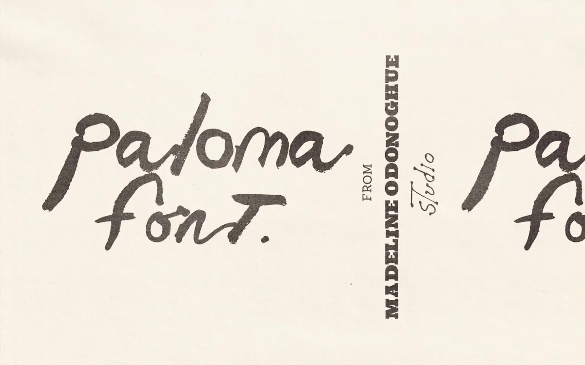
Paloma reads as exactly what it claims to be: letterforms lifted from real brushwork rather than drawn to imitate it. You can see the loading and unloading of the brush in the strokes — thick where the bristles first touch down, thinning and breaking up as the paint runs out. Terminals fray rather than snap to a clean point, and several letters carry visible ridges where two passes of the brush overlapped. This isn’t calligraphic discipline; it’s closer to the loose, fast mark-making you’d find in a sketchbook margin or a signature scrawled at the bottom of a canvas.
The rhythm is intentionally uneven. Letters don’t sit on a rigid baseline so much as bounce along one, and stroke weight varies enough between characters that the whole thing feels handmade rather than assembled. That’s the point of the font, but it also means Paloma has none of the geometric consistency you’d want from a workhorse text face. It’s a mood typeface, not a system.
Character set and features
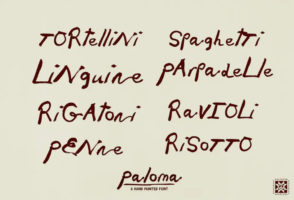
The set is basic by design: uppercase, lowercase, numerals, and basic punctuation, delivered as a single OTF. There’s no mention of ligatures, alternates, or swash characters, so what you see in the specimen is what you get — no built-in mechanism for breaking up repeated letters or softening the inevitable sameness that comes with any handwritten font used at length. That’s a real limitation if you’re setting anything longer than a few words, since brush fonts tend to reveal their repetition the moment the same letter shows up twice in a sentence.
Because the letterforms are painted rather than vector-perfected, some of the texture — flecks, drybrush breaks, slightly ragged edges — will only survive at certain sizes. The seller is upfront that this is a small-to-medium-size font, and that tracks with how brush textures usually behave: enlarge them past a point and the charming roughness starts to look like a printing error rather than a stylistic choice.
Use cases
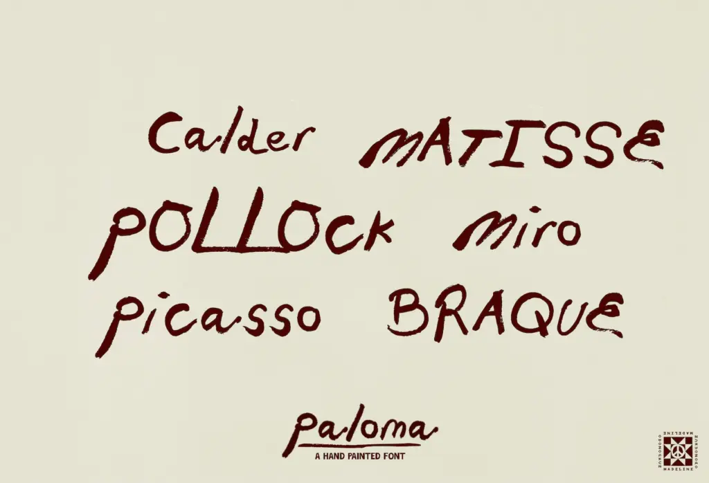
Paloma is built for moments, not paragraphs — a logotype for a ceramics studio, a headline on an exhibition wall panel, a hand-lettered feel on a restaurant menu without actually hand-lettering it. It suits contexts where the brand wants to signal
What we liked, and what we didn’t
Strengths
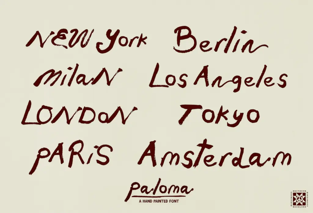
- Visible brush loading and unloading gives it a genuinely painted, not simulated, texture
- Uneven baseline and stroke variation read as authentic rather than templated
- Well suited to short-form artisanal branding like menus, packaging, and gallery signage
Trade-offs
- No ligatures or alternate characters to break up repeated letters in longer text
- Texture and legibility degrade at large sizes, ruling out signage or banner use
Paloma delivers genuine brush texture with none of the usual vector polish, which is its main appeal and its main constraint. It works well as a short-form, artisanal display mark but has no features to manage repetition or scale gracefully beyond small-to-medium sizes.

Tmfonts writes independent reviews of typefaces: what each font does well, where it falls short, what it suits, and where it is sold.