
Atelier Fleur Font Free Download
Is Atelier Fleur free to download?
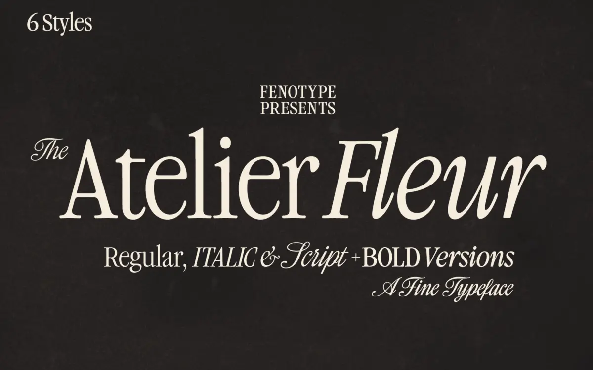
Atelier Fleur is a commercial font sold on Creative Market, so the full version needs a paid license. Get it from the official listing: Atelier Fleur font download.
Need something free? These serif fonts from Google Fonts are free for personal and commercial use:
Design style
Atelier Fleur takes the bones of a Garamond-style old-style serif and squeezes them into a condensed frame. The result reads as classical but pointed rather than classical and stately. Stroke contrast is moderate, the serifs are trimmed and a little sharp, and the overall stance has the narrow, upright posture you get when a wide humanist letterform is pushed into a tighter box. It doesn’t feel forced — the condensing has been done with the counters and apertures adjusted rather than just squashed, so the letters keep some air even at tighter tracking.
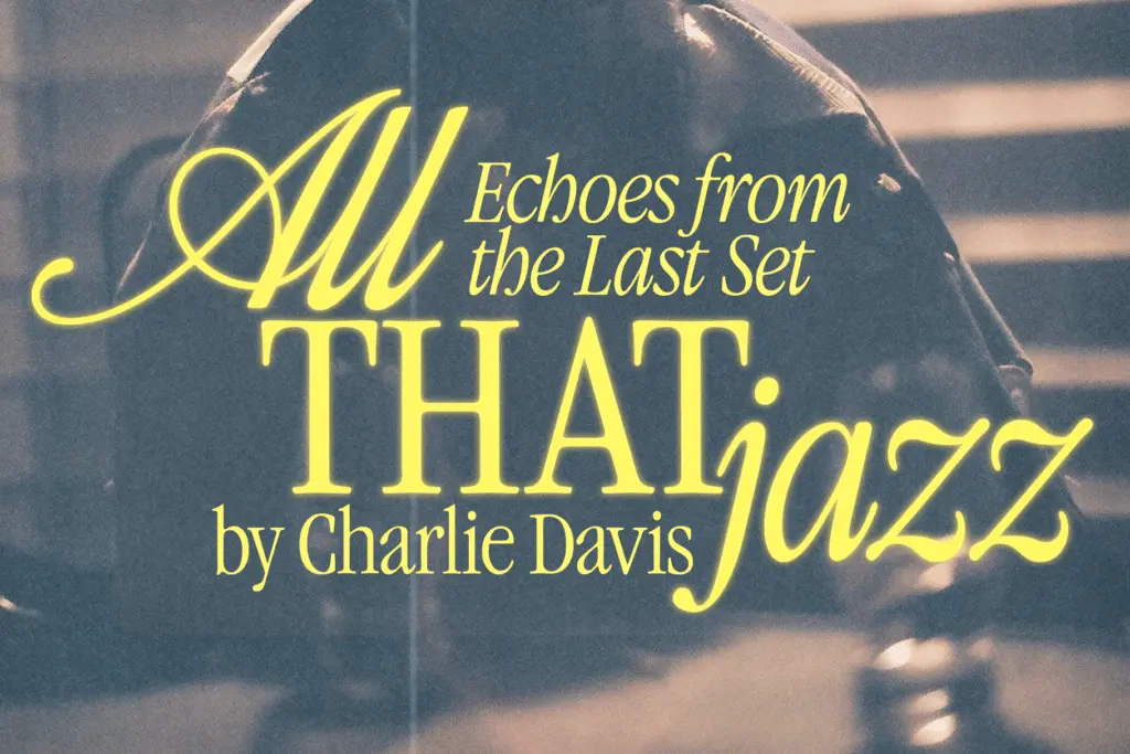
The family covers Serif, Italic, and Script styles, each in Regular and Bold. The italic carries the expected softer curves and calligraphic entry strokes, while the Script sits apart as the more decorative member — a formal, connected script with enough flourish to work as a display face in its own right, not just a companion to the serif. Pairing the three within one project is clearly the intent, and the shared proportions between Serif and Script make that plausible rather than aspirational.
Character set and features
Both the Italic and Script styles carry alternate character sets, reached through Swash, Stylistic Alternates, Titling Alternates, and several Stylistic Sets — the kind of layered OpenType structure that rewards someone comfortable digging through a glyphs panel rather than someone who wants a single default look. The Script style goes further, with decorative pen-stroke elements mapped to the numerals 0 through 9 via Stylistic Set 1, which is a nice touch for anyone setting dates, prices, or numbered lists in a more ornamental register.
The extensive OpenType feature set is the family’s strongest technical asset, but it also means the
What we liked, and what we didn’t
Strengths
- The condensed proportions keep air in the letterforms instead of just squashing a wide face.
- The Script style stands on its own as a display face, not just a decorative add-on.
- Numeral pen-stroke alternates in the Script style are a genuinely useful detail for dates and pricing.
Trade-offs
- The condensed setting and moderate contrast make it a poor fit for small running text.
- Getting the most from the alternates requires manual glyph work rather than relying on defaults.
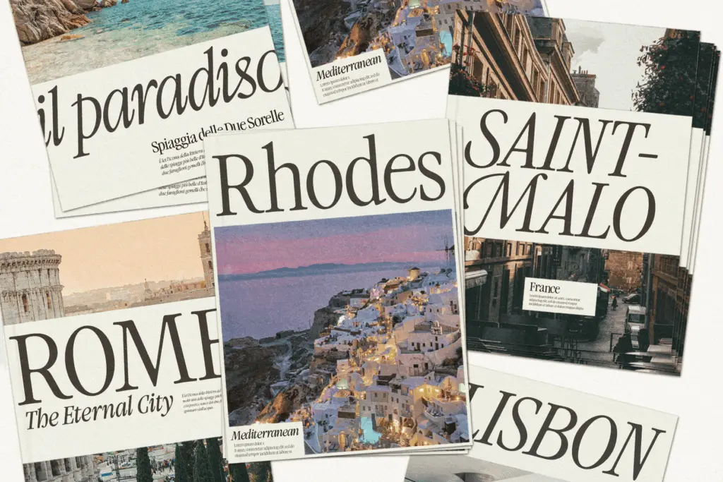
Atelier Fleur is a well-drawn condensed serif with a script companion that actually earns its place alongside it. It's built for headline and editorial work rather than body text, and the alternates reward someone willing to dig into the OpenType panel. Not a font for small print, but a solid choice for branding and editorial display work with a vintage lean.

Tmfonts writes independent reviews of typefaces: what each font does well, where it falls short, what it suits, and where it is sold.