
Belmonte Ballpoint Font Free Download
Is Belmonte Ballpoint free to download?
Belmonte Ballpoint is a commercial font sold on Creative Market, so the full version needs a paid license. Get it from the official listing: Belmonte Ballpoint font download.
Need something free? These handwritten fonts from Google Fonts are free for personal and commercial use:
Design style
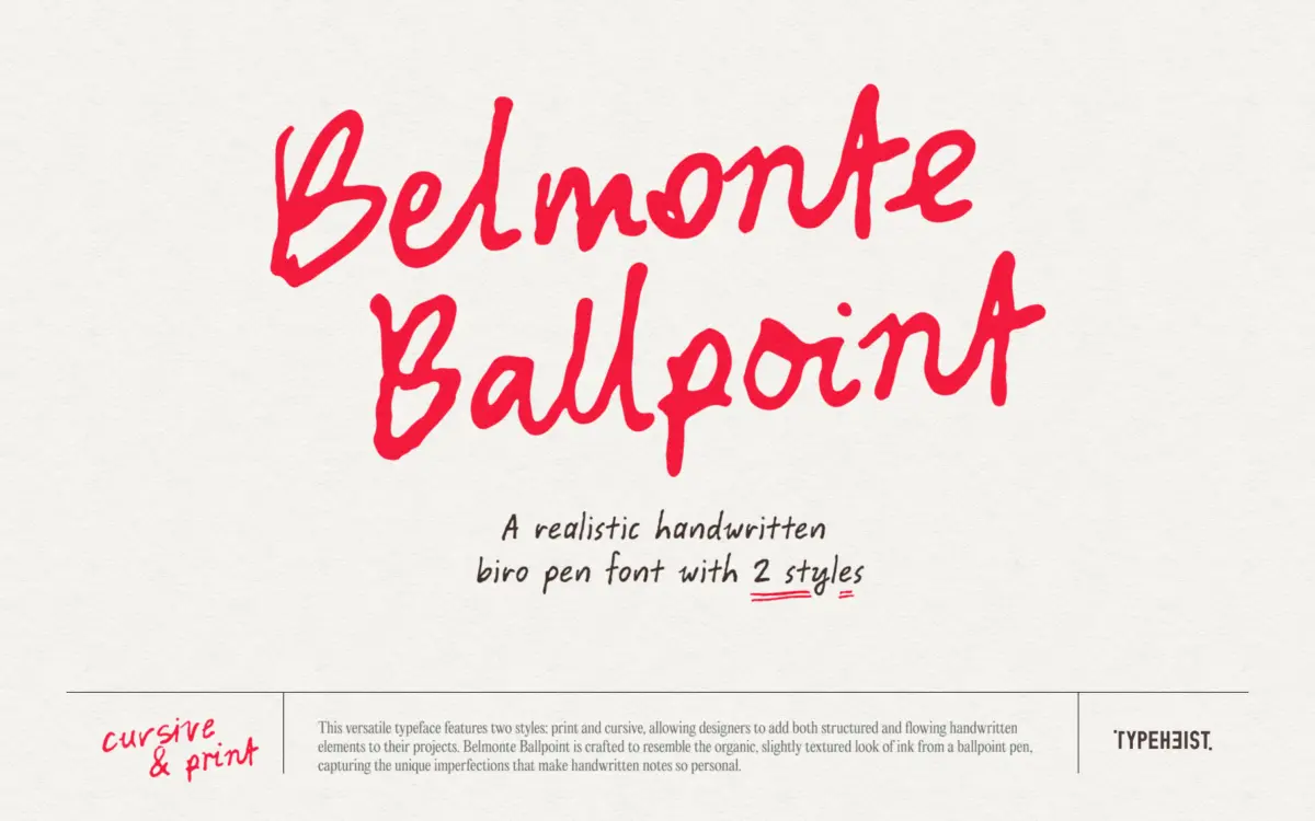
Belmonte Ballpoint sets out to do one specific thing: look like it came out of a cheap pen dragged across paper by an actual hand, not a stylus tablet. It succeeds mostly through restraint. The strokes carry a slight unevenness in pressure — thinner at the start of a stroke, a touch heavier where the pen would have paused — rather than the exaggerated wobble that a lot of handwriting fonts lean on to sell the illusion. The print style keeps letters upright and separated, closer to how someone fills in a form. The cursive style joins letters with the kind of loose, slightly impatient connections you get from someone writing fast rather than someone writing pretty. Neither style tries to look calligraphic or designed; that’s the point of a ballpoint font, and this one doesn’t oversell it.
Where it gets more interesting is the pairing. Print and cursive share enough DNA — same ink weight, same slight texture, same baseline behaviour — that swapping between them mid-layout doesn’t read as two unrelated fonts glued together. That’s harder to pull off than it looks, and it’s the main design achievement here.
Character set and features
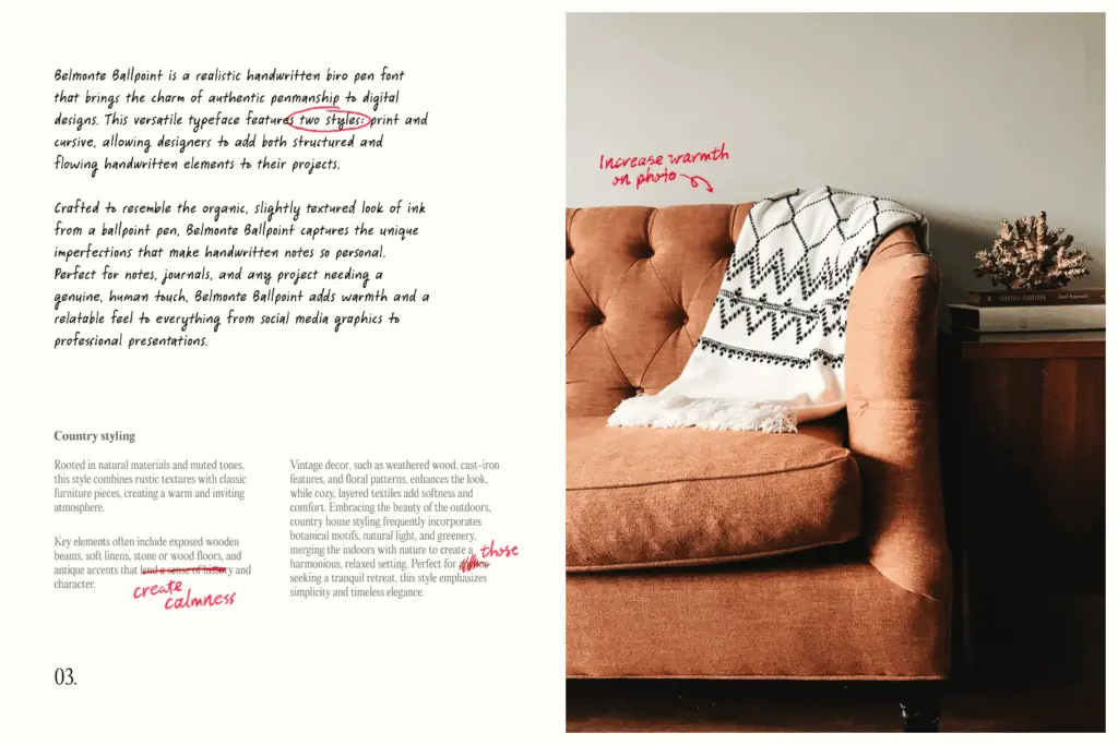
The glyph count is the headline: 1,034 glyphs and 197 custom ligatures across the family, with three alternate sets for A–Z and 0–9. In practice this means repeated letters in a word of body text won’t look identical, which is exactly what stops handwriting fonts from reading as a font. The multilingual Latin support extends this authenticity to accented characters, so the illusion holds up beyond English-only layouts.
The 25 scribble glyphs, dropped in via keyboard shortcuts, are a nice bit of thinking beyond the letterforms — underlines, circles, arrows, the kind of marginalia you’d add to a printed page by hand. They’re a small addition but they widen what the font can do without asking the buyer to source a separate doodle pack.
The trade-off with this much built-in variation is that you’re relying on OpenType features (stylistic sets, ligatures) actually being switched on in whatever software you’re using. Turn them off and you get a flatter, more repetitive version of the font — still usable, but it loses the thing that makes it worth choosing over a simpler handwriting face.
Use cases
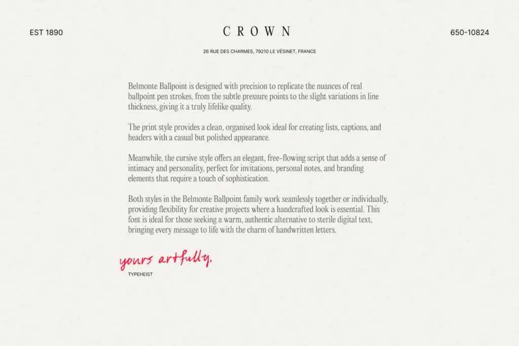
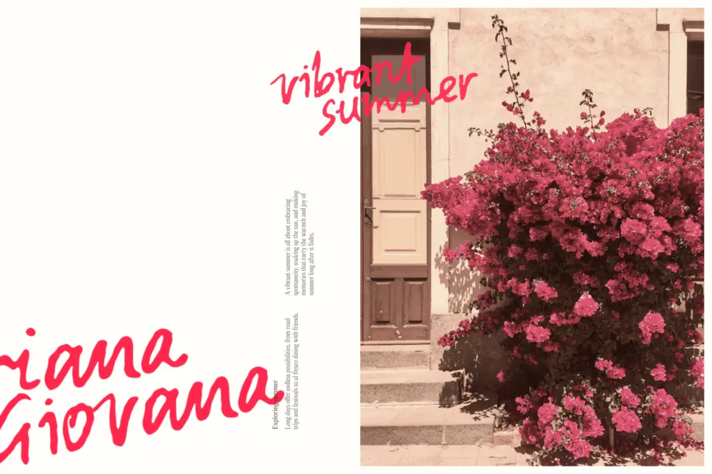
This is a font for projects that need to look handwritten rather than lettered: a note card, a recipe card, a mock diary entry, a personal brand that wants warmth over polish, packaging that wants a
What we liked, and what we didn’t
Strengths
- Print and cursive styles share enough character to mix confidently in one layout
- Three alternate letter sets plus 197 ligatures avoid the repeated-letter giveaway
- 25 scribble glyphs add usable marginalia without needing a separate asset
Trade-offs
- Cursive style loses clarity at small text sizes and works better as a headline or quote treatment
- Full effect depends on OpenType features being active, so plain fallback rendering is noticeably flatter
Belmonte Ballpoint delivers a believable pen-on-paper texture without overacting the wobble, and the letter variation genuinely helps it avoid looking like a font. It works best in short bursts — headlines, notes, cards — and asks a bit more of your software's OpenType support than simpler handwriting faces do.

Tmfonts writes independent reviews of typefaces: what each font does well, where it falls short, what it suits, and where it is sold.