
Beverly Hills Font Free Download
Is Beverly Hills free to download?
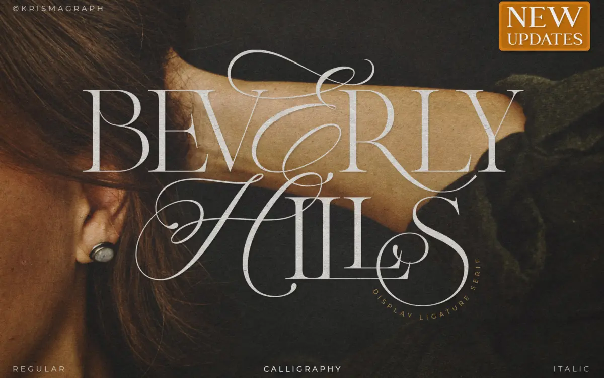
Beverly Hills is a commercial font sold on Creative Market, so the full version needs a paid license. Get it from the official listing: Beverly Hills font download.
Need something free? These serif fonts from Google Fonts are free for personal and commercial use:
Design style
Beverly Hills sits at the crossroads of calligraphy and serif construction, and it wears that hybrid identity openly. Strokes swell and taper the way a broad-edged pen would produce them, but the skeleton underneath is closer to a formal serif than a script. That combination gives it a slightly stiff, posed quality compared to a true calligraphic script — less flowing, more assembled. It reads as considered rather than spontaneous, which suits certain jobs and works against others.
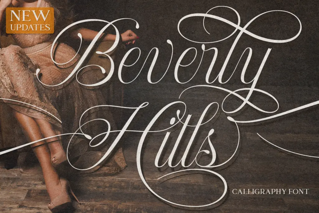
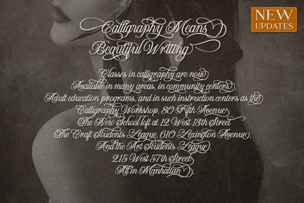
The three versions — regular, italic, and calligraphy — each lean into a different register of that same idea. The regular is the most restrained, closer to a conventional serif with calligraphic flourishes kept in check. The italic loosens the posture a bit. The calligraphy version is where the pen-drawn character comes through most clearly, with looser joins and more pronounced swashes. Having all three in one family gives a designer more room to move than a single-weight script typically allows, though the differences between them are more of degree than of kind.
Character set and features
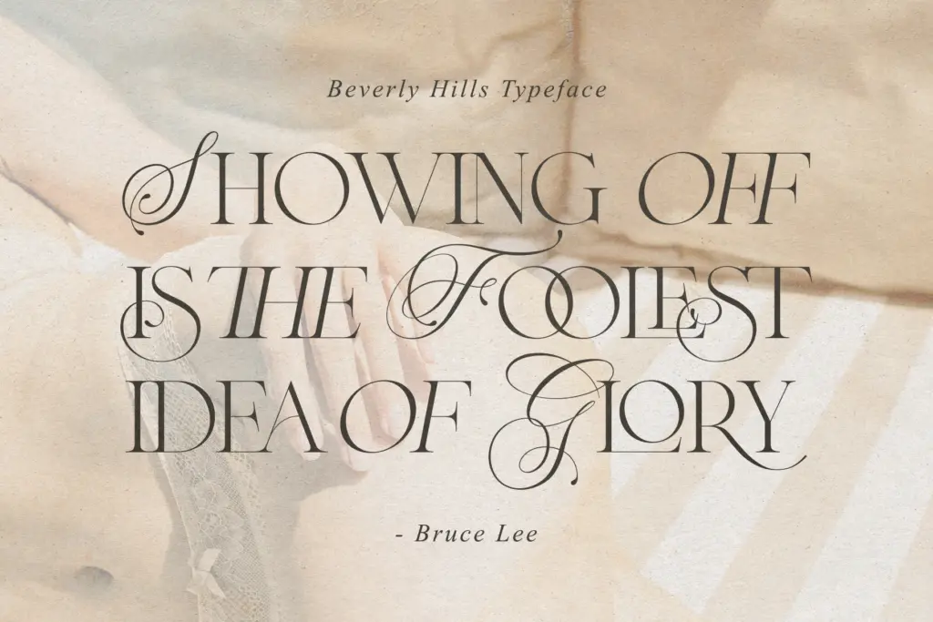
The headline feature is the set of 56 ligatures, and they do the heavy lifting here. Common letter pairs pick up connecting strokes that make the type feel handled rather than typeset, which is presumably the whole point of pairing calligraphy with serif construction. PUA encoding means those ligatures and alternates are reachable through standard glyph panels in Illustrator, Photoshop, or Word, without needing an OpenType-aware layout engine to trigger them — a practical detail for anyone not working in InDesign.
What’s less clear from the material is how deep the alternate and swash coverage goes beyond the ligatures themselves — no stated figure for alternates, no numeral treatment specified, and multilingual support is mentioned only in general terms. Treat the ligature count as the reliable fact and the rest as worth checking in a trial file before committing a layout to it. At small sizes, the ligatures start to lose their crispness; this is a typeface built for headline and title use, not body copy, and it says so itself.
Use cases
This is a typeface for short bursts of text where atmosphere matters more than reading speed: a wedding invitation’s couple names, a fashion logotype, a product label, an Instagram quote graphic. The calligraphic warmth gives it an easy fit with vintage mood boards and glamour-adjacent branding — the kind of look that wants to feel handwritten but also wants to feel finished. Packaging and editorial titling are reasonable extensions of the same logic.
It’s less suited to anything requiring sustained reading or a large character set doing consistent work across a document — a magazine’s running text, a UI, a multi-page brochure body. The ligatures that make a headline sing become a liability at paragraph size, where the swells and joins just add noise. Pair it with a plain sans or a workmanlike serif for supporting text, and let Beverly Hills do the one job it’s built for: the first thing someone reads, not the tenth.
What we liked, and what we didn’t
Strengths
- 56 ligatures add genuine handmade texture to short headlines and logotypes
- Three versions (regular, italic, calligraphy) give a working range within one family
- PUA encoding makes the special glyphs usable without OpenType-savvy software
Trade-offs
- Legibility drops noticeably below display sizes, limiting it to short text only
- Detailed information on alternates, numerals, and language coverage is thin
Beverly Hills is a competent calligraphic-serif hybrid built for short, decorative text rather than reading. The 56 ligatures give it personality, but that personality only holds up at headline sizes. Fine for logos, invitations, and social graphics; not a workhorse.

Tmfonts writes independent reviews of typefaces: what each font does well, where it falls short, what it suits, and where it is sold.