
Sidewalk Surf Font Free Download
Is Sidewalk Surf free to download?
Sidewalk Surf is a commercial font sold on Creative Market, so the full version needs a paid license. Get it from the official listing: Sidewalk Surf font download.
Need something free? These display fonts from Google Fonts are free for personal and commercial use:
Design style
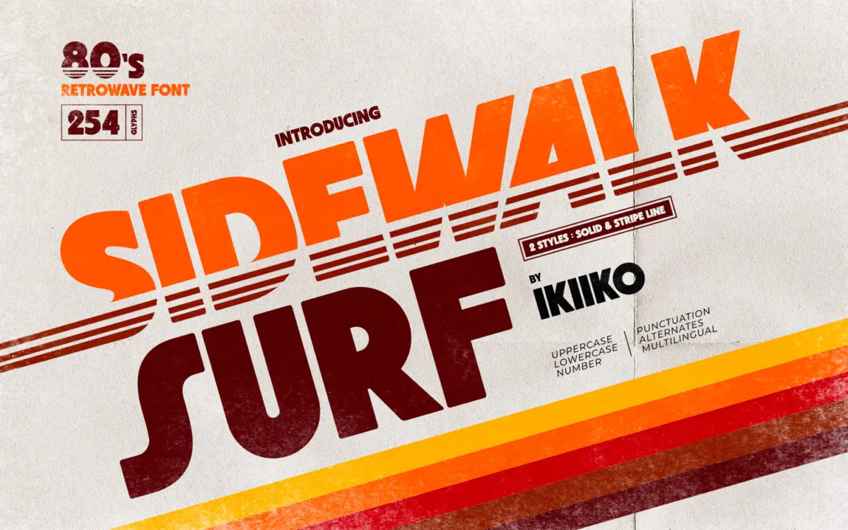
Sidewalk Surf sits squarely in the thick-letter, sun-drenched-boardwalk tradition of retrowave lettering. The strokes are heavy, the corners rounded off just enough to feel friendly rather than industrial, and the overall proportions lean wide, which is typical of the genre and gives every word a kind of confident swagger. There’s nothing subtle here, and that’s the point: this is a font built to be looked at from across a room, not read in a paragraph.
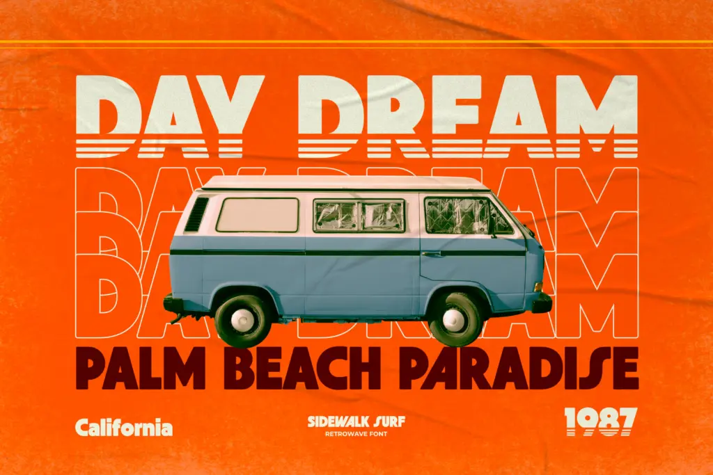
The two variants — Solid and Stripe Line — are really the same skeleton dressed differently. Solid is the workhorse version, a chunky monoline shape that reads clearly at large sizes. Stripe Line takes the same letterforms and cuts horizontal bands through them, echoing the chrome-and-neon motion lines you’d expect on an 80s van mural or a VHS box cover. It’s a nice touch that saves you from having to fake the effect yourself in an image editor, though it does mean the Stripe version is legible only in isolation — pair it with a plain sans for any supporting text.
Character set and features
The set covers uppercase, lowercase, numerals and punctuation, plus a batch of alternates for swapping out repeated letters in short words — useful since display faces like this tend to get used in logotypes and single-word headlines where letter repetition is common. Multilingual support extends its reach beyond English-only branding jobs, though as with most heavily stylised display fonts, don’t expect the lowercase to carry long stretches of text gracefully. It’s built for words, not sentences.
Both styles come in TTF and OTF, so there’s no format friction moving between different design applications. The alternates are a practical addition rather than a decorative flourish — swap in a different curve on a repeated vowel and a logotype instantly looks less mechanical, less like it came straight out of a font menu.
Use cases
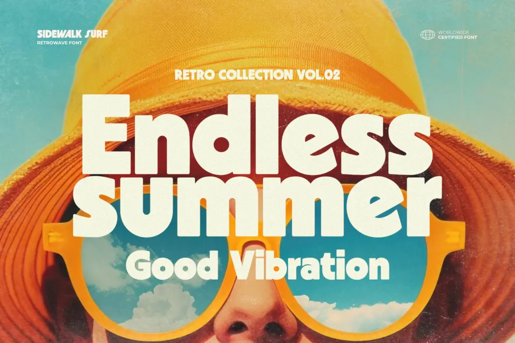
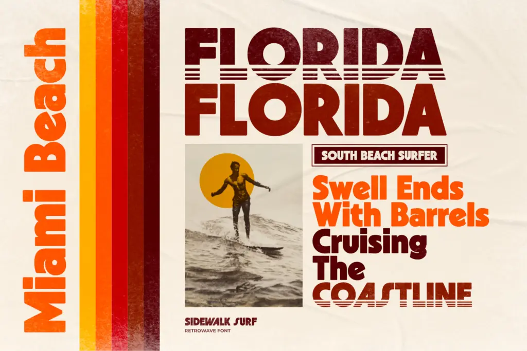
This is a font for a specific mood, and it commits to it. Poster headlines, apparel graphics, magazine mastheads, packaging call-outs, quote graphics for social media — anywhere the brief calls for loud, nostalgic, sun-faded cool, Sidewalk Surf delivers without much extra styling required. The Stripe Line variant in particular does a lot of the visual heavy lifting that would otherwise take a designer time in Illustrator or Photoshop with gradients and glow effects.
Where it won’t help you is anywhere restraint is the brief. This isn’t a font for a body of text, a UI, or a client who wants
What we liked, and what we didn’t
Strengths
- a
- b
- c
Trade-offs
- a
- b
placeholder

Tmfonts writes independent reviews of typefaces: what each font does well, where it falls short, what it suits, and where it is sold.