
Seraphine Font Free Download
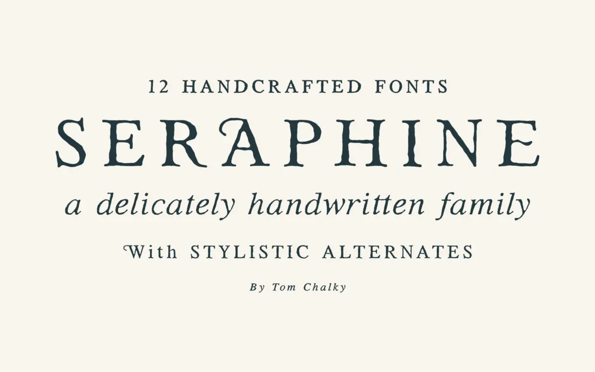
Is Seraphine free to download?
Seraphine is a commercial font sold on Creative Market, so the full version needs a paid license. Get it from the official listing: Seraphine font download.
Need something free? These serif fonts from Google Fonts are free for personal and commercial use:
Design style
Seraphine sits in that increasingly crowded space of serifs built to feel warm rather than authoritative. Tom Chalky’s approach here is restrained: the letterforms keep a classic serif skeleton but soften the joints and terminals so the overall texture reads as handmade rather than drafted. It’s not a calligraphic revival and it’s not trying to be quirky — the warmth comes from small decisions, slightly uneven stroke transitions, terminals that don’t quite snap to a grid, rather than from any obvious flourish.
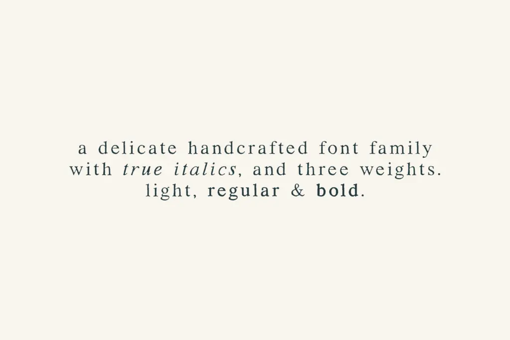
The family splits into regular and rounded versions, each running light, regular and bold, with true italics across the board. That’s a sensible way to cover a lot of ground without overcomplicating the concept. The rounded cut takes the same skeleton and softens the serifs further, which is a useful trick — you get two distinct moods from one drawing effort, and they sit close enough in proportion that pairing them within a single project doesn’t feel like mixing two different typefaces.
Where the design earns its keep is in the italics. True italics, rather than sloped romans, are increasingly rare at this price point of ambition, and Seraphine’s cursive structure gives the family a genuine secondary voice for pull quotes or emphasis rather than just a tilted duplicate.
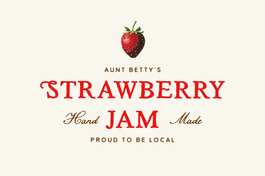
Character set and features
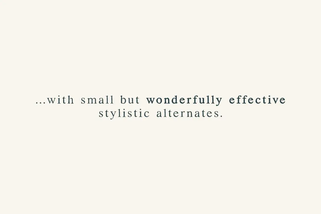
The brief lists a full Latin-1 multilingual glyph range, which covers most Western European diacritics — enough for French, German, Spanish and similar, though anyone working in Central or Eastern European languages will want to check specific characters before committing. Stylistic alternates are present but described as subtle, and that matches how the family behaves: this isn’t a font with a showy alternate set to dig through, more a handful of quieter options for a few letters that can look repetitive in longer settings.
Across twelve weights and styles, the family holds its identity well — the light weights keep enough stroke contrast to avoid looking thin and characterless, and the bold weights don’t inflate the serifs into something clunky. That consistency across such a wide weight range is not trivial to pull off, and it’s the strongest technical achievement here.
Use cases
Seraphine is built for editorial and branding work, and that’s genuinely where it belongs. In body copy at a reasonable text size, the regular weight reads cleanly with enough personality to avoid feeling like a stock system serif, without tipping into anything distracting. For packaging and product branding, the rounded cut gives a friendlier alternative to the standard version — useful if a brand wants warmth without going fully script or handwritten.
It’s less suited to very small print sizes or dense data-heavy layouts, where the organic irregularities that give it character start to work against clarity — nothing dramatic, but enough that a plainer workhorse serif would hold up better in a footnote or a table. As a display or headline face it’s fine but not remarkable; the personality is subtle enough that it won’t carry a poster on its own the way a more idiosyncratic display serif would. Its home is mid-size text: subheads, short editorial passages, product copy, logotypes that need a touch of craft without leaning decorative.
What we liked, and what we didn’t
Strengths
- The rounded and regular cuts share proportions closely enough to mix within one project without clashing.
- True italics give the family a genuine secondary voice instead of a mechanically sloped duplicate.
- Weight range from light to bold holds its character consistently rather than thinning out or bloating at the extremes.
Trade-offs
- The organic irregularities that give it warmth work against it at very small sizes or in dense tabular text.
- As a display face it's understated to the point of being forgettable next to more distinctive headline serifs.
Seraphine is a well-considered, quietly warm serif family that does branding and editorial work capably without trying to be a showpiece. The rounded/regular split and true italics give it real range, but its subtlety means it needs the right context to shine.

Tmfonts writes independent reviews of typefaces: what each font does well, where it falls short, what it suits, and where it is sold.