
Editorial Society Font Free Download
Is Editorial Society free to download?
Editorial Society is a commercial font sold on Creative Market, so the full version needs a paid license. Get it from the official listing: Editorial Society font download.
Need something free? These script fonts from Google Fonts are free for personal and commercial use:
Design style
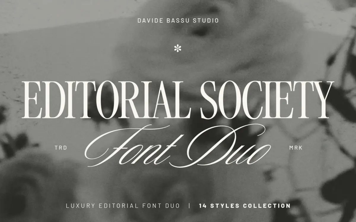
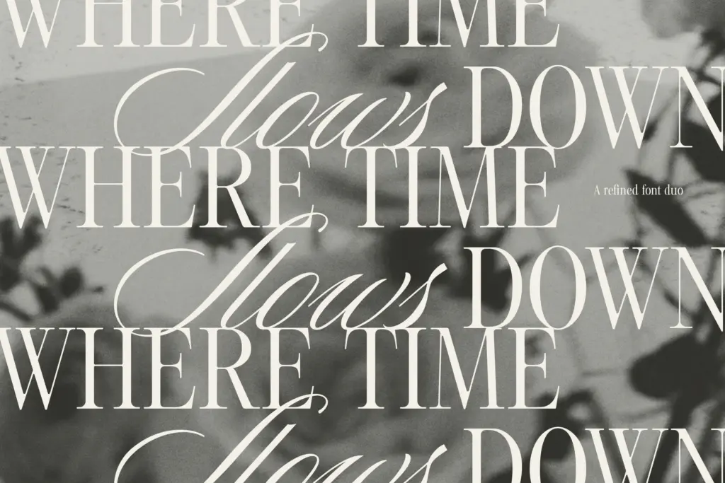
Editorial Society pairs a restrained serif with a handwritten script, and the pairing is the point. The serif is the workhorse: a fairly conventional editorial letterform with moderate contrast, sharp but not brittle serifs, and a construction that doesn’t try too hard to be distinctive. It reads as neutral in the way editorial serifs need to be neutral — it gets out of the way of the content. The script sits opposite it as the expressive half, with looped ascenders and connecting strokes that lean toward invitation lettering rather than casual handwriting. Neither half is groundbreaking on its own, but the drawing is even-handed: the serif’s proportions and the script’s stroke weight have clearly been tuned to sit next to each other rather than developed in isolation.
Where the design earns its keep is in the two script variants. Script is the tidier of the two, with less flourish and a more even baseline rhythm — useful where the handwritten feel needs to stay legible at small sizes. Lush pushes further into decorative territory, with looser joins and more movement in the terminals. Having both under one name means you’re not stuck choosing a single register for a whole identity system.
Character set and features
The serif comes in Regular and Tall proportions, each with Light, Regular and Bold weights — six cuts in total, enough to build a text hierarchy without leaving the family. Tall is the more useful of the two for headline work; it compresses horizontally in a way that reads as more editorial and less generic than a straightforward serif. The script’s four styles per variant (Thin, Bold, Thin Oblique, Bold Oblique) give a similar spread on the expressive side, though obliques on a script font are a slightly odd inclusion — they read less as italics and more as a stylistic option, and I’d expect most buyers to settle on one and ignore the rest.
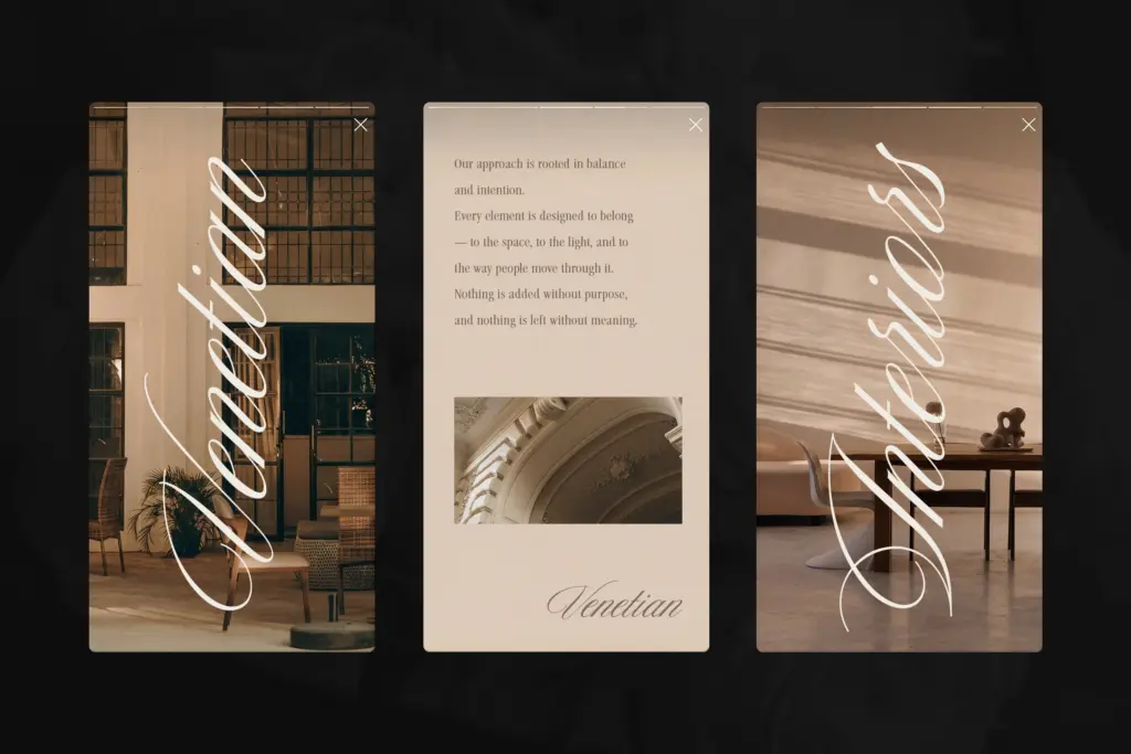
The 25 ligatures and alternates are where the script earns its handcrafted claim. They’re not decorative filler — the connecting forms between common letter pairs are what stop a script font from looking like joined-up printing, and this set covers enough combinations to keep longer words from feeling mechanically stitched together. Setting expectations: 25 is a modest set for a script with this many style variants, so heavy users of alternates in long-form lettering may find themselves repeating forms sooner than they’d like.
Use cases
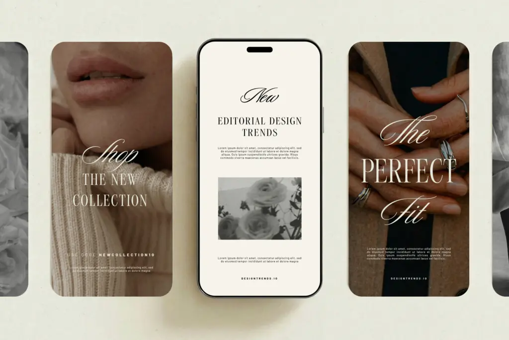
This is a branding and identity typeface first, a text typeface second. The serif’s Regular proportion can carry short paragraphs — pull quotes, packaging copy, product descriptions — but it wasn’t built for long-form reading and starts to feel a bit ordinary at that length. Where it performs is in the combination: serif headline or wordmark, script for a signature line, tagline or monogram flourish underneath. That’s a familiar formula in fashion and beauty branding, and this duo executes it competently rather than reinventing it.
Wedding stationery is an obvious fit given the script’s decorative range, and logo work benefits from the Tall serif’s compressed rhythm. Where it’s less suited is anything requiring dense body copy or a distinct personality that stands apart from the current crop of editorial serif-script pairings — it does the job well without pushing the format anywhere new.
What we liked, and what we didn’t
Strengths
- The serif and script are visibly tuned to sit together rather than bolted on as an afterthought
- Tall serif proportion gives headline work a compressed, editorial rhythm distinct from the Regular cut
- 25 ligatures and alternates keep the script's joins looking handcrafted rather than mechanical
Trade-offs
- The serif reads as competent but generic and isn't suited to long-form text setting
- 25 alternates is a modest set given how many script style variants are on offer
Editorial Society does a familiar job competently: a neutral editorial serif paired with a handwritten script, tuned to work together rather than shine individually. It's a safe, useful choice for fashion and beauty branding rather than a distinctive one.

Tmfonts writes independent reviews of typefaces: what each font does well, where it falls short, what it suits, and where it is sold.