
Parisian Vintage Calligraphy Script Font Free Download
Is Parisian Vintage Calligraphy Script free to download?
Parisian Vintage Calligraphy Script is a commercial font sold on Creative Market, so the full version needs a paid license. Get it from the official listing: Parisian Vintage Calligraphy Script font download.
Need something free? These script fonts from Google Fonts are free for personal and commercial use:
Design style
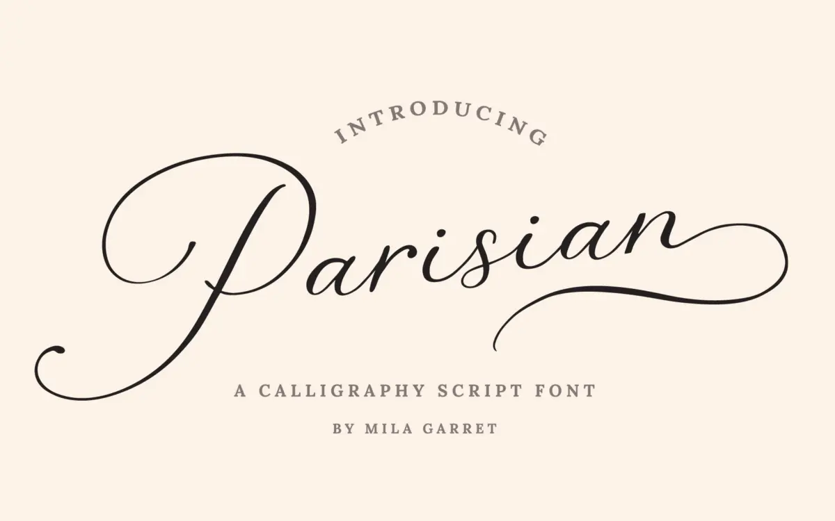
Parisian Vintage Calligraphy Script sits in the well-populated field of brush-style scripts modelled loosely on old-world signage and formal handwriting. The letters lean, the strokes swell and taper with a moderate contrast, and the joins between letters are close enough to read as continuous writing rather than a chain of disconnected glyphs. It doesn’t try to look like a genuine dip-pen hand — the curves are a bit too even and the rhythm a bit too regular for that — but it reads as a competent, market-tested version of the vintage-calligraphy genre rather than anything with a distinct new personality.
The uppercase is where the vintage cue is strongest: the swash capitals carry extra loops and flourishes that push the letters into ornamental territory, useful for a monogram or an opening word but heavy if repeated across a line. The lowercase is calmer and does the actual reading work.
Character set and features
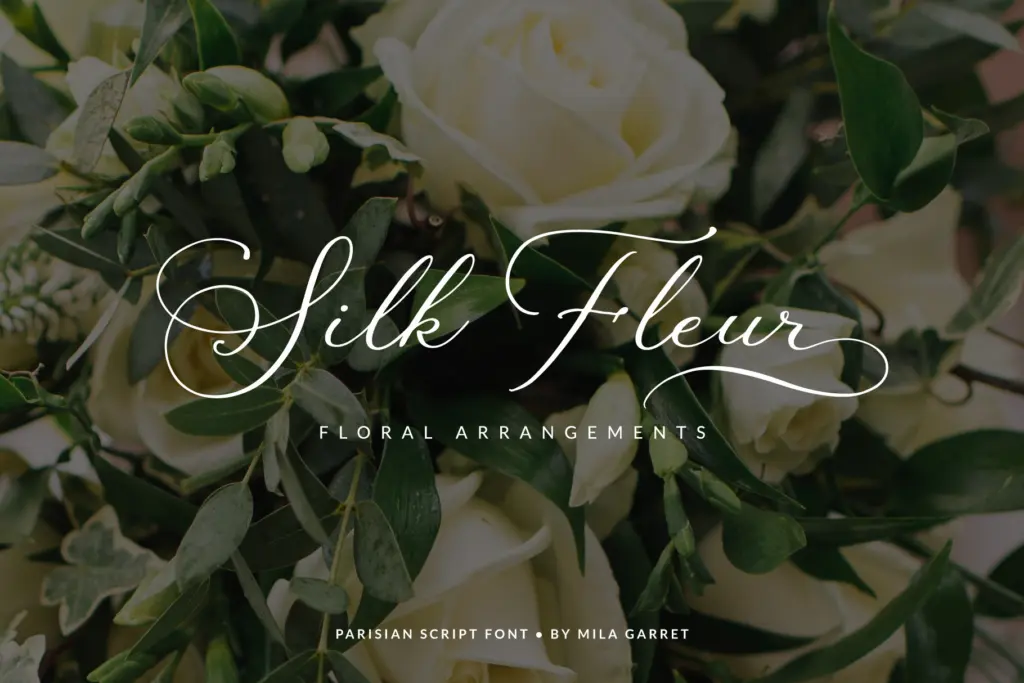
The set covers the standard alphabet and punctuation, plus a separate tier of beginning swash capitals and ending swash lowercase, so you can dress up the start and finish of a word without over-decorating the middle. There are stylistic alternates and ligatures on top of that, and the extended swash characters are PUA-encoded, meaning they sit on their own keycodes and don’t require a glyphs panel or OpenType-savvy software to reach — a practical detail for anyone working in a program that doesn’t expose stylistic sets easily.
Multilingual coverage extends to the accented characters common across Western European languages, plus currency symbols, so the font isn’t limited to English-only projects. None of this changes the core letter construction, but it does mean the font will behave in Spanish, French or German copy without falling back to a default face for missing accents.
What’s not included, at least from what’s specified, is any indication of weight variation or a companion sans for body text — this is a single-style script, so pairing decisions are left entirely to the user.
Use cases
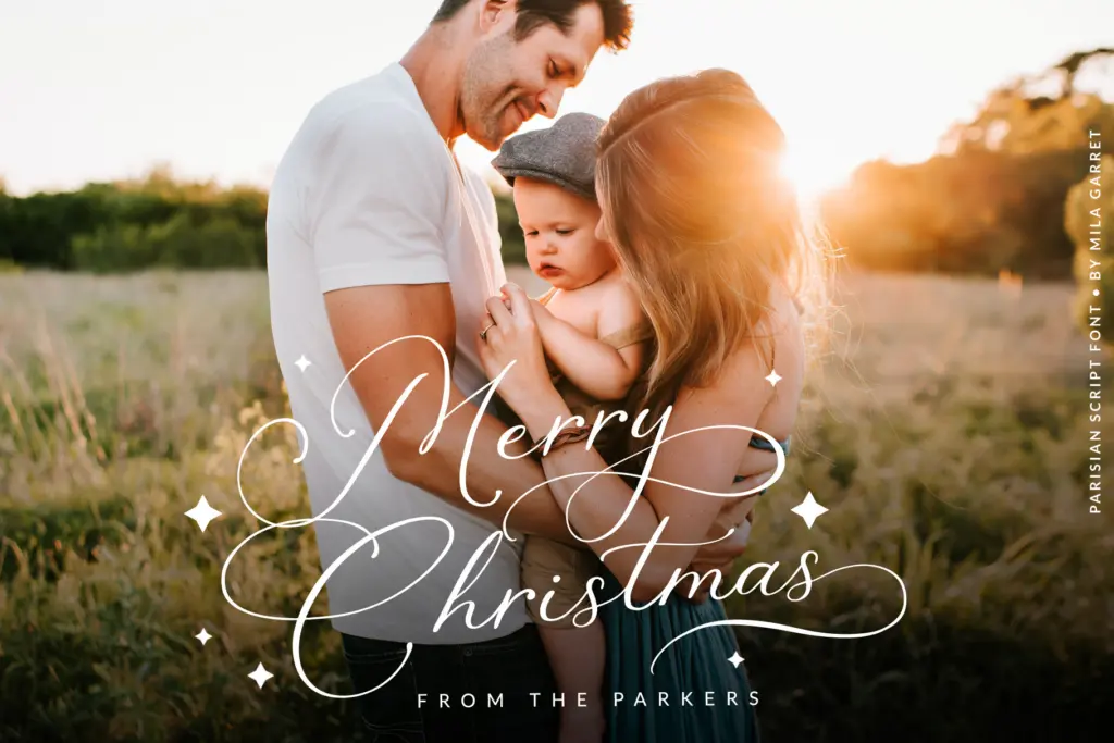
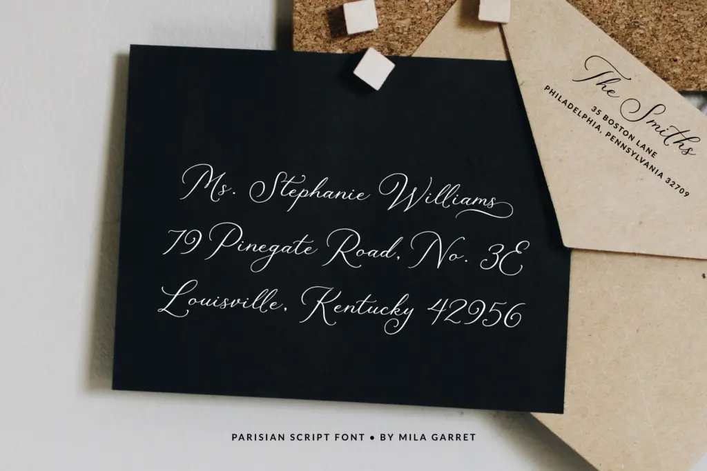
This is a font built for short, prominent settings rather than paragraphs: a couple’s names on a wedding suite, a logotype, a greeting card cover line, a website hero headline. The swash sets earn their keep here — a swashed capital on a monogram or an ending flourish on a signature word can do a lot visually without needing much text at all.
It’s less suited to anything that needs to be read quickly or at small size — dense invitation copy, body paragraphs, or UI text will all suffer under the joined strokes and swash weight. Held to single words, short phrases, and names, though, it does the job it’s designed for cleanly enough, and the PUA encoding removes a common friction point for less technical users trying to access the extra characters.
What we liked, and what we didn’t
Strengths
- PUA encoding means the swash alternates are reachable without OpenType-aware software
- Separate beginning-capital and ending-lowercase swash sets allow restrained, targeted flourish
- Multilingual accented character support extends its use beyond English-only projects
Trade-offs
- The base letterforms don't distinguish themselves much from other vintage calligraphy scripts on the market
- Heavy swash capitals can overwhelm a design if used beyond a single word or name
A solidly built vintage script that does what its category promises without pushing past it. The swash sets and PUA encoding are genuinely useful conveniences, but the letterforms themselves stay close to genre convention rather than offering something distinct.

Tmfonts writes independent reviews of typefaces: what each font does well, where it falls short, what it suits, and where it is sold.