
Volda Sans Font Free Download
Is Volda Sans free to download?
Volda Sans is a commercial font sold on Creative Market, so the full version needs a paid license. Get it from the official listing: Volda Sans font download.
Need something free? These sans serif fonts from Google Fonts are free for personal and commercial use:
Design style
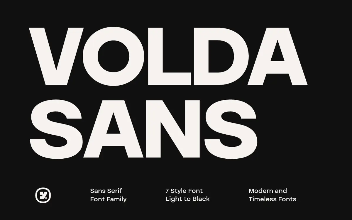
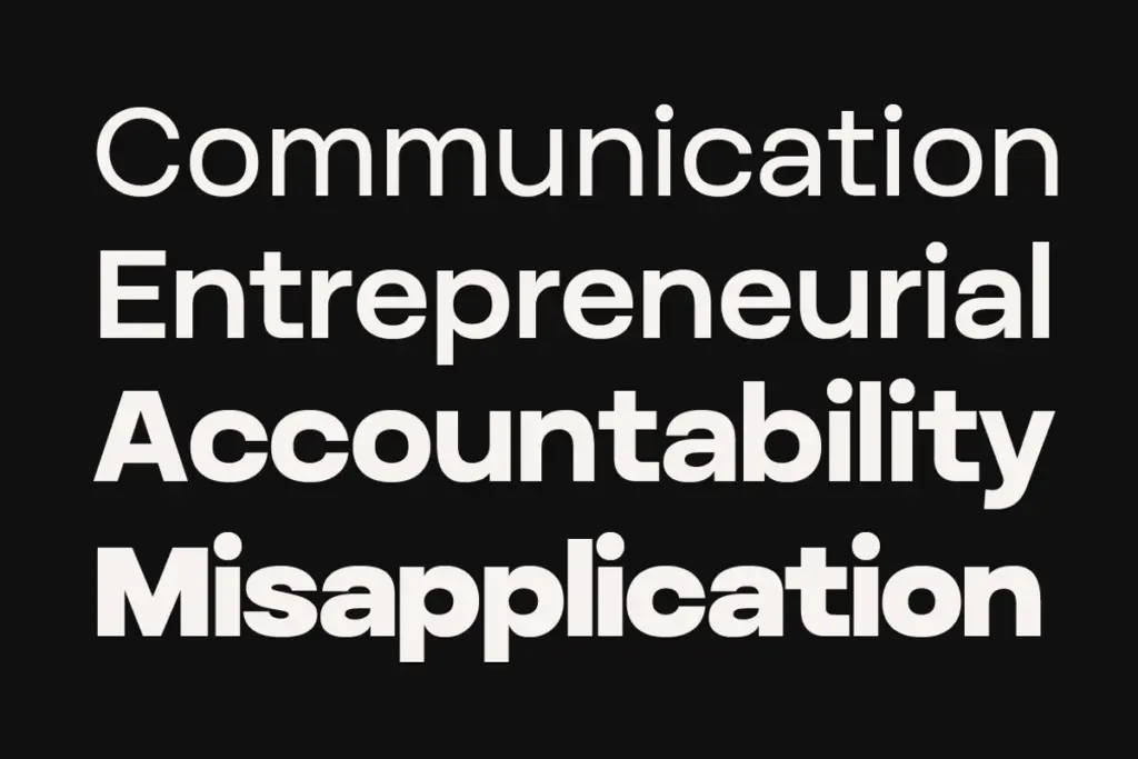
Volda Sans sits in the well-worn but reliable territory of grotesque-influenced sans serifs built for corporate and editorial systems rather than personality-driven display work. The letterforms are even in weight distribution, with apertures that stay open enough to keep the lighter weights from closing up at small sizes. There’s nothing eccentric here — no quirky terminals, no geometric flourishes — and that restraint is the point. It reads as a font built to disappear into a layout rather than announce itself.
The proportions lean slightly condensed compared to some contemporary sans families, which gives it a tighter, more efficient set width useful in columns and captions. Curves are kept simple, joins are clean, and the overall impression is of a typeface drawn for consistency across a large weight range rather than for a single dramatic gesture at one size.
Character set and features
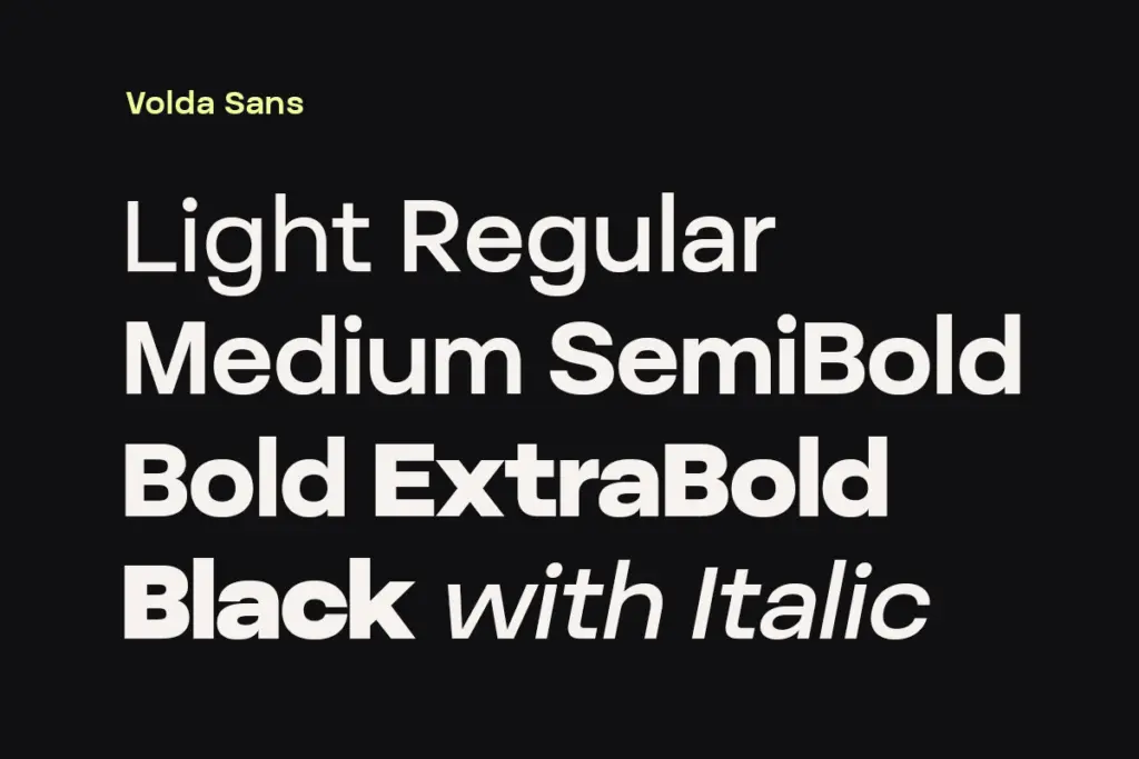
Seven weights from Light to Black, each with a matching italic, gives fourteen styles total — enough range to build a full type system without reaching for a second family. The italics are true companions rather than simple obliques judging by the consistent stroke logic across the range, which matters if you’re setting body copy that needs emphasis without a jarring shift in texture.
The weight progression is where this family earns its keep. Light and Thin-adjacent weights hold their shape at small sizes instead of thinning into hairlines, while the Black end stays legible rather than clogging at the joins — a common failure point in sans families that stretch across this many weights. That said, without seeing the full glyph set or opentype feature list confirmed, treat any claims about extended language support or stylistic alternates as unverified until you check the files yourself.

Use cases
This is a system font in the best sense: pick it for a project where you need one family to carry a logotype, a set of headlines, body text, and captions, and want them all to feel like they belong together. Branding work benefits from the range — Light or Regular for a wordmark, Black for a poster or packaging headline, using the same underlying letterforms throughout.
Editorial layouts are a natural fit too, particularly magazine or report-style grids where you need a working hierarchy of weights without switching typefaces. Packaging and presentation decks are reasonable uses as well, though the middle weights are more useful there than the extremes.
Where it’s less convincing is anywhere you need a strong point of view — a fashion brand chasing a distinct voice, or a display headline meant to be memorable rather than merely readable. Volda Sans doesn’t do memorable; it does dependable. That’s a fair trade for a lot of commercial work, just not all of it.
What we liked, and what we didn’t
Strengths
- Seven weights with matching italics cover the full range from minimal to bold without needing a second family
- Light weights stay readable at small sizes instead of thinning into hairlines
- Tighter set width suits column-heavy editorial and caption use
Trade-offs
- Letterforms are restrained to the point of being generic — little personality for display or brand-defining work
- Claims around language support and opentype features aren't confirmed and should be checked before relying on them
Volda Sans is a competent, well-built workhorse sans with a genuinely useful weight range, but it doesn't have a strong visual signature of its own. Good choice for a brand or publication that needs one dependable family to do many jobs; not the one to reach for if you need a headline that stands out on its own.

Tmfonts writes independent reviews of typefaces: what each font does well, where it falls short, what it suits, and where it is sold.