
Dreams on Paper Handwritten Pencil Font Free Download
Is Dreams on Paper Handwritten Pencil free to download?
Dreams on Paper Handwritten Pencil is a commercial font sold on Creative Market, so the full version needs a paid license. Get it from the official listing: Dreams on Paper Handwritten Pencil font download.
Need something free? These handwritten fonts from Google Fonts are free for personal and commercial use:
Design style
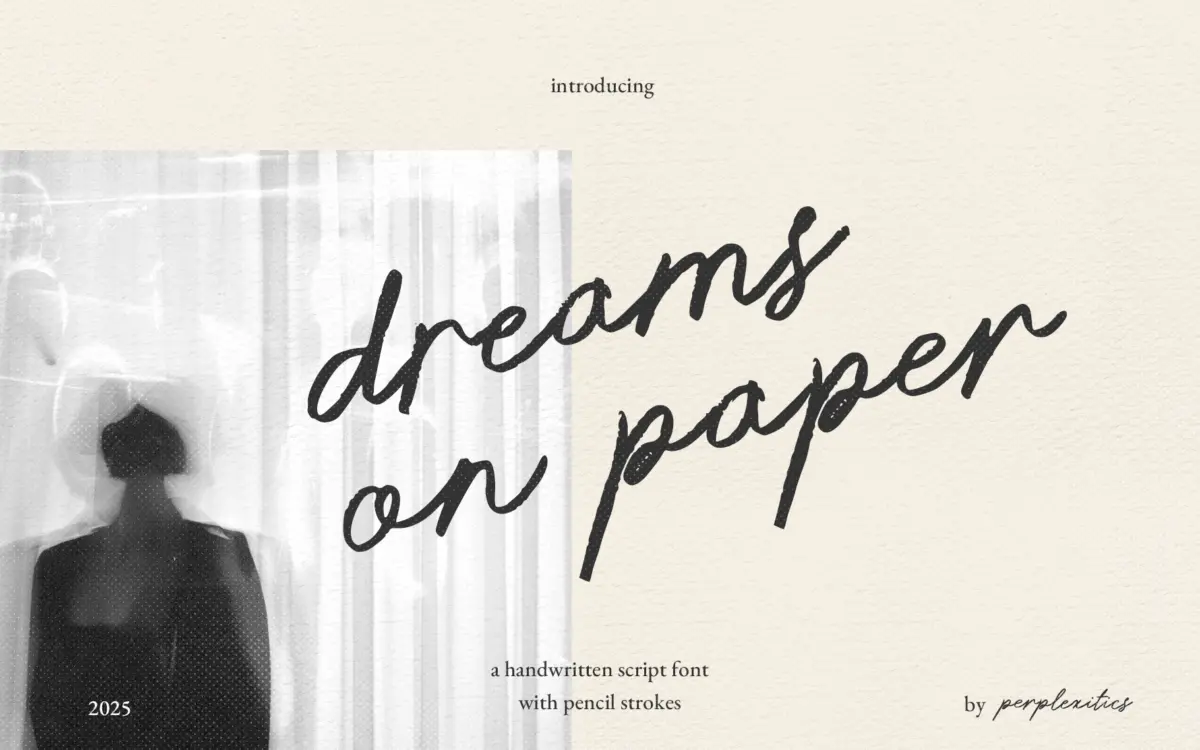
Dreams on Paper is a single-weight handwritten script built to look like it came off the end of a graphite pencil rather than a brush or a marker pen. The strokes carry a granular, slightly broken edge rather than the smooth, wet line you get from most script fonts. Letters lean forward gently and connect in a semi-cursive way, mimicking the pace of someone actually writing a note rather than performing calligraphy for an audience.
The texture is the whole point here. Instead of a flat vector stroke, the letterforms have that faint unevenness of pencil pressure — thinner at the start of a stroke, slightly denser where the hand slows down. It reads as sketchbook rather than studio, and it avoids the over-polished gloss that a lot of “handwritten” fonts fall into once you actually type with them. The trade-off is that this texture can start to look a little repetitive across long passages, since the same grain pattern recurs letter after letter rather than varying the way a real hand would.
Character set and features
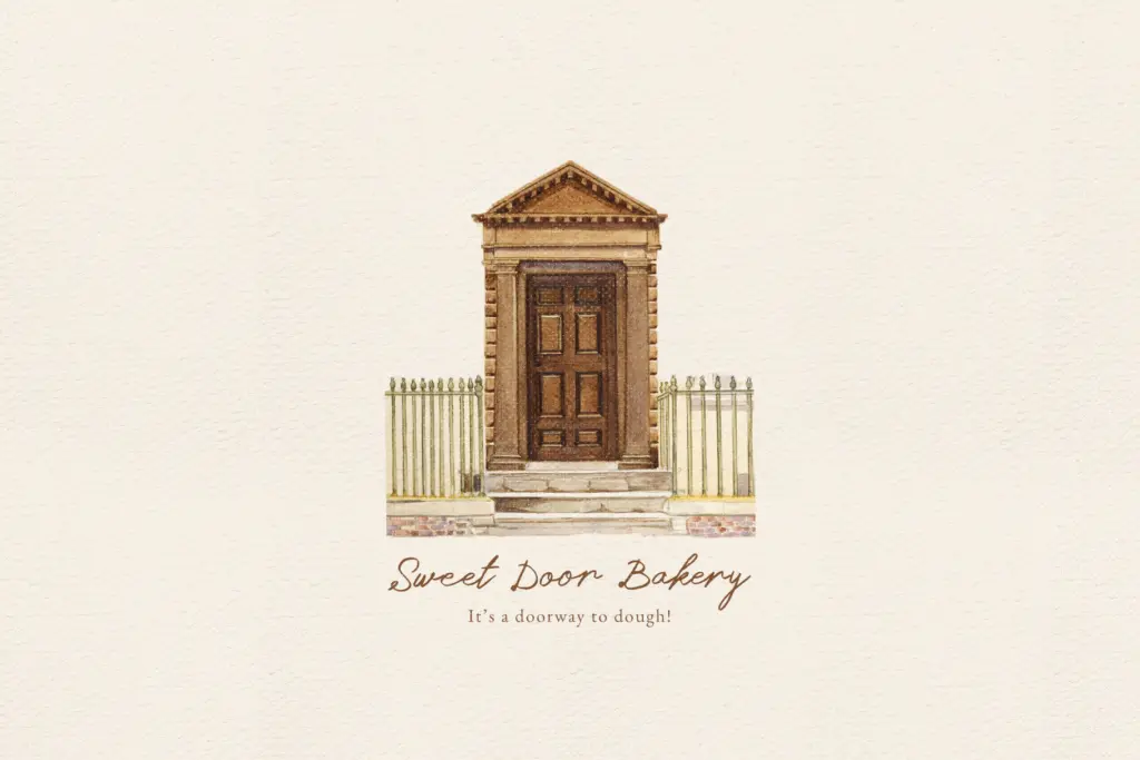
The set covers uppercase and lowercase, numerals, and standard punctuation, along with a broad range of accented characters for European languages — the kind of Central and Eastern European diacritics that make a font usable well outside an English-only market. That’s a genuinely useful inclusion for a script this specialised, since accented forms are often the first thing skipped in handwritten fonts.
There’s no mention of alternate glyphs, ligature sets, or swash variants, so this isn’t a font built around OpenType flourish — what you see in the default character map is what you get. That keeps things simple to use, but it also means there’s less room to break up repetition in longer lines; without alternates, recurring letters like double consonants will look identical rather than naturally varied, which slightly undercuts the handmade illusion at word level.
Use cases
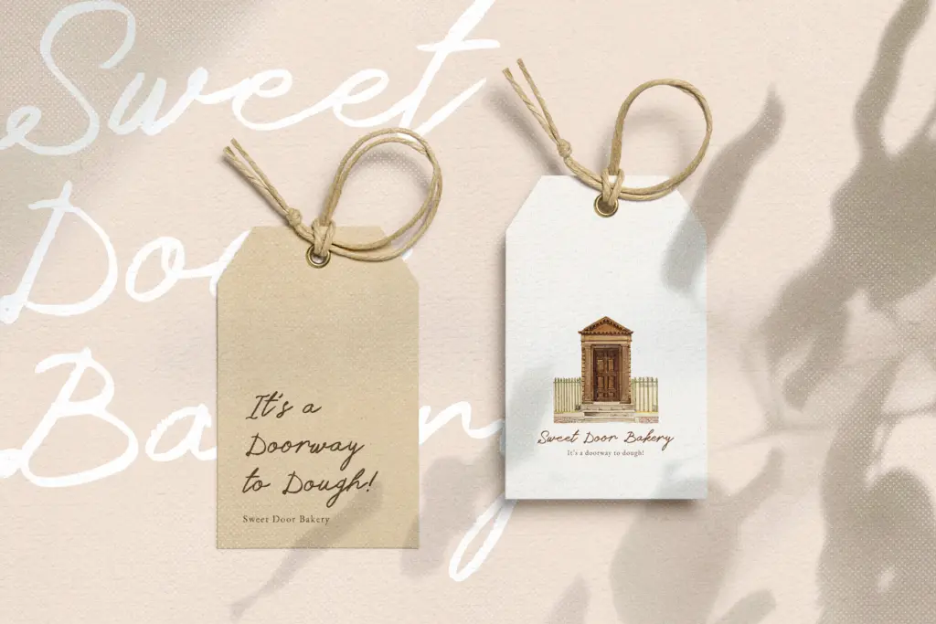
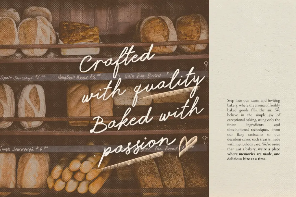
This font sits comfortably in short-form, high-warmth contexts: a wedding invitation line, a handwritten-style quote overlay for social media, a signature-style logotype, a greeting card message, or a sketch-adjacent brand mark that wants to feel personal rather than corporate. It works best set fairly large, where the pencil texture reads clearly rather than turning into visual noise — at small sizes the grain can muddy legibility, especially in print where texture and paper stock interact.
It’s not a font for body copy or dense paragraphs; the texture and forward lean tire the eye over more than a line or two, and the lack of alternates means a whole paragraph in this face will start to look mechanically repetitive rather than organic. Treat it as an accent voice — a headline, a quote, a handwritten note inside a larger, more neutral layout — rather than the main typographic voice of a project.
What we liked, and what we didn’t
Strengths
- Convincing granular pencil texture instead of a flat vector script line
- Broad accented character support for European languages
- Forward-leaning semi-cursive rhythm reads as genuinely handwritten, not stylised
Trade-offs
- No alternate glyphs, so repeated letters look identical across longer text
- Texture and legibility both degrade at small sizes or on lower-quality print stock
Dreams on Paper delivers a convincing pencil-sketch texture that suits short, warm-toned design moments like invitations and social quotes. It lacks alternates and stumbles at small sizes or in long text, so it works best as an accent voice rather than a workhorse.

Tmfonts writes independent reviews of typefaces: what each font does well, where it falls short, what it suits, and where it is sold.