
Highway Motel Retro Vibe Sans Script Font Free Download
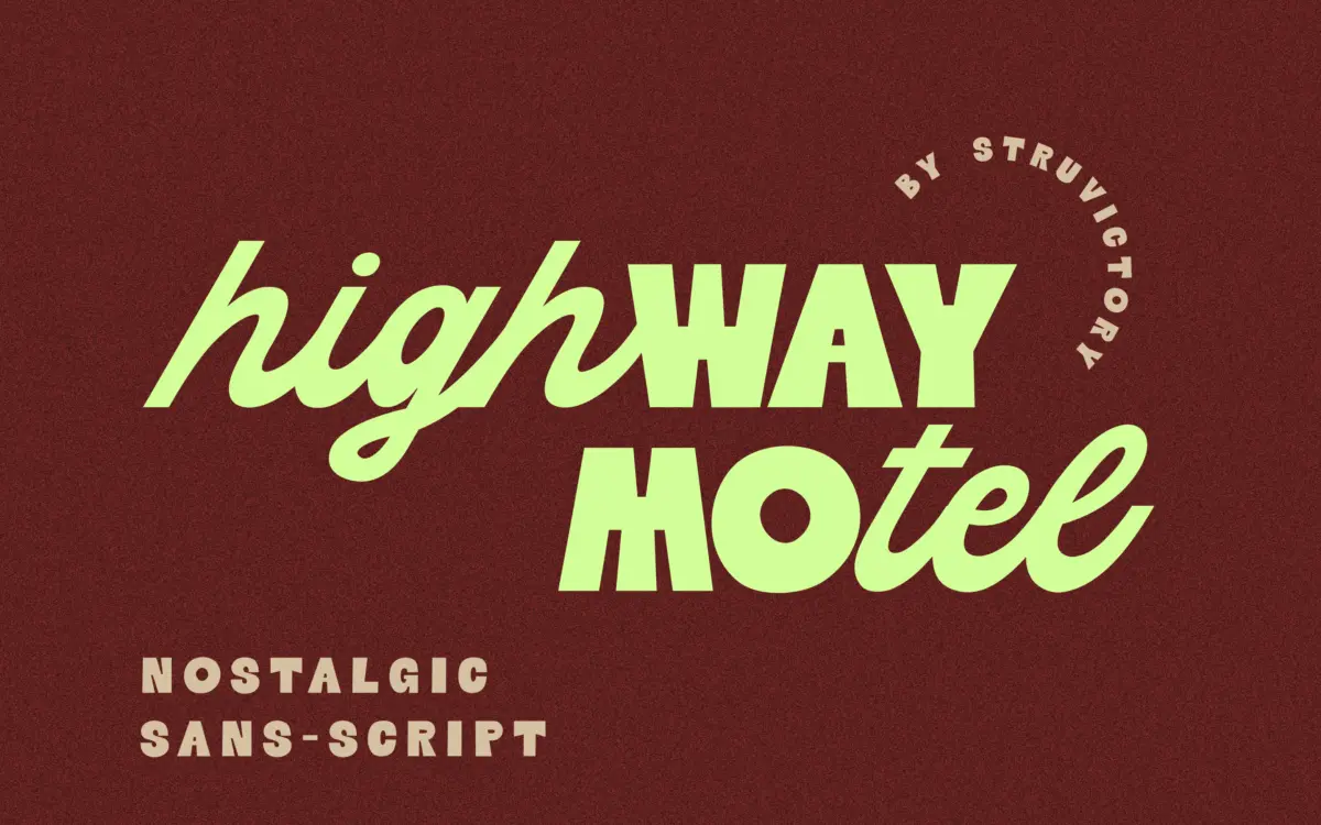
Is Highway Motel Retro Vibe Sans Script free to download?
Highway Motel Retro Vibe Sans Script is a commercial font sold on Creative Market, so the full version needs a paid license. Get it from the official listing: Highway Motel Retro Vibe Sans Script font download.
Need something free? These script fonts from Google Fonts are free for personal and commercial use:
Design style
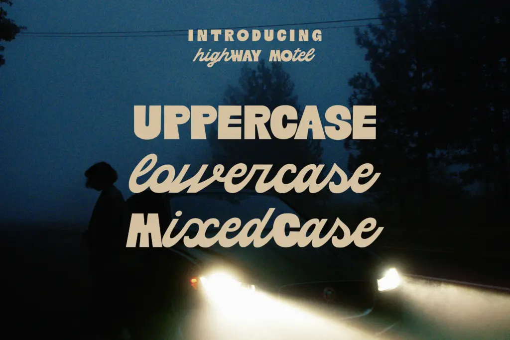
Highway Motel is built on a split personality rather than a single letterform logic. The uppercase is a chunky geometric sans, rounded at the corners and drawn with the kind of confidence you see on old motel signage — thick strokes, low contrast, and a slightly retro squash to the counters. The lowercase abandons that structure entirely and runs as a connected script, looping and joining with real momentum. Put a capital next to a lowercase letter and you get two different eras of lettering shaking hands: one static and blocky, one loose and cursive.
This is the whole premise of the font, and it works as a novelty effect rather than a refined system. There’s no attempt to reconcile the stroke weights or the rhythm between the two cases — the contrast is the point. It reads as a designed collision, not an accident, but it’s a font that announces its gimmick on first glance rather than revealing craft over time.
Character set and features
The set covers the standard Latin range with support extended to common Western European languages, so accented characters are present without needing a workaround. There’s no mention of contextual alternates or swash sets in the material, and the script lowercase joins in a fixed way rather than shifting per letter combination, so don’t expect the kind of variable connection you’d get from a script built with OpenType ligature logic. What you’re getting is a fixed dual-case font: one geometric sans skeleton, one script skeleton, sharing a baseline.
Spacing between the two cases needs watching. Because the script lowercase has built-in motion and the caps are static blocks, setting a full sentence in mixed case can start to look busy fast — this is a font that wants short bursts of text, not paragraphs. Kerning pairs will matter more here than in a conventional script, since the visual weight swings wildly letter to letter.
Use cases
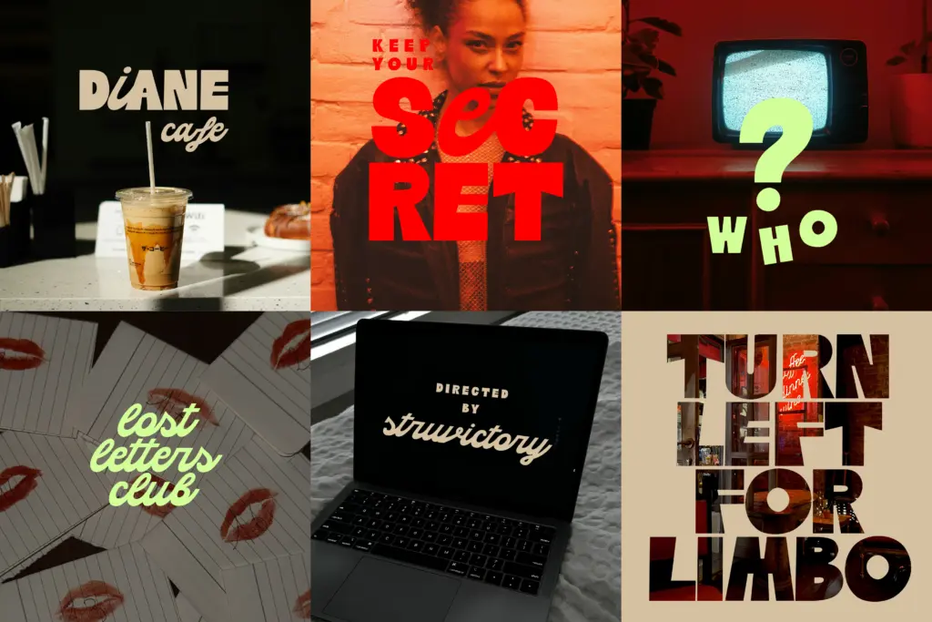
This is a logotype and headline font first. A short brand name — three to eight letters — where the cap/lowercase switch reads as a wordmark quirk rather than a legibility problem, is where it earns its keep. Diner and motel branding, road-trip or Americana-themed packaging, poster headlines for a film night or a true-crime podcast cover, Instagram graphics that need one punchy line of text — all reasonable fits given the retro-cinematic tone it’s going for.
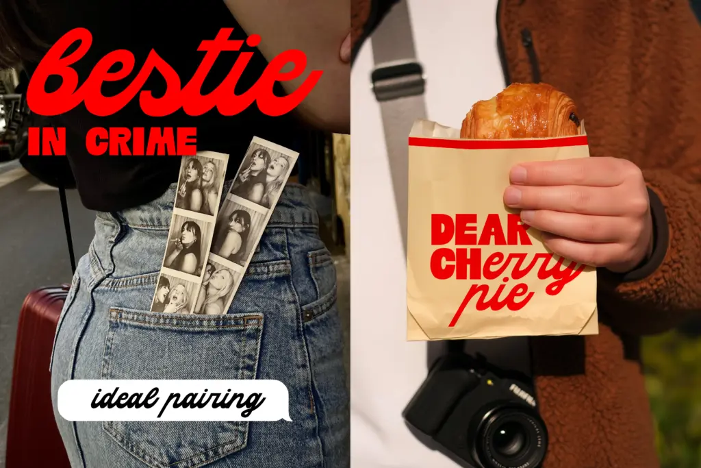
It’s not a font for body copy, captions, or anything that needs to be read at length; the mixed construction fights against sustained reading. It also won’t sit quietly as a secondary or supporting typeface — it wants to be the loudest thing on the page, which means pairing it with a plain, restrained sans or serif elsewhere in the layout so the collision doesn’t get muddled by other decorative choices nearby.
What we liked, and what we didn’t
Strengths
- The geometric caps have real retro character on their own, independent of the script pairing.
- Effective for short wordmarks where the cap/lowercase contrast reads as intentional styling.
- Latin language support means accented text isn't an afterthought.
Trade-offs
- Mixed-case sentences get visually noisy fast, limiting it to very short text.
- The fixed script joins offer no contextual variation, so long words can look mechanical.
Highway Motel is a one-trick font, but the trick is drawn with conviction. It belongs on short branding lines and posters, not in running text, and its dual-case gimmick will wear thin if overused across a project.

Tmfonts writes independent reviews of typefaces: what each font does well, where it falls short, what it suits, and where it is sold.