
Cocogoose Classic Font Free Download
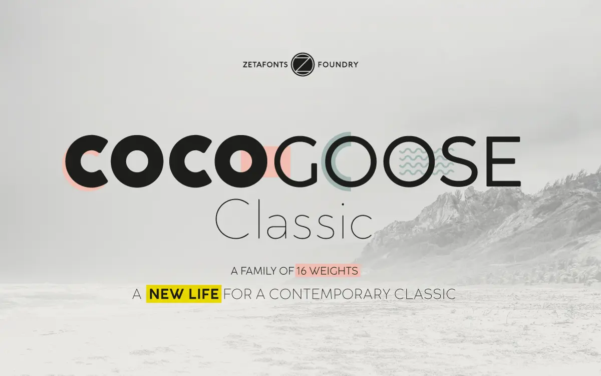
Is Cocogoose Classic free to download?
Cocogoose Classic is a commercial font sold on Creative Market, so the full version needs a paid license. Get it from the official listing: Cocogoose Classic font download.
Need something free? These sans serif fonts from Google Fonts are free for personal and commercial use:
Design style
Cocogoose Classic is a geometric sans that keeps the bones of the original Cocogoose — geometric proportions, low contrast, corners softened just enough to avoid feeling clinical — while quietly redrawing the lowercase. The original had an extreme x-height that made it read as almost all-caps at a glance. Classic pulls that back, giving the lowercase its own smaller x-height and round dots rather than square ones, so the family feels less like a slab of uniform weight and more like a proper text-capable design, even though its instincts are still display-first.
Where the original Cocogoose was a blunt instrument — one or two weights doing a loud job well — Classic is the version built for range. Eight weights plus matching italics means you can move from a light, almost delicate headline down to something dense enough to read as branding lockup without switching families. The geometric skeleton stays consistent across that range, which is the harder trick: many geometric sans families lose their circles and get mushy at the extremes, and this one mostly holds its shape.
Character set and features
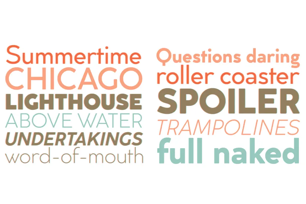
The glyph count here — over a thousand characters across the family — points to a font built by people who expected it to be used hard, not just admired in a specimen. Positional numerals, alternate letterforms, and extended ligatures give it more flexibility in the details than most geometric sans faces bother with, particularly ones aimed at logotype work where a single ligature can make or break a wordmark. Cyrillic and Greek support broadens the family well past a Latin-only display face, which matters if your brand work needs to travel.
The uppercase is unchanged from the original Cocogoose, and it’s the stronger half of the design — confident, evenly weighted, happy at large sizes. The redrawn lowercase is more workmanlike: legible, tidy, but it doesn’t have quite the same personality as the caps. That’s not necessarily a flaw, since a display face doesn’t need every part shouting, but it does mean the lowercase alternates and italics feel more like supporting cast than lead.
Use cases
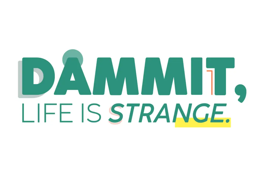
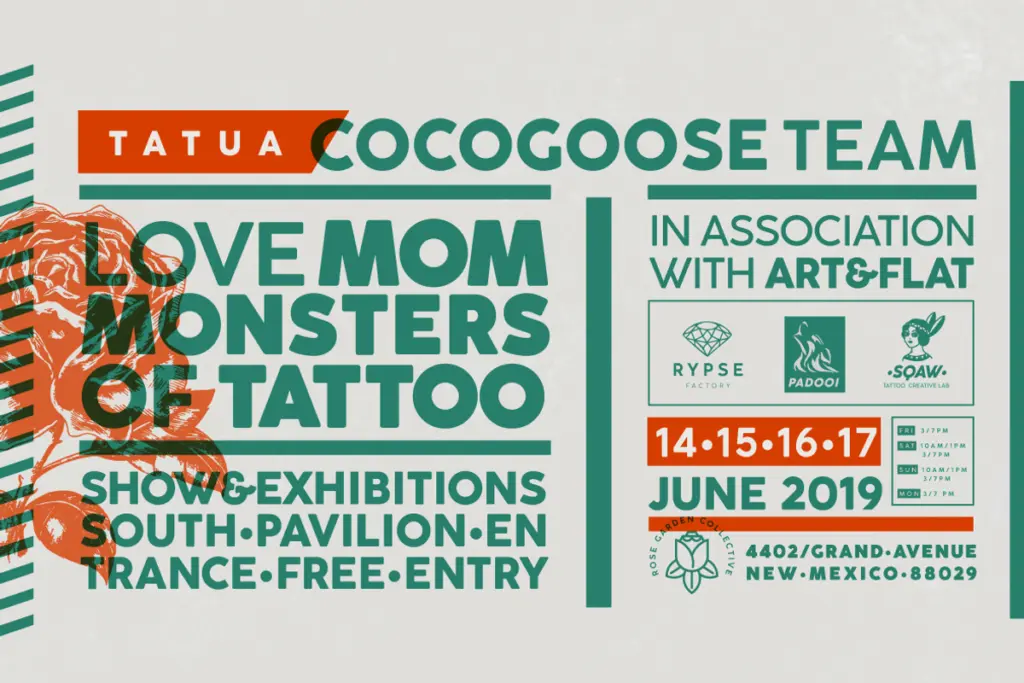
This is a logo and headline typeface first. The geometric regularity and low contrast make it read cleanly at large scale — posters, packaging fronts, editorial mastheads, app icons — and the weight range means a single family can carry a full brand system from a light tagline to a heavy logotype without reaching for a second typeface. The Cyrillic and Greek coverage makes it a genuine option for international branding work rather than a Latin-only novelty.
It’s less suited to long-form body text. Even with the lowercase pulled back, the geometric letterforms and tight apertures start to feel monotonous in paragraphs of running copy, and the italics, while functional, don’t have the calligraphic warmth that makes some italics genuinely useful for emphasis in text. Treat it as a display and identity workhorse, and pair it with something quieter for the reading copy.
What we liked, and what we didn’t
Strengths
- Eight weights with matching italics give real range for brand systems without switching families
- Uppercase retains the confident geometric shape that made the original Cocogoose popular for logotypes
- Cyrillic and Greek support plus extended OpenType features make it viable for multilingual identity work
Trade-offs
- Lowercase, while improved, lacks the personality of the uppercase and reads as more utilitarian
- Not built for long-form text — paragraphs of the geometric letterforms grow monotonous quickly
Cocogoose Classic takes a loud, single-purpose display face and gives it the range to do actual brand work — eight weights, matching italics, and a lowercase that finally behaves. It's still not a text typeface, and the italics feel secondary to the caps, but as a logo and headline tool it's well built and unusually complete.

Tmfonts writes independent reviews of typefaces: what each font does well, where it falls short, what it suits, and where it is sold.