
Special Moment Font Free Download
Is Special Moment free to download?
Special Moment is a commercial font sold on Creative Market, so the full version needs a paid license. Get it from the official listing: Special Moment font download.
Need something free? These handwritten fonts from Google Fonts are free for personal and commercial use:
Design style
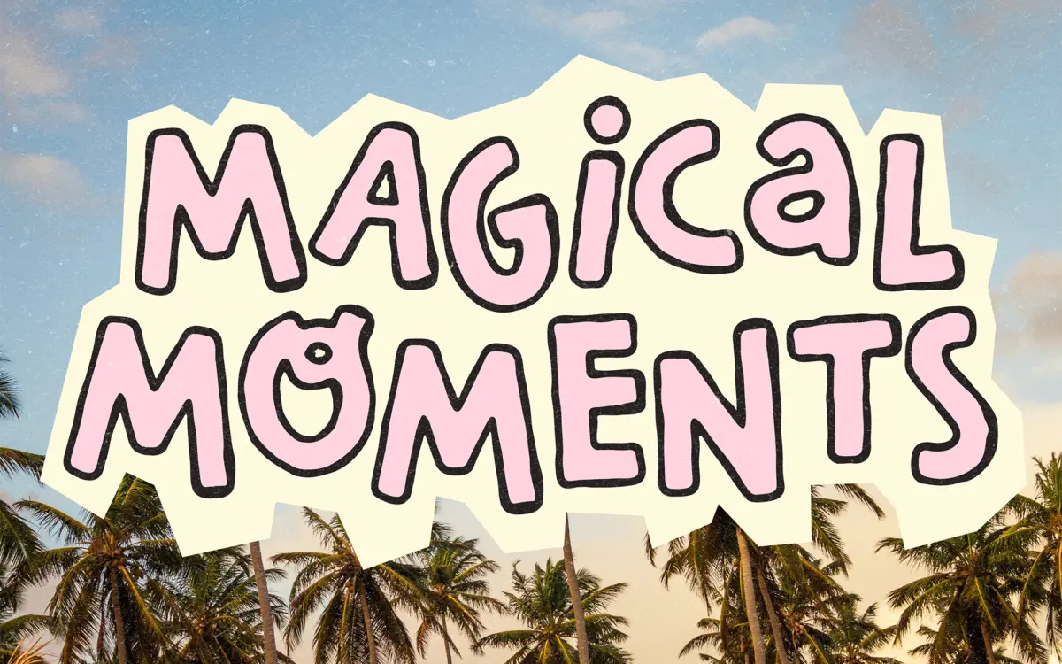
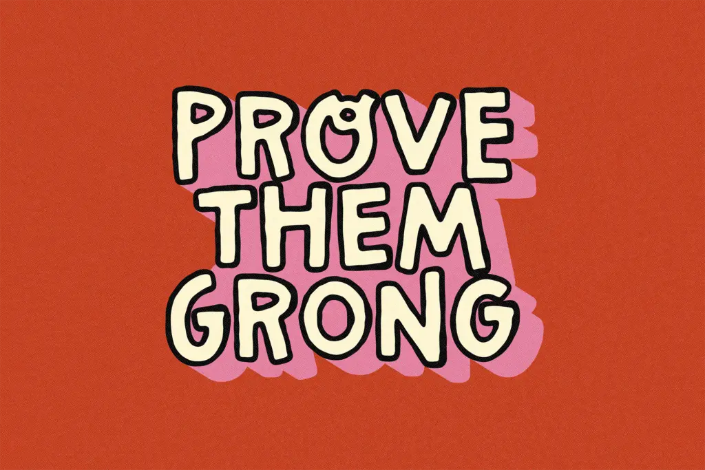
Special Moment is a loose, marker-style hand-lettered font built for the kind of quick, personal graphics that fill up a phone screen. The strokes wobble slightly, the baselines drift, and the letters look like they were written fast with a fat felt-tip rather than ruled out with a nib. That informality is the entire point. There’s no attempt at calligraphic polish here — no tapered thicks and thins, no formal joining logic. It reads as friendly scribble, and it commits to that register from the first glyph to the last.
The family comes in three cuts: a regular weight, a bold, and a fill version, which suggests the outline/fill pairing is meant to be layered for a sticker or patch effect — one shape sitting behind the other in a contrasting colour. That’s a sensible way to add depth to what is otherwise a flat, single-stroke letterform, and it’s the most useful design decision in the set. Mixing uppercase and lowercase within a single word is encouraged by the brief, and the letters are drawn loosely enough that this doesn’t look like an error so much as part of the style — though it does mean the font resists any attempt at looking tidy or considered.
Character set and features
Accented characters and most symbols are covered, which matters for a font aimed at social content where captions often need more than basic Latin. Five punctuation marks have been swapped for decorative glyphs — hearts, stars, a shine mark — accessed through period-centred, curly brackets, the bar and the logical-not character. It’s a small, workable system, but it means anyone using it needs to remember which keystroke does what rather than relying on standard punctuation behaving as punctuation. That’s a minor friction, but a real one if you’re handing the font to someone else on a team.
There’s no mention of an extended OpenType feature set — no alternates, no ligatures — so what you see in the three files is what you get. That keeps things simple, but it also means the

What we liked, and what we didn’t
Strengths
- Outline and fill versions let you layer the letters for a sticker or patch effect without extra software work
- Accented characters and most symbols are covered, which helps for social captions beyond plain English
- The loose, uneven strokes commit fully to a casual hand-drawn look rather than half-heartedly imitating handwriting
Trade-offs
- The irregular baseline and heavy texture make it tiring to read at anything smaller than display size
- Five punctuation keys are remapped to decorative symbols, which anyone else using the font will need to be told about
Special Moment is a competent, cheerful hand-drawn display font built for social graphics, thumbnails and stickers rather than anything that needs to be read carefully. The outline/fill pairing is a genuine plus, but the swapped-in symbol punctuation and single-register personality limit it to casual, short-text jobs.

Tmfonts writes independent reviews of typefaces: what each font does well, where it falls short, what it suits, and where it is sold.