
Black Mango Font Free Download
Is Black Mango free to download?
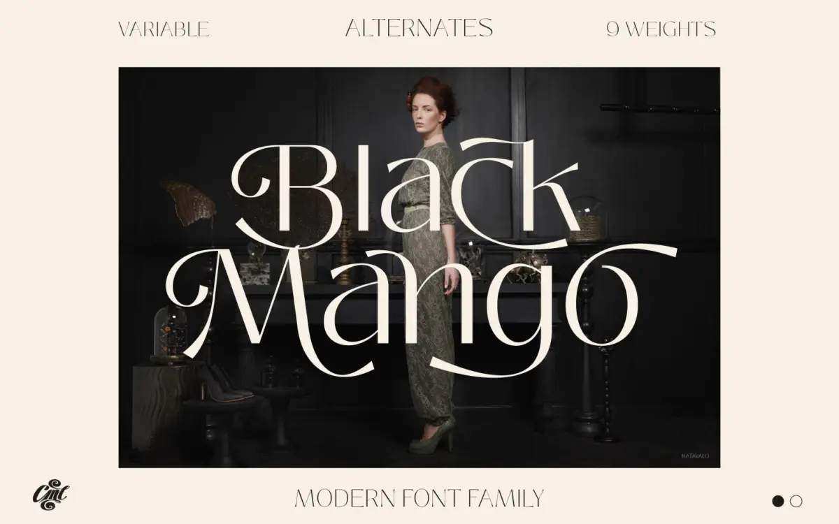
Black Mango is a commercial font sold on Creative Market, so the full version needs a paid license. Get it from the official listing: Black Mango font download.
Need something free? These sans serif fonts from Google Fonts are free for personal and commercial use:
Design style
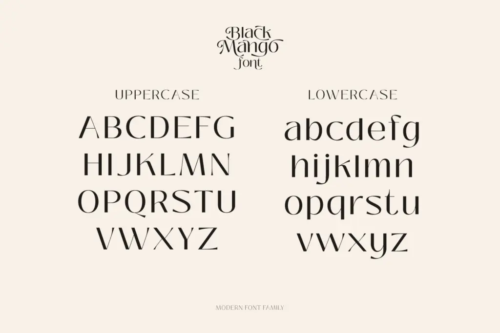
Black Mango sits in the current wave of pared-back grotesque-adjacent sans faces: low contrast, closed apertures kept just open enough to read at small sizes, and a general refusal to draw attention to any single letter. Nothing about it shouts. The x-height is generous but not exaggerated, and the overall rhythm favours even, quiet text over dramatic display moments. Where it earns its “modern” tag is in the finishing — terminals are cut cleanly rather than rounded off, and there’s a slight geometric squareness to bowls that keeps it from reading as generic humanist sans.
The name suggests something with more attitude than the letterforms actually deliver. This isn’t a quirky or characterful face; it’s a workhorse dressed in a fashionable label. That’s not a criticism so much as a description of the market it’s aiming at — brand identity work and web interfaces where restraint is the point.
Character set and features
Nine weights is the headline spec, and it’s a genuinely useful range if the brief calls for a full editorial or brand system rather than a single logotype. The variable format means those weights can be interpolated rather than treated as fixed stops, which is handy for responsive web type where a designer wants fine control over optical size and emphasis without loading nine static files.
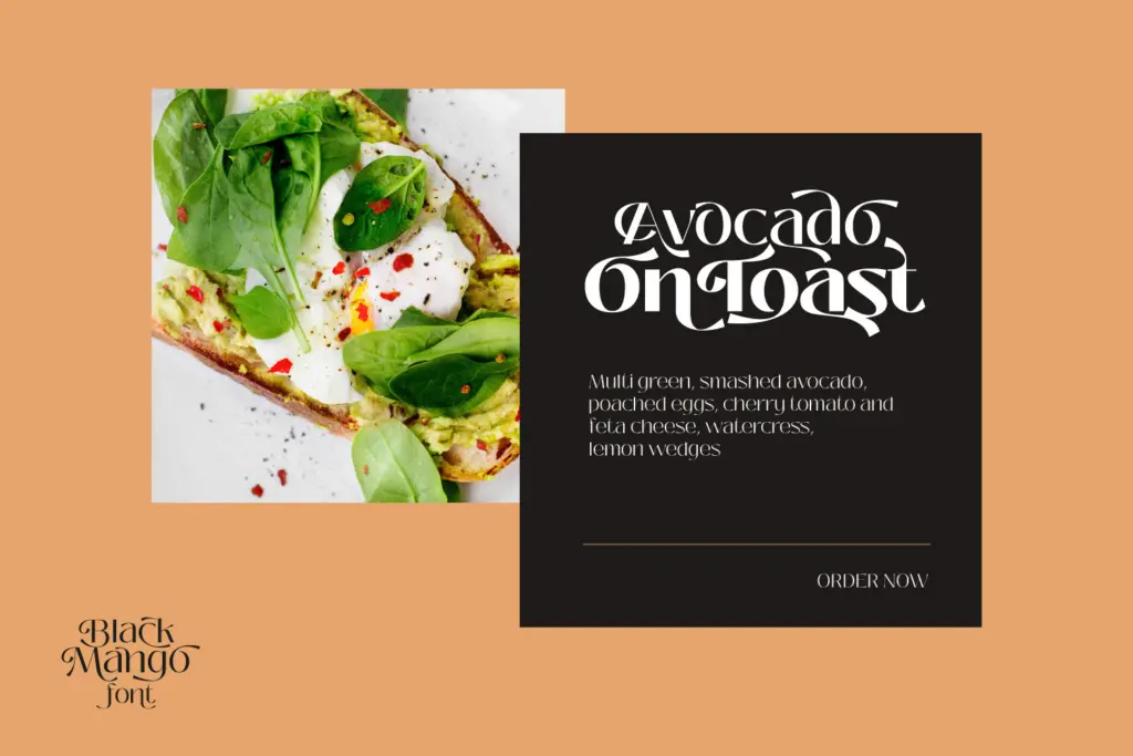
Alternate characters are included, described as numbering in the dozens, though the brief doesn’t specify which letters carry them or how far they push the design away from the default forms. Worth checking swatches before assuming they’ll transform the face’s personality — in most families of this type, alternates tend to be subtle swaps rather than a second typeface hiding inside the first. Multilingual support, numerals, and currency symbols round out the set, which matters more than it sounds for anything destined for a live website or an international brand rollout rather than a one-off poster.
Use cases
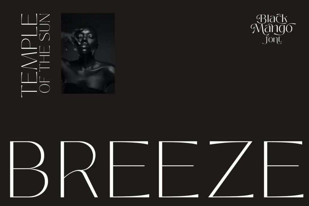
Branding and web design are where this family should live. The weight range gives a design system room to breathe — a light weight for body copy, a heavy one for a wordmark, and enough steps between them to build a proper hierarchy without reaching for a second typeface. That’s genuinely valuable for studios that want one family to do most of the talking across a brand.
It’s less suited to work that needs a distinct voice at large display sizes — a masthead, a fashion headline, a poster where the type itself is the image. The letterforms are too well-behaved for that; they’ll sit fine but won’t do any of the heavy lifting. For logo design, it works best as a foundation to be customised rather than used straight, since the default forms are close enough to other contemporary sans faces that a wordmark built from it alone risks looking interchangeable. Pair it with strong colour, spacing, or layout decisions and it holds up well. Left to carry a design on its own, it reads competent rather than memorable.
What we liked, and what we didn’t
Strengths
- Nine weights plus variable interpolation give real control over a brand's type hierarchy.
- Clean, closed apertures keep it legible at small sizes and in interface contexts.
- Multilingual and currency support make it practical for live, international web projects.
Trade-offs
- The default letterforms are close enough to other contemporary sans faces that a wordmark needs extra styling to stand apart.
- Alternates are undocumented in scope, so their actual impact on the design's character is unclear without testing.
Black Mango is a competent, well-specified workhorse sans rather than a face with strong personality of its own. The nine-weight variable range makes it genuinely useful for brand and web systems that need consistent hierarchy, but it won't carry a display headline or a standalone logo on charm alone.

Tmfonts writes independent reviews of typefaces: what each font does well, where it falls short, what it suits, and where it is sold.