
Kentwell Font Free Download
Is Kentwell free to download?
Kentwell is a commercial font sold on Creative Market, so the full version needs a paid license. Get it from the official listing: Kentwell font download.
Need something free? These script fonts from Google Fonts are free for personal and commercial use:
Design style
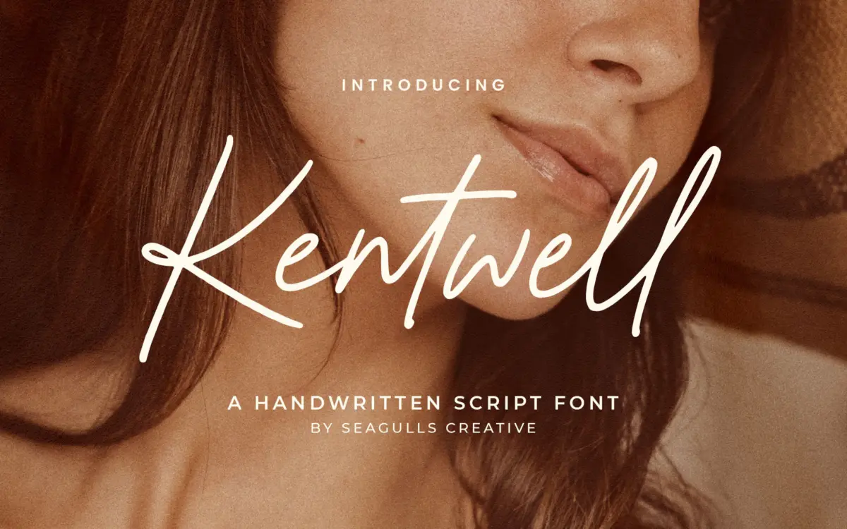
Kentwell sits in the crowded field of casual handwritten scripts built to look like a quick pen note rather than formal calligraphy. The strokes are monoline or close to it, with a slight tremor in the curves that reads as human rather than plotted. Letters lean gently to the right and connect in the way real cursive does when someone is writing at a normal clip, not performing penmanship. There’s no showy contrast between thick and thin strokes, no elaborate swashes forcing themselves into every cap. That restraint is the point: it’s a script meant to sit quietly on a label rather than shout on a poster.
Where it distinguishes itself from the dozens of similar marketplace scripts is in the consistency of its baseline rhythm. Ascenders and descenders don’t loop excessively, which keeps the x-height area calm and stops lines of text from turning into a tangle. It reads as confident but unfussy — closer to a good handwriting sample than to a lettering artist’s flourish piece.

Character set and features
The set covers uppercase and lowercase letters, numerals, punctuation, and a run of ligatures intended to smooth over awkward letter combinations that scripts are prone to — double letters, certain ascender-descender collisions, that sort of thing. Ligatures in a font like this matter more than they might in a sans: without them, a handwritten script can look mechanically repeated the moment the same letter pair shows up twice in a headline, and Kentwell’s substitutions do a reasonable job of hiding that.
Multilingual support is included, which extends its usefulness beyond English-only projects, though as with most script fonts, accented characters are worth checking individually before committing to a layout — connecting scripts often handle diacritics less gracefully than they handle bare letters. The font is delivered as an OTF, works across the usual Adobe apps and Word, and installs like any standard desktop font, so there’s nothing unusual to navigate technically.
Use cases
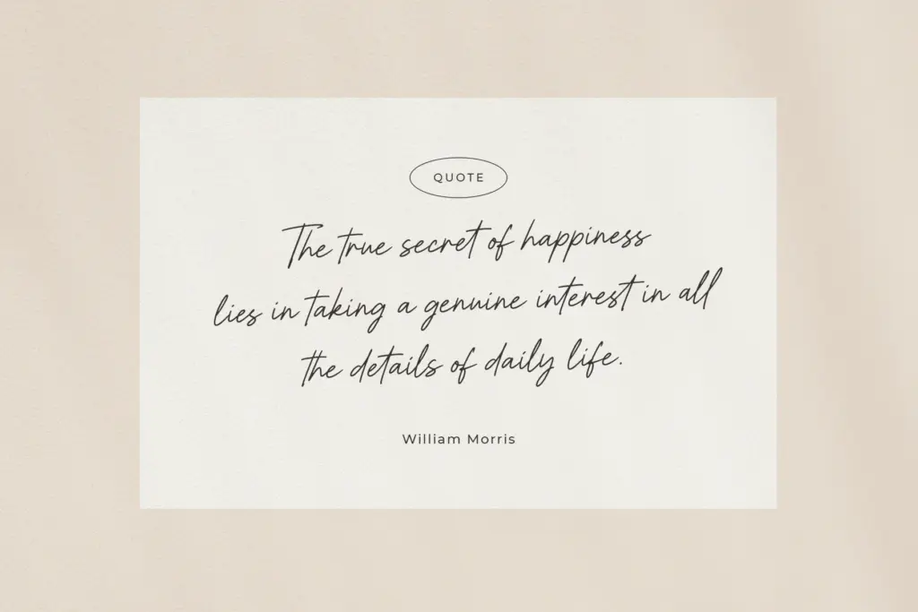
Kentwell earns its keep on the smaller, quieter jobs: a signature-style logotype, a

What we liked, and what we didn’t
Strengths
- Ligatures smooth over repeated-letter awkwardness common in connecting scripts
- Calm, low-contrast strokes keep it legible at small sizes like labels and packaging
- Multilingual support widens its use beyond English-only projects
Trade-offs
- Single style with no weight variation limits it as a full font family
- Loses clarity and charm at large display sizes or in extended text
Kentwell is a competent, unfussy handwritten script that does small jobs well — signatures, labels, short wedding-stationery lines — without trying to be a display showpiece. It won't stand out in a portfolio of scripts, but it won't embarrass you either. Best used sparingly, paired with a plain typeface for anything longer than a phrase.

Tmfonts writes independent reviews of typefaces: what each font does well, where it falls short, what it suits, and where it is sold.