
Evergreen Font Free Download
Is Evergreen Font free to download?
Evergreen Font is a commercial font sold on Creative Market, so the full version needs a paid license. Get it from the official listing: Evergreen font download.
Need something free? These sans serif fonts from Google Fonts are free for personal and commercial use:
Design style
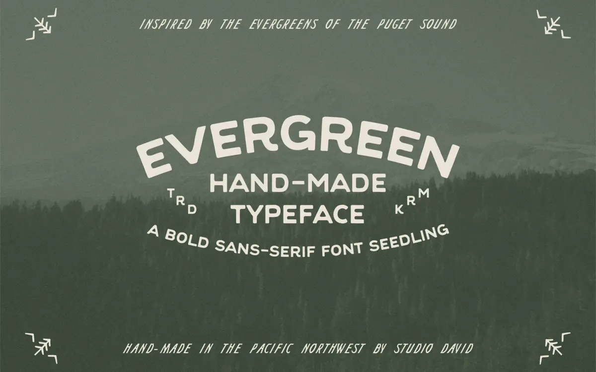
Evergreen is an uppercase-only sans with a hand-built feel rather than a mechanically drawn one. The strokes carry small irregularities in width and angle that read as a hand-cut or brush-shaped letterform, cleaned up just enough to hold together as a typeface. There’s a slight roughness to the terminals and joins that gives it the mossy, weathered character the name suggests, without tipping into a distressed or grunge treatment.
The letterforms sit somewhere between a stencil and a rustic signage face — think painted lodge signs, hand-lettered trailheads, that kind of vernacular. It’s not trying to be neutral. Every letter has a bit of a lean or a taper that keeps the whole set feeling drawn rather than constructed, which is the point, but it also means it won’t disappear into a layout the way a true workhorse sans would.
Character set and features
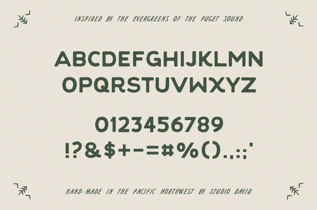
This is an all-caps font — there’s no separate lowercase to fall back on, so every word set in Evergreen reads as a shout, or at least as a label. It includes numbers and punctuation, which covers the basics for pricing, dates, and short lines of copy, but there’s no mention of ligatures, alternates, or extended language support, so treat it as a single-weight, single-case display tool rather than a flexible text system.
Because there’s only one case, designers need to do their own work with tracking and hierarchy — pairing Evergreen with a plain body text set elsewhere, using size and spacing to create contrast, rather than expecting the font itself to shift registers. The punctuation set looks functional rather than expressive, which is fine given the font’s job is short bursts of type, not paragraphs.
Use cases
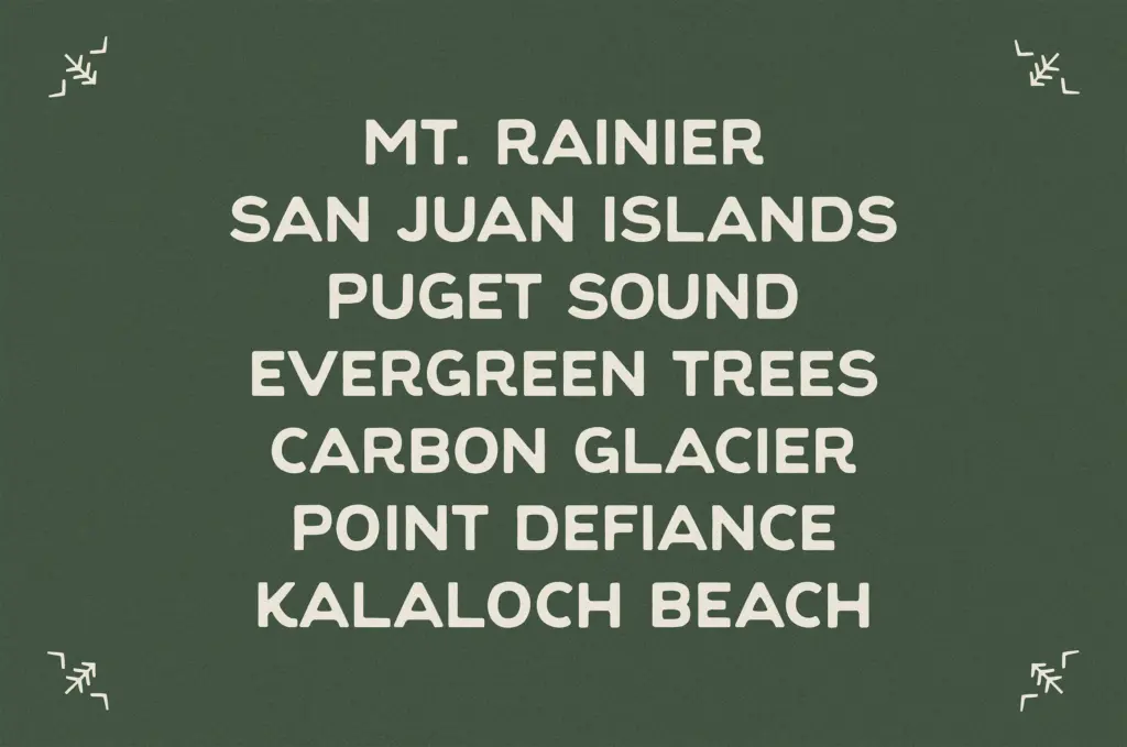
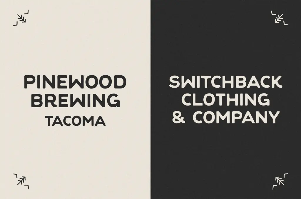
Evergreen is built for identity work with an outdoor or rustic lean: logos for campgrounds, breweries, lodges, trail gear, seasonal markets, that general territory. It works well as a lockup with an icon — a mountain, a tree, a compass — where the rough-edged caps do the job of a badge or crest without needing an illustrator to draw the whole mark from scratch. Short product names, single words, and initials are its comfort zone.
It’s less suited to anything that needs sustained reading. Multi-word headlines start to fight each other because every character carries similar weight and roughness, and there’s no lowercase to break up the rhythm. Packaging callouts, badge text, and short headers on rustic or seasonal collateral are where it earns its keep; body copy, long taglines, and formal or corporate identity work are outside its range. Anyone drawn to Evergreen should be looking for a supporting display face for a nature or camp-adjacent brand, not a do-everything system font.
What we liked, and what we didn’t
Strengths
- Rough, hand-cut terminals give it a genuine rustic character rather than a filtered effect
- Reads well as a badge or lockup logotype paired with an icon
- Punctuation and numerals cover basic identity and packaging needs
Trade-offs
- All-caps only, so there's no way to build a lowercase-based hierarchy within the font itself
- Multi-word headlines get visually noisy since every letter carries similar weight and irregularity
Evergreen is a competent hand-drawn caps font for outdoor and rustic branding work — good at badges, logotypes, and short packaging callouts. It's narrow in scope by design: no lowercase, no advanced features, and it strains past a word or two.

Tmfonts writes independent reviews of typefaces: what each font does well, where it falls short, what it suits, and where it is sold.