
Vintage Heirloom Font Free Download
Is Vintage Heirloom free to download?
Vintage Heirloom is a commercial font sold on Creative Market, so the full version needs a paid license. Get it from the official listing: Vintage Heirloom font download.
Need something free? These script fonts from Google Fonts are free for personal and commercial use:
Design style
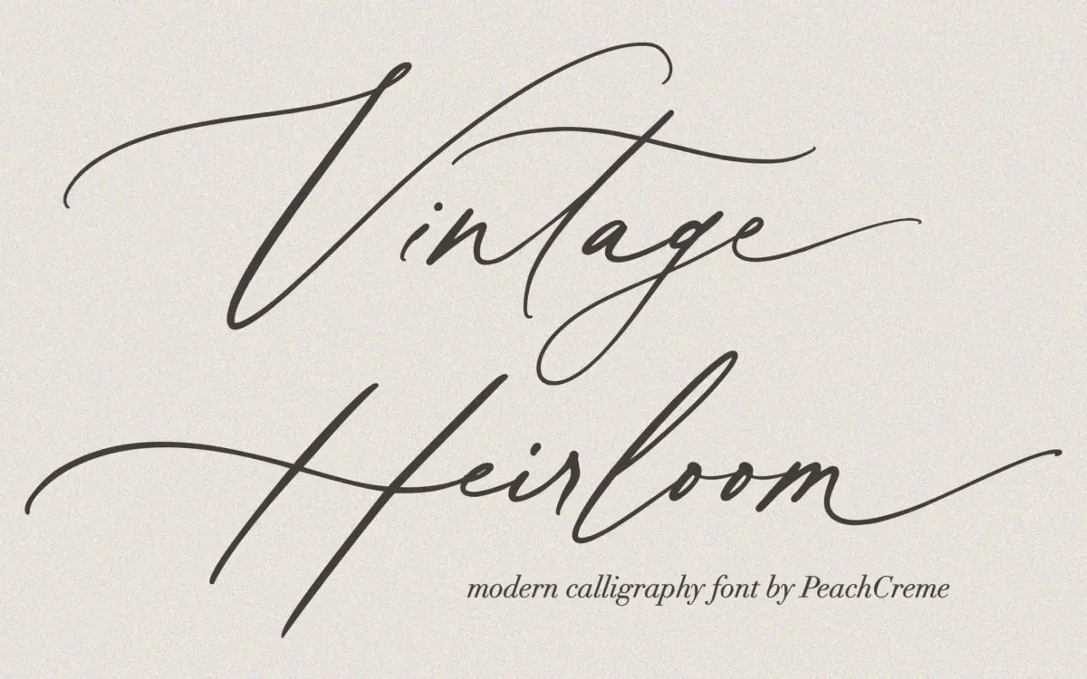
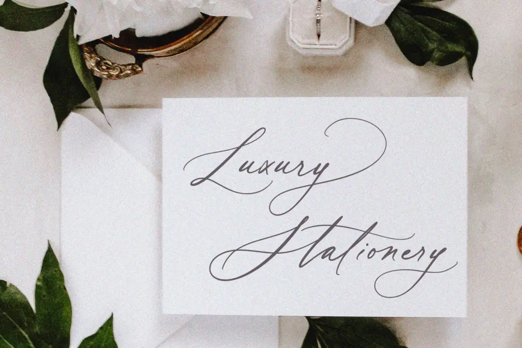
Vintage Heirloom belongs to the crowded family of fine-point calligraphy scripts built to mimic pointed-pen lettering: thin hairline entry strokes, swelling downstrokes, and a slant that leans forward with some confidence. The contrast between thick and thin is pronounced, which is what gives it that hand-inked look rather than the flatter, more mechanical feel of brush scripts. Letters connect in a continuous flow, so words read as a single gesture rather than a row of separate glyphs.
The style sits squarely in the wedding-stationery tradition — think engraved place cards and monogrammed napkins rather than anything with edge or attitude. It doesn’t try to reinvent that genre. What it does is execute it cleanly, with consistent stroke weight and a slant angle that stays steady across the alphabet, which matters more than novelty in this category. Where it earns its keep is in the swash system: three variants per lowercase letter give you real room to vary a word’s rhythm without switching fonts, which is more generous than most scripts at this price point.
Character set and features
The set covers uppercase and lowercase, numerals, punctuation, and 52 ligatures, plus the swash alternates. That’s a reasonable working kit for a script — enough to avoid obvious repetition in short lines of text, like a name or a date, which is exactly where scripts tend to fall apart. The ligatures help smooth over awkward letter pairs that would otherwise collide or leave odd gaps, a common failure point in calligraphy fonts that weren’t tested against real names.
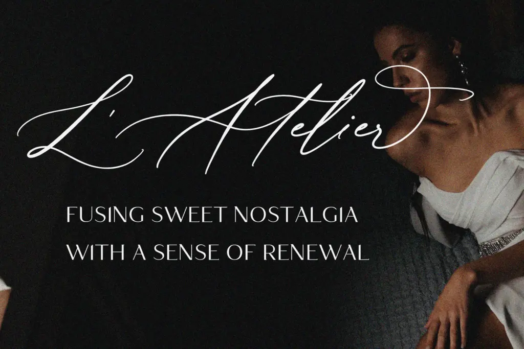
The fine hairlines are the font’s biggest legibility risk. At small sizes or on textured paper stock, those thin entry strokes can drop out or blur, and the delicate weight overall means this isn’t a font you want to shrink below a certain point size and expect to hold up. It wants generous tracking, decent contrast against its background, and ideally a print process (letterpress, foil, engraving) that can render fine lines crisply. On screen at small sizes, particularly on lower-resolution displays, the thinnest strokes will look thready.
There’s no mention of extended language support or a variable axis, so treat this as a single-weight, Latin-alphabet script rather than something built for multilingual or responsive use.
Use cases
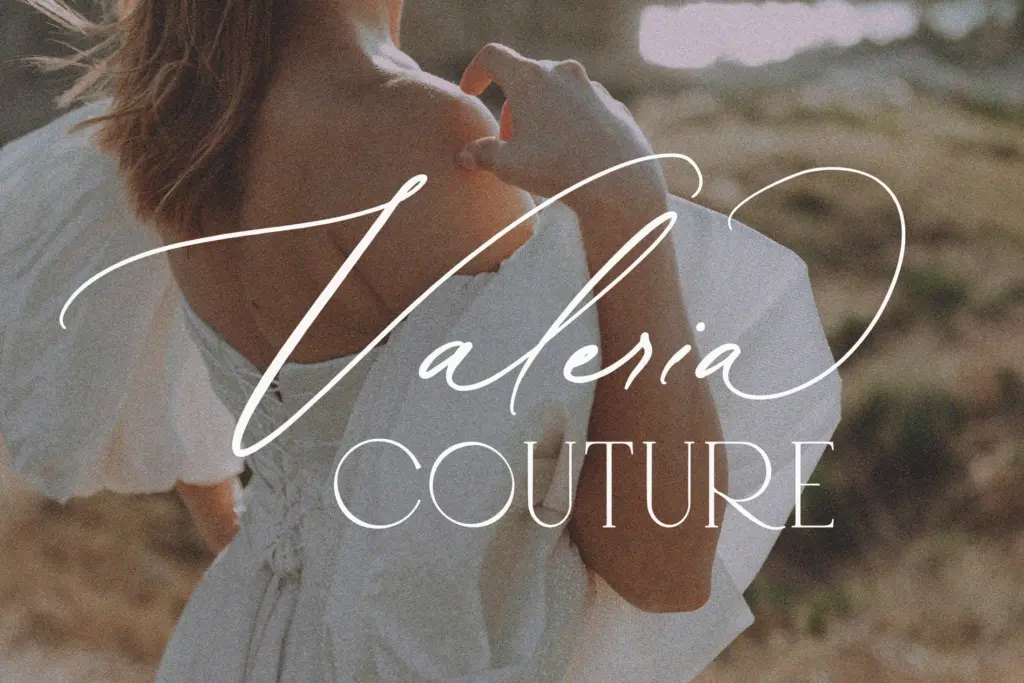
This is a font for occasion-driven work: wedding invitations, save-the-dates, place cards, and the softer end of feminine branding — packaging labels, boutique logos, monogram work. It reads as intimate and personal rather than corporate, so it’s a poor fit for anything needing authority or neutrality. Because of its delicacy, it works best as a headline or accent element — a couple’s names, a brand wordmark, a pull quote — rather than as body text, where the joins and hairlines would quickly tire the eye.
Pair it with a plain, high-contrast serif or a restrained sans for supporting text; the script needs quiet company to stay legible and to let its swashes do the talking. Given the delicate strokes, test it at your actual print size and stock before committing — what looks graceful on screen can vanish under bad print conditions.
What we liked, and what we didn’t
Strengths
- Three swash variants per lowercase letter allow real word-to-word variation without extra fonts
- 52 ligatures smooth over common letter collisions that trip up cheaper scripts
- Consistent slant and stroke contrast give it a genuine hand-calligraphy feel
Trade-offs
- Fine hairline strokes risk dropping out at small sizes or on textured print stock
- No stated multilingual or variable-weight support limits it to single-weight Latin use
Vintage Heirloom is a competent, well-mannered pointed-pen script that does what wedding stationery designers ask of the genre. It's not innovative, and its hairline strokes demand care in print and at size, but the ligature and swash coverage give it more flexibility than many scripts in this niche.

Tmfonts writes independent reviews of typefaces: what each font does well, where it falls short, what it suits, and where it is sold.