
Lovers in New York Font Free Download
Is Lovers in New York free to download?
Lovers in New York is a commercial font sold on Creative Market, so the full version needs a paid license. Get it from the official listing: Lovers in New York font download.
Need something free? These script fonts from Google Fonts are free for personal and commercial use:
Design style
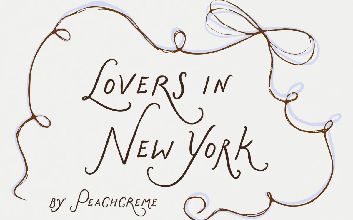
Lovers in New York sits in the crowded field of hand-drawn wedding-style scripts, but it has a specific personality within that field: loose, slightly uneven strokes that read as brush or marker work rather than pointed-pen calligraphy. The contrast is modest — there’s no dramatic thick-thin swing — which keeps the overall texture soft rather than showy. Terminals taper gently and joins between letters have a slight wobble, the kind of controlled irregularity that’s meant to suggest a human hand rather than a plotter.
What’s unusual is the structural decision underneath the casual surface. The lowercase is built to an all-caps skeleton, meaning the letters share consistent height and a steadier baseline than most scripts of this type, which tend to bounce. That’s a deliberate trade against pure decoration in favour of a calmer rhythm. The uppercase, by contrast, is where the personality gets spent: each capital carries an extended flourish or swash, so the ornamentation is concentrated at the start of a word rather than distributed evenly through it. It’s a sensible split — restraint where you need it, flourish where you want it.
Character set and features
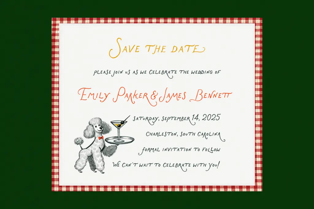
The letterforms are organic rather than geometric, with visible variation from letter to letter that avoids the stamped, repeated look some script fonts fall into when the same glyph appears twice in a word. The single decorative capital per word is doing real work: it sets the tone of a headline or a name without requiring the whole word to be swash-heavy, which is often where scripts become illegible. Lowercase strokes stay narrower and more even, so word shapes remain readable at a glance even when the capital is elaborate.
The overall texture is closer to handwriting than to formal script calligraphy — there’s charm in the imperfection, but it’s a controlled imperfection, not a chaotic one. Spacing between characters seems built to accommodate the flourish-heavy capitals without collision, which matters more in a font like this than it does in a plain sans; a script with generous swashes needs generous kerning to avoid letters crashing into each other, and this one appears to have been drawn with that in mind.
Use cases
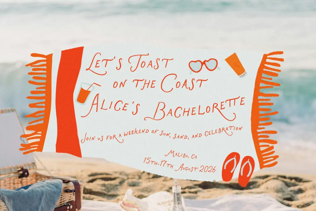
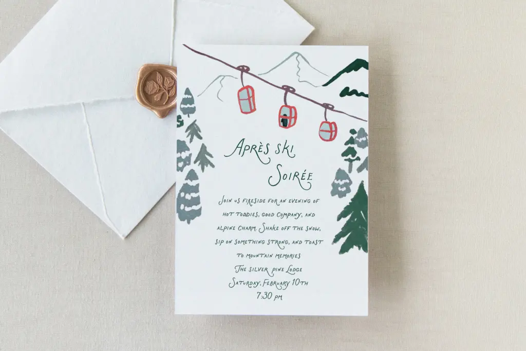
This is a font for the moments where a name or a short phrase needs warmth: wedding invitations, save-the-dates, place cards, boutique branding, and packaging for lifestyle or beauty products chasing a feminine, personal tone. The steadier lowercase rhythm means it can hold up in short lines of body copy — a subheading, a quote pulled onto a card — better than scripts that are all flourish, all the time. It is not a typeface for paragraphs. Even with its calmer baseline, extended reading in a script face this decorative will tire the eye, and it should be reserved for titles, monograms, logotypes, and short editorial callouts.
Pair it with a plain, quiet sans or a restrained serif for supporting text, and let this carry the emotional weight of a headline or a name. Used that way — sparingly, at a size where the flourishes can breathe — it does the job it’s built for.
What we liked, and what we didn’t
Strengths
- The all-caps lowercase structure keeps word shapes steadier than most scripts in this category.
- Flourish is concentrated on a single capital per word, so decoration doesn't compromise readability.
- Organic, uneven strokes avoid the repetitive stamped look common in script fonts.
Trade-offs
- The decorative capitals demand generous space, so it struggles in tight layouts or small print.
- It's firmly a display/short-text face — not built for anything beyond a line or two.
Lovers in New York is a competent, warm hand-drawn script that solves the legibility-versus-charm tension by putting flourish only on the capitals. It won't work for long text and it doesn't reinvent the genre, but for invitations, monograms and short branding lines it does exactly what it promises.

Tmfonts writes independent reviews of typefaces: what each font does well, where it falls short, what it suits, and where it is sold.