
Perfectly Nineties Font Free Download
Is Perfectly Nineties free to download?
Perfectly Nineties is a commercial font sold on Creative Market, so the full version needs a paid license. Get it from the official listing: Perfectly Nineties font download.
Need something free? These serif fonts from Google Fonts are free for personal and commercial use:
Design style
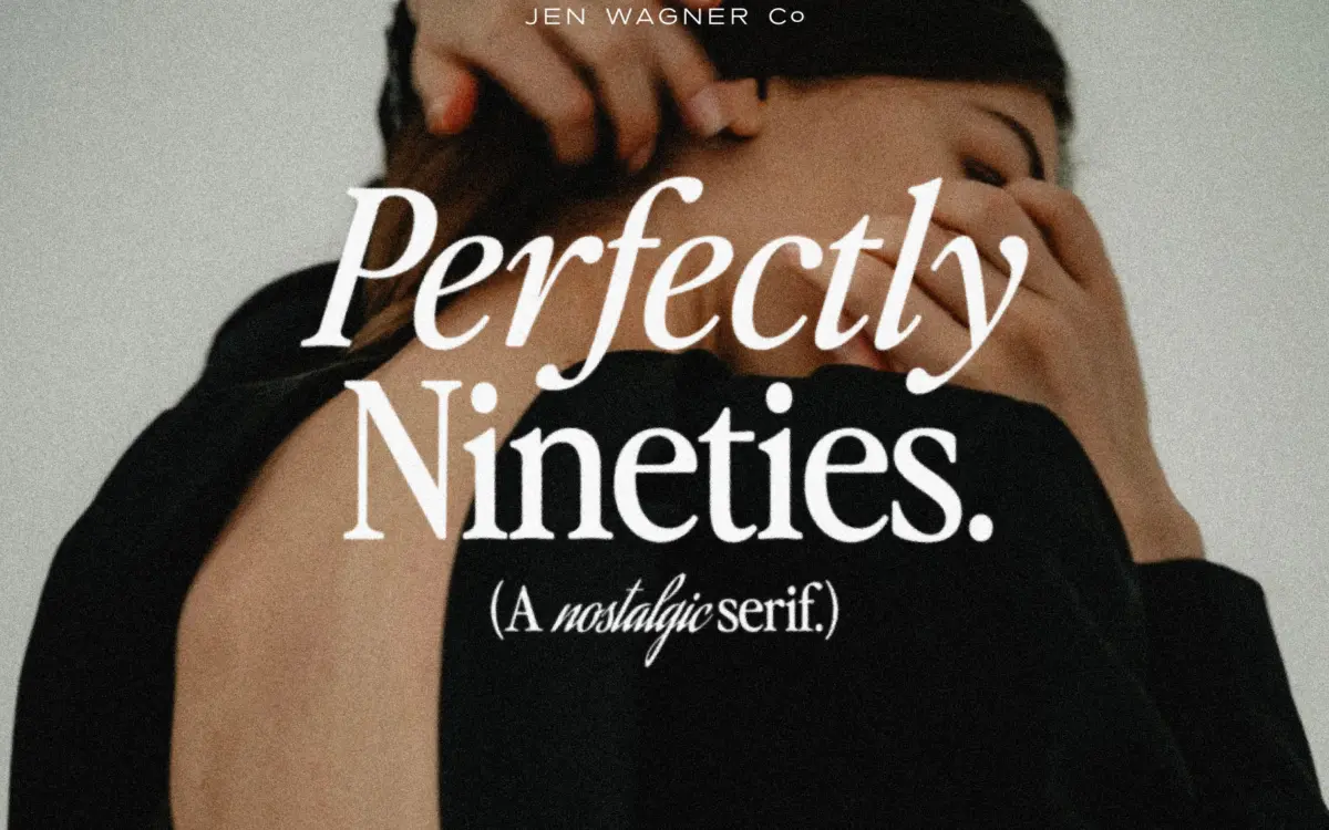
Perfectly Nineties draws on the compact, no-nonsense serifs that filled magazine mastheads and fashion spreads in the late 80s and early 90s. The letterforms are upright, moderately contrasted, and drawn with small, sharp serifs rather than bracketed slab feet. It doesn’t chase the fashion-editorial extremes of a modern didone; the contrast is gentler and the proportions are closer to a workhorse text serif than a display headline face. That restraint is the point. This is a serif built to look like it was already sitting in a drawer of old type specimens, not one trying to shout.
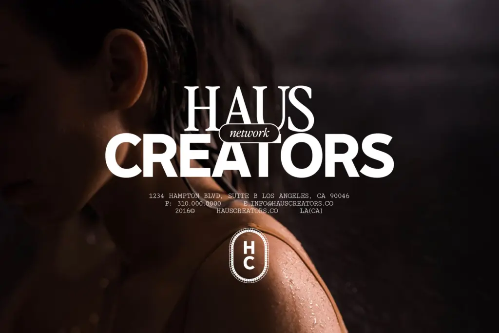
The default spacing is generous, closer to a body-copy setting than a display one, which gives the face an oddly formal, almost typewritten calm at small sizes. At larger sizes that same spacing reads as loose and a little dated in the wrong way unless it’s tightened. The seller’s own recommendation to pull tracking in by 10 to 20 units for display use is worth taking seriously — the letterforms themselves want to sit closer together than the metrics default to.
Character set and features
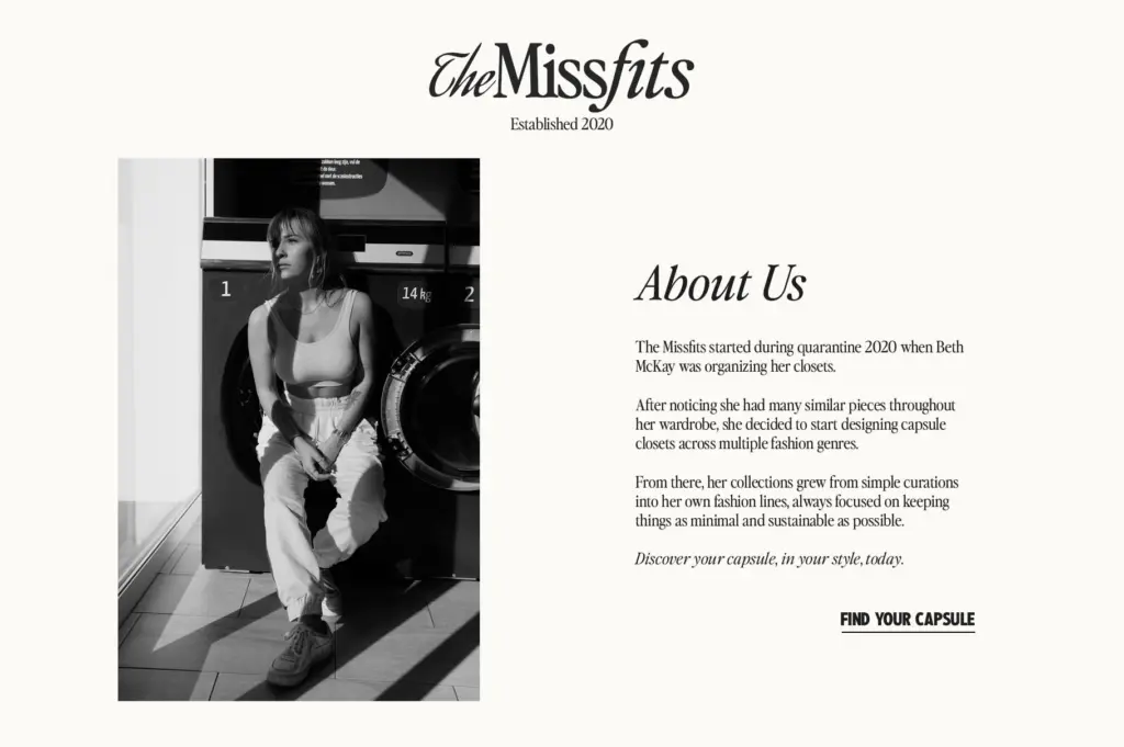
The family includes upper and lowercase, and an italic that’s clearly meant to be used alongside the roman rather than as a fallback. Mixing regular and italic within a single word or line is the most distinctive move the type offers — it produces a scrapbook, cut-and-paste feel that suits collaged or zine-style layouts more than clean corporate branding. Used well, that mixing gives short headlines a handmade rhythm without needing hand-lettering.
Two bundled Photoshop actions add a vintage magazine print texture — halftone-ish degradation, ink bleed, that sort of thing. That’s a nice bonus for anyone building a full retro composition, but it’s a Photoshop effect, not a typographic feature, so don’t expect it to change how the letterforms themselves behave in a plain HTML or InDesign context. There’s no mention of extended language support or a larger stylistic set beyond the roman/italic pairing, so treat this as a two-style family rather than a sprawling system.
Use cases
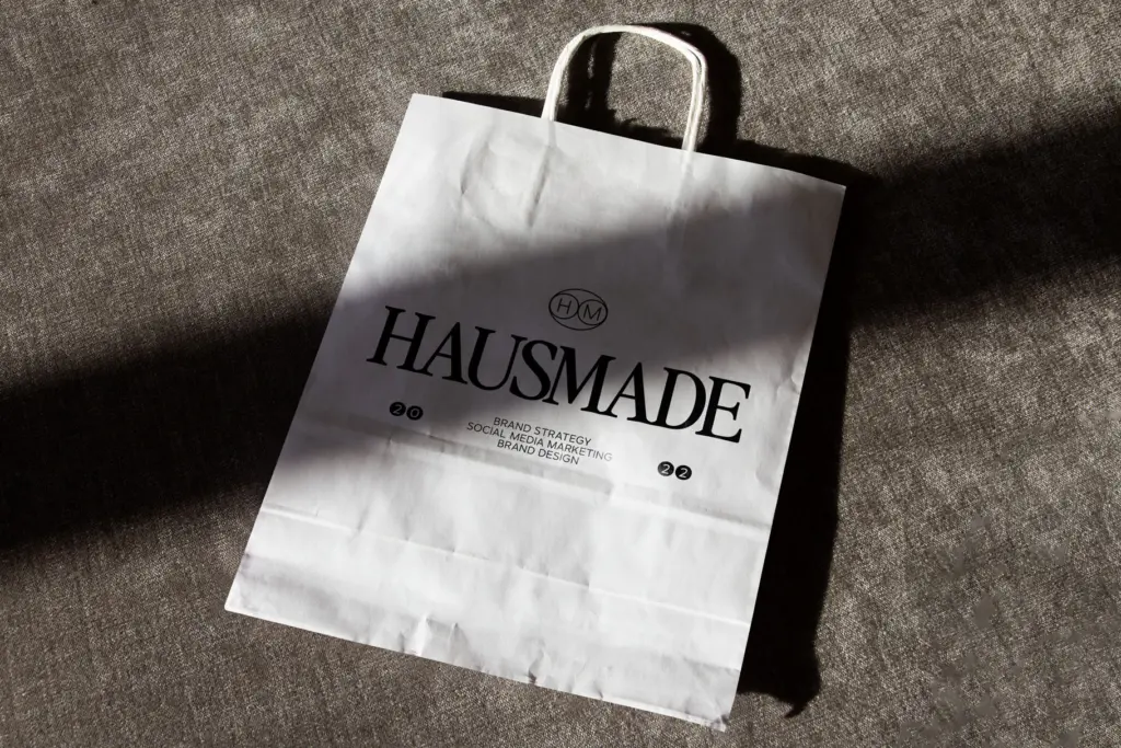
This is a font for people building a specific mood: fashion blog headers, editorial pull quotes, product labels for a brand chasing a 90s-nostalgic identity, zine covers, playlist art. The body-friendly spacing means it can genuinely carry paragraph text in print or long-form web copy, which is unusual for a typeface marketed mostly on its display charm — most nostalgic serifs in this category fall apart below 14pt. Perfectly Nineties doesn’t.
Where it struggles is anywhere that wants crisp, modern neutrality — a tech interface, a minimalist product label, anything that needs to read as contemporary rather than referential. It’s also not a face for dense information design; the character feels too specific, too tied to a decade, to disappear into a UI. Use it where the nostalgia is the message, not the background noise.
What we liked, and what we didn’t
Strengths
- Genuinely readable at body text sizes, not just a display gimmick
- Roman/italic mixing gives short headlines a handmade, collaged character
- Serif drawing feels period-accurate without tipping into pastiche
Trade-offs
- Default letterspacing needs manual tightening for display use
- Limited to two styles, so it can't flex into a broader brand system on its own
Perfectly Nineties nails a specific, unfashionable-until-it-wasn't decade of serif design and manages to hold up at body text sizes, which is rarer than it sounds. It's a mood font more than a system, so it rewards designers who already know they want that mood and will need to do some manual spacing work to get display sizes right.

Tmfonts writes independent reviews of typefaces: what each font does well, where it falls short, what it suits, and where it is sold.