
Hamilton Archive Font Free Download
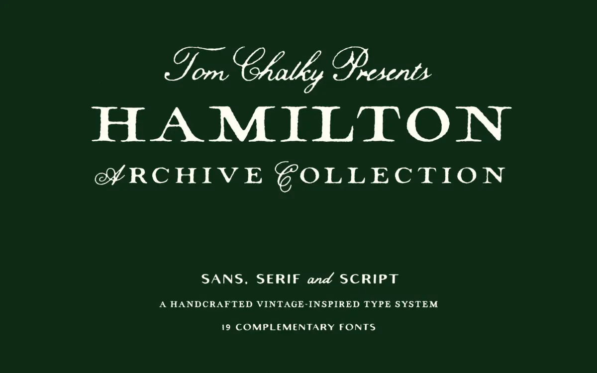
Is Hamilton Archive free to download?
Hamilton Archive is a commercial font sold on Creative Market, so the full version needs a paid license. Get it from the official listing: Hamilton Archive font download.
Need something free? These handwritten fonts from Google Fonts are free for personal and commercial use:
Design style
The Hamilton Archive is less a single typeface than a small type system built around one idea: early 20th-century print, with all its handset irregularity, translated into something usable on a screen. The serif and sans families carry the weight of the collection, and both lean into slightly worn, softened terminals rather than the crisp geometry you’d get from a contemporary revival. Nothing here reads as sterile. The script, which is clearly meant as the flourish piece of the set, is looser and more calligraphic, with entry and exit strokes that lean into the antique mood rather than a clean modern hand.
The overall character is warm rather than austere. There’s a handcrafted unevenness to the letter construction that suggests the designer wanted texture over precision, and for the most part it works — the collection feels coherent, like it was drawn as one project rather than assembled from separate leftover files.
Character set and features
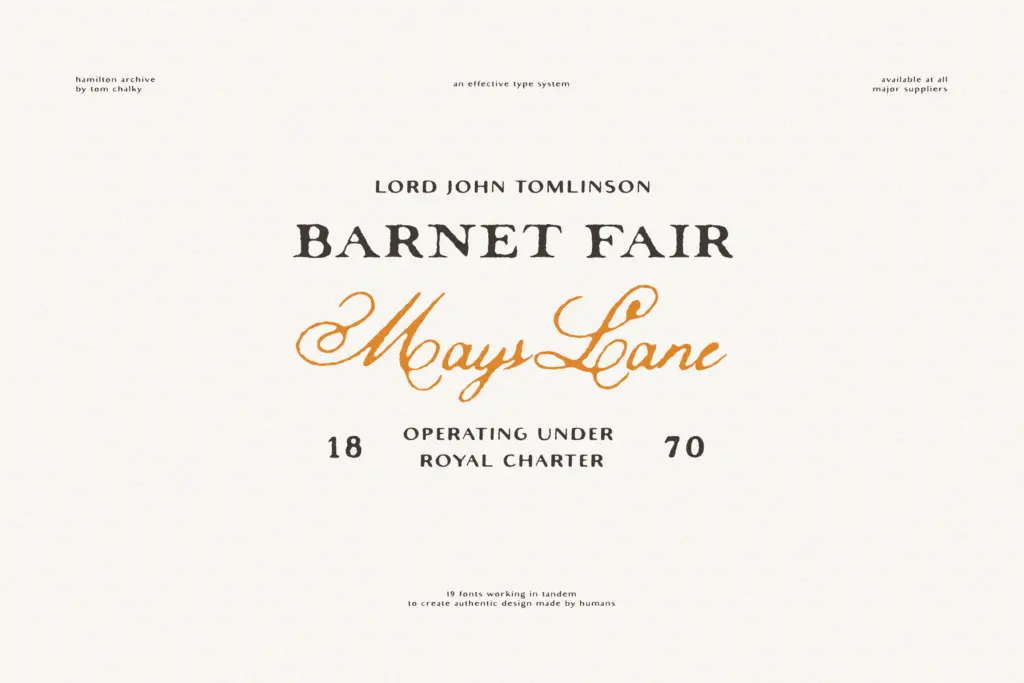
Structurally, this is a generous package. The serif and sans each come in regular and bold, with a condensed cut of each, plus a ‘Small’ style pitched at smaller text sizes but flexible enough to hold up larger too. That’s a sensible way to cover a lot of layout ground without needing to reach for an unrelated typeface for subheads or captions. The script adds light, regular, and bold weights, with ligatures and stylistic alternates that push it toward a more ornamental, old-world feel — useful for invitation work where a bit of flourish is the point.
Multilingual support is included across the set, which matters if any of this is going into editorial work beyond English-language copy. What’s less clear from the collection is how the weights behave against each other in a hierarchy-heavy layout — with 19 fonts on offer, some testing is needed before committing to a full system, since not every combination will pull its weight equally in a masthead-to-body-copy relationship.
Use cases
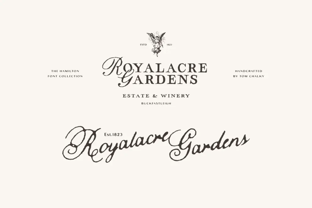
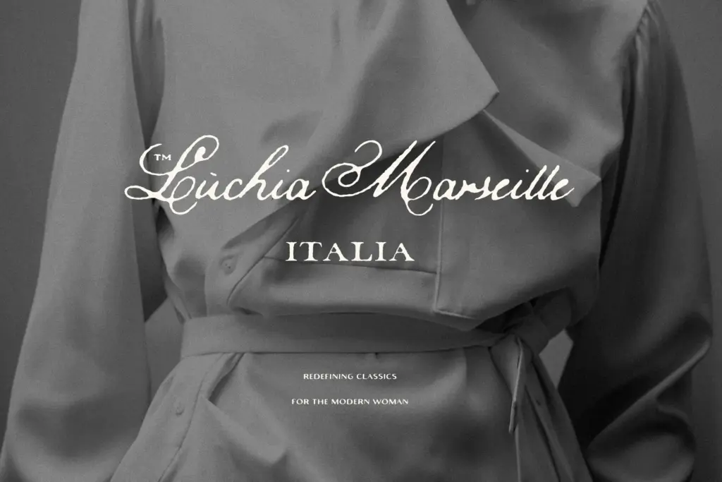
This is a strong fit for branding and editorial projects that want a lived-in, vintage register without going full Victorian pastiche — think small-batch product packaging, boutique hospitality, or a magazine section that wants a period feel without looking like a costume. The condensed and small styles give it enough range to sit comfortably in body copy, captions, and tighter display settings, not just headlines.
Wedding invitations are an obvious use, particularly with the script’s ligature and alternate support doing the heavy lifting for that romantic, handwritten-note quality. Where it will strain is in strictly minimal or corporate-modern contexts — the deliberate roughness that gives this collection its charm works against it if the brief calls for something clean and neutral. It’s a character font family first, and a workhorse second.
What we liked, and what we didn’t
Strengths
- Nineteen coordinated styles cover serif, sans, and script needs without hunting for separate typefaces.
- Condensed and 'Small' cuts extend usability into body copy and tight layouts, not just headlines.
- Script styles include ligatures and stylistic alternates that add genuine antique character to invitation work.
Trade-offs
- The deliberate handcrafted irregularity works against briefs calling for clean, modern minimalism.
- With 19 fonts, some combinations require testing before they hold together in a layout hierarchy.
The Hamilton Archive is a well-considered set of vintage-leaning fonts that covers serif, sans, and script needs in one purchase. It suits editorial and branding work with period charm, though its deliberate roughness limits its use in cleaner, more modern contexts.

Tmfonts writes independent reviews of typefaces: what each font does well, where it falls short, what it suits, and where it is sold.