
Fifty Fifty Font Free Download
Is Fifty Fifty free to download?
Fifty Fifty is a commercial font sold on Creative Market, so the full version needs a paid license. Get it from the official listing: Fifty Fifty font download.
Need something free? These serif fonts from Google Fonts are free for personal and commercial use:
Design style
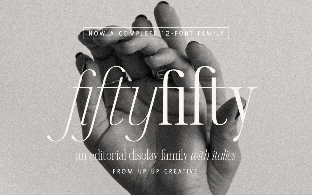
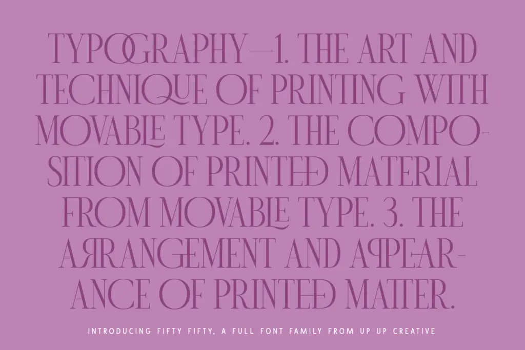
Fifty Fifty sits in the editorial serif camp that has become common on the marketplace over the last few years: moderate contrast, smoothed-off curves, and a sense of polish aimed squarely at magazine mastheads and Instagram carousels rather than long-form text. The caps are the strongest part of the design. They’re upright, evenly weighted, and carry a slight flare at the terminals that reads as confident without tipping into decorative territory. Set a monogram or a short headline in the caps and the family does exactly what it promises.
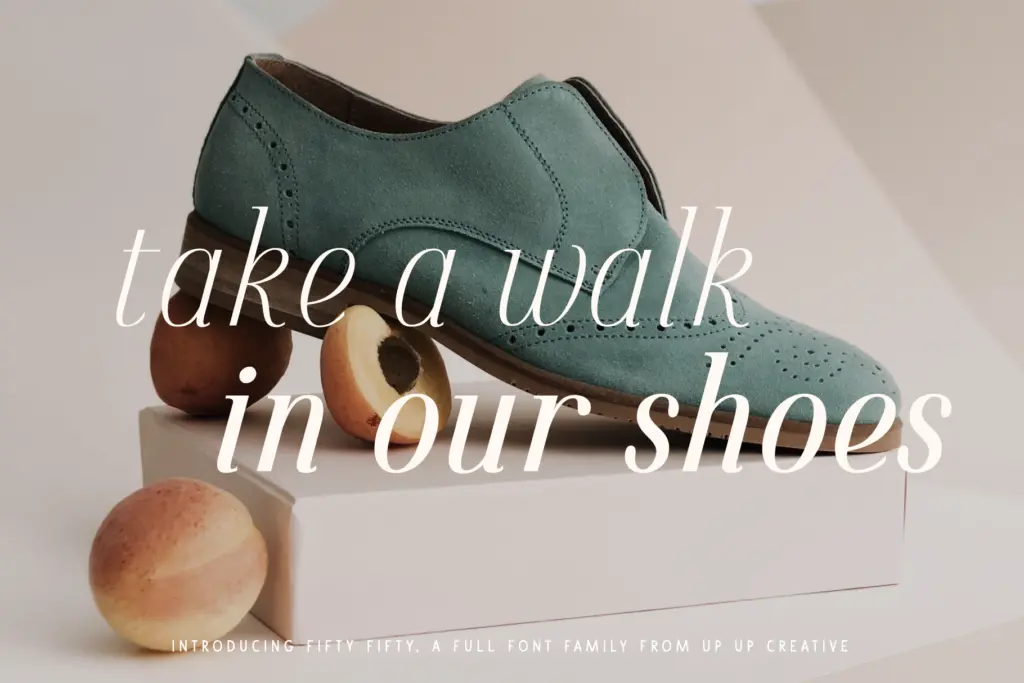
The lowercase is more mixed. It’s competent — the x-height is generous, the curves are consistent with the caps — but it doesn’t have quite the same personality. At larger display sizes the lowercase softens the overall effect a little, which is fine for a headline family but worth knowing before you plan a project around the lowercase carrying equal visual weight to the caps.
Character set and features
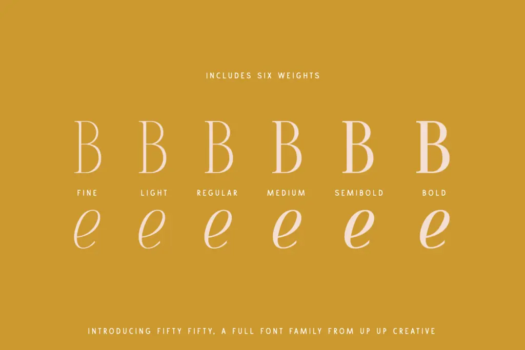
Six weights, each with a matching italic, gives Fifty Fifty a genuine range from light to bold, which is more than most single-purpose display serifs offer. The italics lean more calligraphic than the romans, with a bit more slant and swing in the terminals, and they pair well for pull quotes or subheads that need contrast against a bolder roman headline.
The headline number here is the ligature set: 117 standard and discretionary ligatures across roughly 700 glyphs, plus stylistic sets, character variants, and multilingual support with alternate currency symbols. That’s a real feature set, not a marketing footnote — it means there’s room to customise a wordmark or logotype without redrawing anything by hand, provided you’re working in software that exposes OpenType panels properly. Illustrator and InDesign will get you there without friction. Word users will need to dig into the advanced font menu, and anyone doing web typesetting should check in advance which of these features their CSS/OpenType pipeline can actually trigger, since ligature-heavy features don’t always survive the trip to a browser cleanly.
Use cases
This is a headline and branding font first. It’s built for logotypes, monograms, poster type, packaging, and editorial titling — anywhere you’re setting a handful of words at a large size and want the ligatures and stylistic sets to do some of the design work for you. The six-weight range extends its usefulness into things like fashion branding or magazine section headers where you want a light weight for a kicker and a bold for the main title, all from one family.
It is not designed for body copy, and pushing it there will expose the limits of the lowercase fairly quickly — the ligatures and swashes that make it interesting at 60pt are wasted, sometimes distracting, at 10pt. Treat it as a display and identity tool, pair it with a plain workhorse text face for anything longer than a paragraph, and it earns its keep.
What we liked, and what we didn’t
Strengths
- Caps have a distinct, polished character well suited to monograms and logotypes
- Six weights with matching italics give real range for a single family
- 117 ligatures plus stylistic sets and multilingual support offer genuine customisation depth
Trade-offs
- Lowercase is competent but less characterful than the caps, especially at larger sizes
- Not built for body text — the ligature-heavy design only pays off at display sizes
Fifty Fifty is a confident headline serif with real range across six weights and a genuinely deep ligature set. The caps are the star; the lowercase is solid but less distinctive, and this is a display tool rather than a text face. For logos, mastheads, and monograms it does its job well.

Tmfonts writes independent reviews of typefaces: what each font does well, where it falls short, what it suits, and where it is sold.