
Sequoia Display Font Free Download
Is Sequoia Display free to download?
Sequoia Display is a commercial font sold on Creative Market, so the full version needs a paid license. Get it from the official listing: Sequoia Display font download.
Need something free? These display fonts from Google Fonts are free for personal and commercial use:
Design style
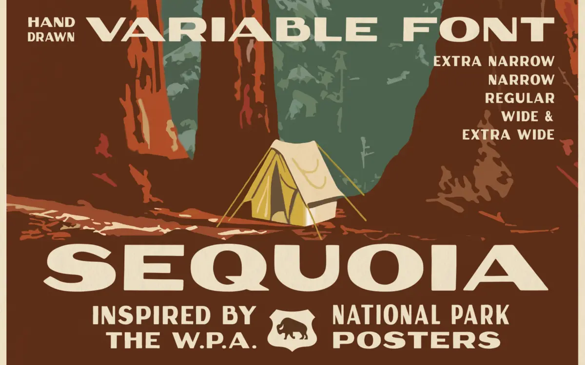
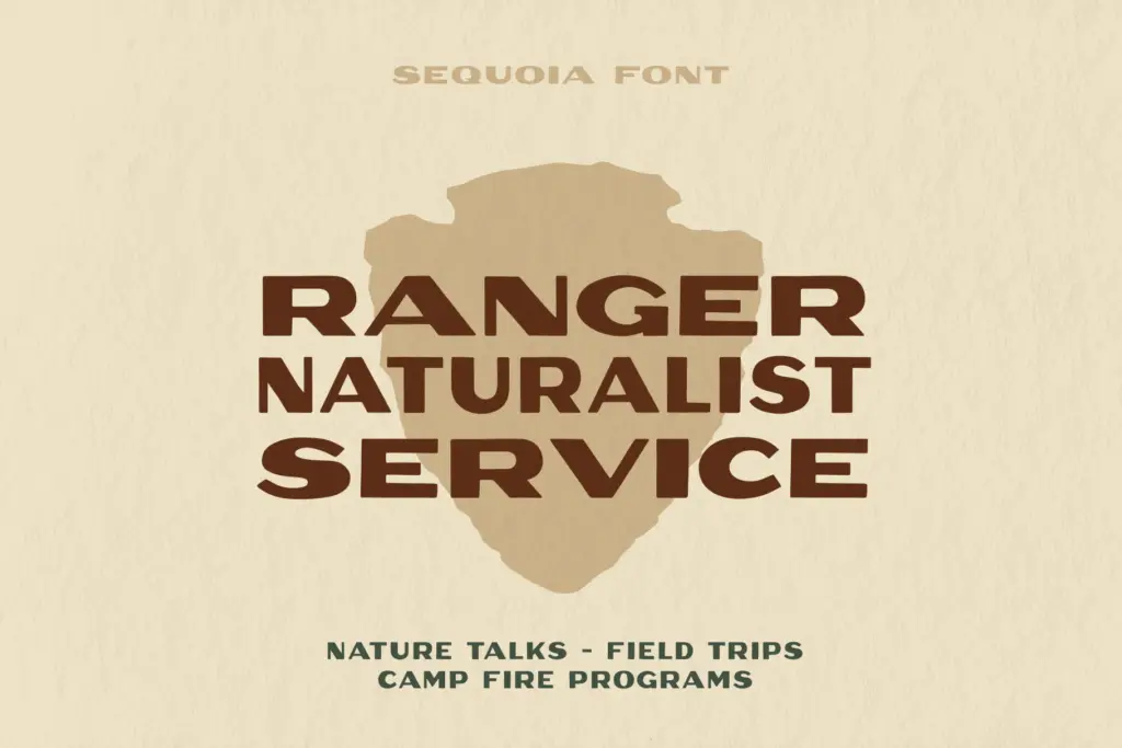
Sequoia Display draws from the lettering on 1930s National Park Service posters, and it keeps the hand-built quality of that source rather than smoothing it into a generic revival. Strokes are heavy and slightly uneven in a way that reads as carved or painted rather than typeset. Curves have a soft, rounded quality, and terminals are blunt, not sharp. It’s a chunky, warm letterform with none of the geometric discipline of a modern sans — the appeal is in the imperfection.
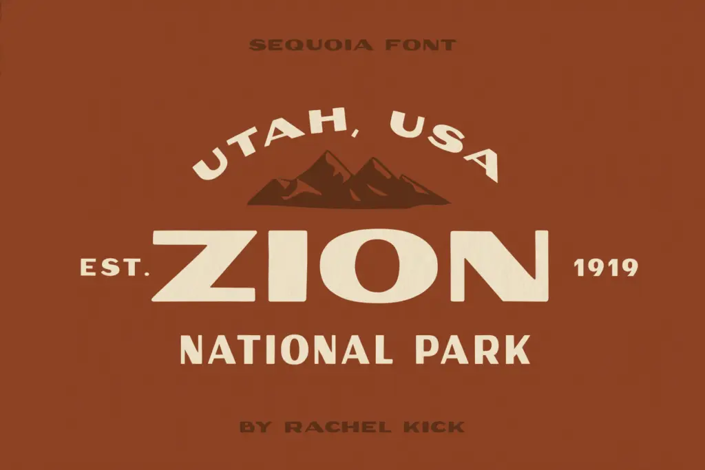
The variable width axis is the real design idea here. Rather than shipping one weight and calling it done, Sequoia lets you dial the letters from extra narrow to extra wide on a continuous slider, mimicking the way sign painters would compress or stretch lettering to fill a fixed space. That’s a genuine nod to the source material, where hand-lettered headlines were routinely squeezed or stretched to hit a margin. If you don’t want to fuss with variable font tooling, five fixed-width instances cover the same range in discrete steps.
Character set and features
As a display face built for short bursts of text, Sequoia’s letterforms are big, bold, and built to be read from a few feet back rather than set in paragraphs. The width axis is the standout feature — practically, it means one family can hit a headline’s exact measure without cropping, kerning tricks, or swapping to a condensed cut that doesn’t match stylistically. That’s a real workflow advantage over static families where

Tmfonts writes independent reviews of typefaces: what each font does well, where it falls short, what it suits, and where it is sold.