
Papyrcuts Font Free Download
Is Papyrcuts free to download?
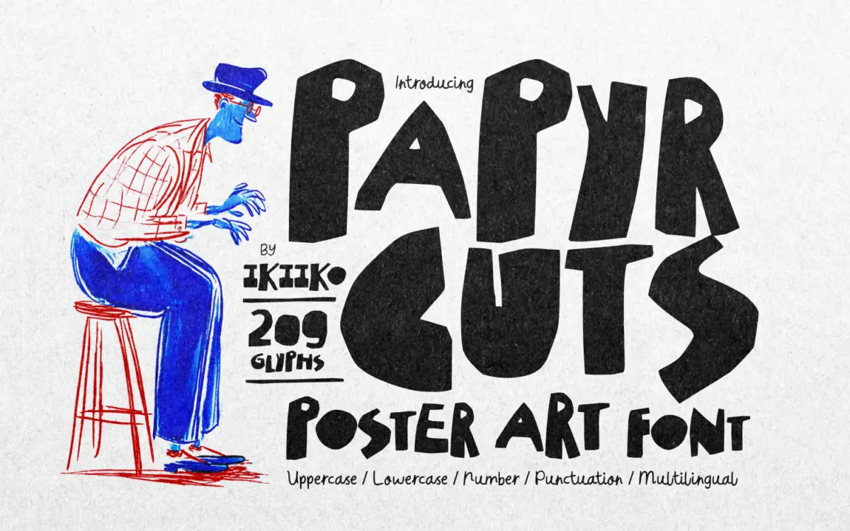
Papyrcuts is a commercial font sold on Creative Market, so the full version needs a paid license. Get it from the official listing: Papyrcuts font download.
Need something free? These display fonts from Google Fonts are free for personal and commercial use:
Design style
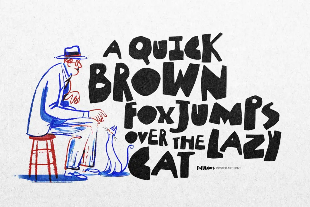
Papyrcuts leans into the cut-paper look rather than just gesturing at it. The letterforms read like shapes cut from card with scissors rather than a knife — edges are jagged, corners are notched unevenly, and no two strokes have quite the same width. It sits in that ransom-note lineage of collage lettering, but it’s more controlled than a true ransom note: the letters are still built on a consistent skeleton, so the piece holds together as a typeface rather than a pile of scraps.
The rawness is the point. There’s no attempt to smooth the cut marks or regularize the notches, and that inconsistency is what gives it the handmade, DIY feel the brief is going for. It won’t suit anything that needs to look considered or premium — it reads as scrappy on purpose, closer to a zine cover or a flyer stapled to a lamppost than a gallery wall label.
Character set and features
The set covers uppercase and lowercase, numerals, and punctuation, with multilingual support for wider language coverage. Both TTF and OTF files are provided and it’s built to work across PC and Mac, so there’s no platform friction getting it into a layout program.
Because the cut-out treatment depends on irregularity, the lowercase in particular varies more in stroke weight and cut angle than a conventional display face would. That’s a feature at large sizes, where the texture reads clearly, but it means the font is not built for even color across a paragraph — it’s not trying to be, and shouldn’t be asked to.
Use cases
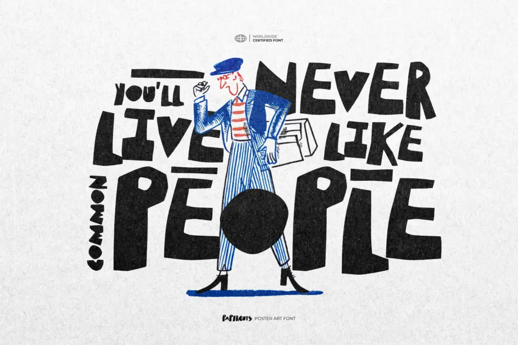
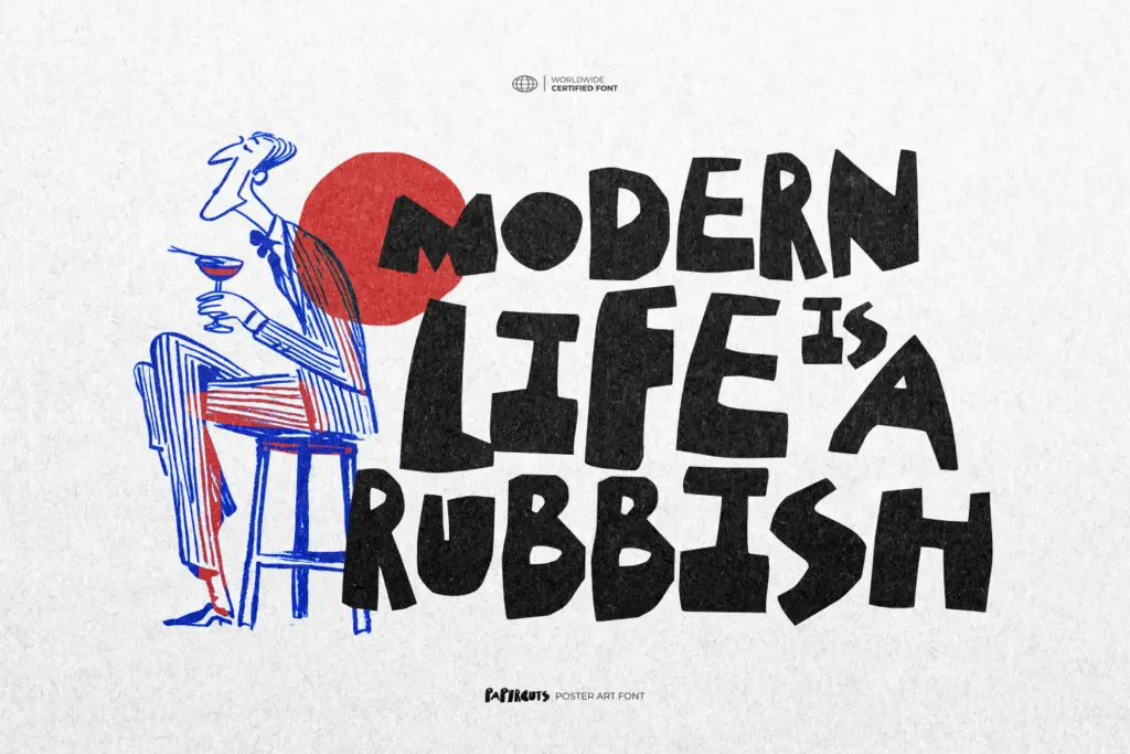
This is a headline and lockup font, not a text font. It’s suited to poster titles, gig flyers, streetwear graphics, magazine mastheads, and short punchy statements on packaging or merch where the torn-paper texture reads as intentional attitude rather than noise. Single words or short phrases set large will show off the cut detail; anything longer starts to fight itself, since the eye has to work harder to parse each letter’s improvised shape at reading size.
Pair it with a plain, quiet sans or a simple serif for supporting copy — the contrast of one wild headline against calm body text is how a font like this earns its keep. Used on its own across a whole layout, the roughness stops feeling deliberate and starts feeling like a lack of a plan.
It’s not a font for corporate branding, annual reports, or anything needing restraint. It’s also not a subtle font — there’s no quiet mode to switch into. Buyers should go in expecting a loud, textured display face for one job: making a headline look torn from the page, not a flexible workhorse for a whole identity system.
What we liked, and what we didn’t
Strengths
- Convincing torn-paper texture that reads as handmade rather than a filter effect
- Consistent letter skeleton keeps the roughness from turning into chaos
- Multilingual support and both TTF/OTF formats give it practical flexibility for delivery
Trade-offs
- Uneven stroke widths and jagged cuts make it tiring to read past a few words
- Too aggressive and specific in mood to work for calm or corporate branding
Papyrcuts is a loud, single-purpose display font that does the cut-paper look convincingly at headline sizes. It's not built for reading comfort or restraint, and it shouldn't be — just don't expect it to carry a whole layout on its own.

Tmfonts writes independent reviews of typefaces: what each font does well, where it falls short, what it suits, and where it is sold.