
Tequila Blanco Font Free Download
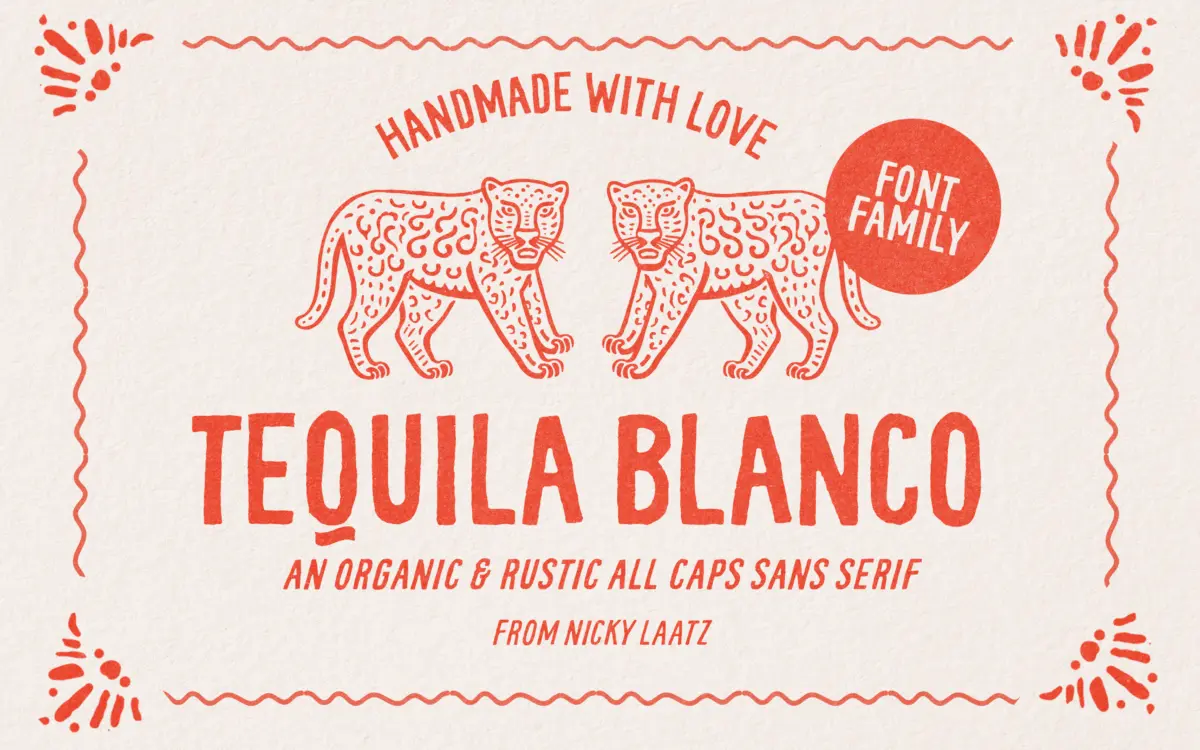
Is Tequila Blanco free to download?
Tequila Blanco is a commercial font sold on Creative Market, so the full version needs a paid license. Get it from the official listing: Tequila Blanco font download.
Need something free? These handwritten fonts from Google Fonts are free for personal and commercial use:
Design style
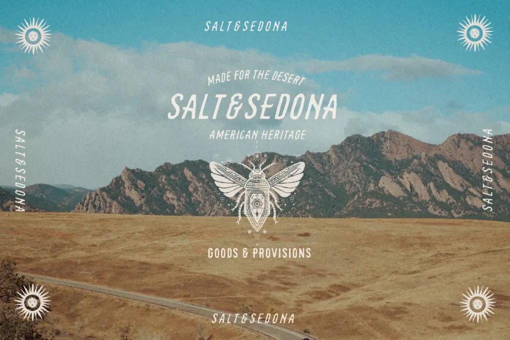
Tequila Blanco is an all-caps display face built around a single idea: rough-hewn, hand-cut letters that look like they were carved rather than typed. The strokes have uneven edges and worn corners, not the crisp, uniform imperfection you get from a lot of “distressed” fonts but something closer to a genuine wobble in the hand. Some uppercase letters carry small curved spurs at the terminals, which read like tool marks left over from a signage painter’s brush. It leans hard into a Southwestern, sun-bleached mood — think weathered wood signs and hand-painted shopfronts rather than anything polished.
The rusticism is consistent rather than random: the roughness sits at the same intensity across the character set, so words don’t suddenly look like they were set in two different fonts. That control is what separates a usable rough face from a novelty one, and Tequila Blanco mostly gets it right.
Character set and features
The family ships in fifteen variations built from four underlying drawings — the original, a Light, a Short, a Smooth, and a Squat — each with an oblique companion. That’s a genuinely wide spread for a hand-drawn display face, and it’s the most useful thing about the package. The Light cuts the stroke weight down for a more delicate rustic look, Smooth softens the roughness for slightly better legibility at small sizes, Short reduces the vertical extension for tighter line spacing, and Squat compresses the proportions for a stockier, more compact mark. Having all four sitting under one name means you can swap between them without hunting for a companion font that matches the mood.
Language support covers a handful of Northern and Western European sets — Danish, French, German, Norwegian, Portuguese, Swedish and Swiss German alongside English — so it’ll hold up for European retail and hospitality branding without falling over on accented characters. There’s no lowercase; this is a caps-only face, which is worth knowing before you start setting long copy.
Use cases
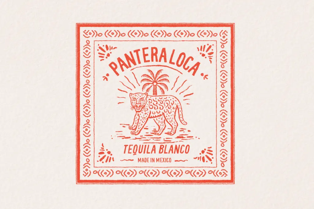
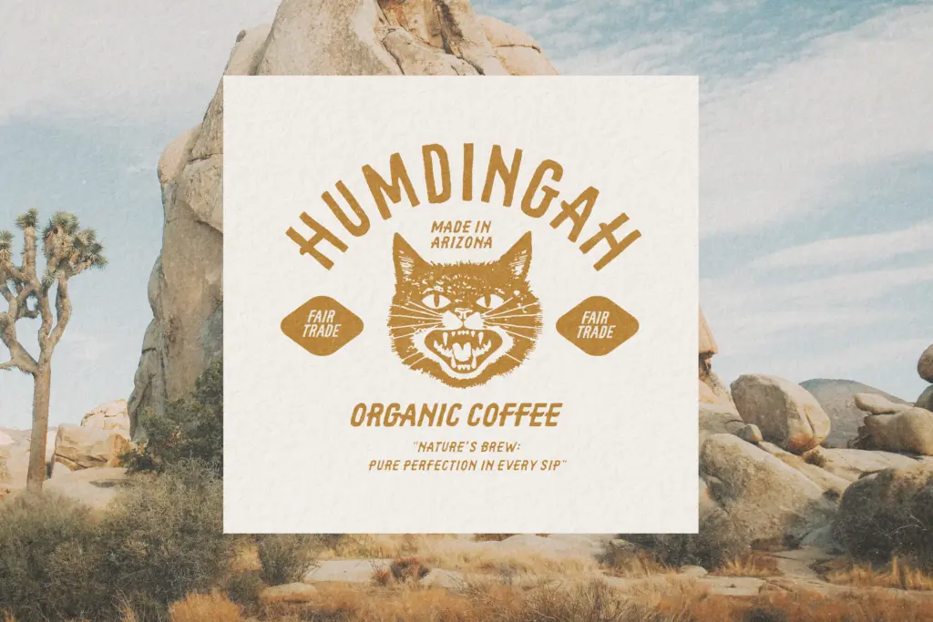
This is a logotype and headline font first. It suits rustic and coastal branding, farm-to-table packaging, craft beverage labels, market signage, and quote graphics that want a hand-lettered, slightly weathered feel. The Squat and Short variants work well for badge-style logos where the type needs to sit inside a circle or shield without stretching awkwardly. The Light and Smooth options are the better choice for anything that needs to be read at a distance or in a smaller lockup, since the roughest version can blur into itself below a certain size.
It’s not a font for body copy or dense paragraphs — there’s no lowercase, and the intentional irregularity works against readability once you’re past a headline or a short line of text. It’s also a strongly themed face: it won’t quietly disappear into a clean, minimal brand system, so it’s best kept for projects that actually want that rugged, hand-carved signal rather than ones that need a neutral display option.
What we liked, and what we didn’t
Strengths
- Four distinct drawings (Light, Smooth, Short, Squat) plus obliques give real flexibility within one theme
- The roughness is applied evenly across characters, so it reads as a coherent style rather than random distress
- Squat and Short variants work well for compact badge and shield-style logo lockups
Trade-offs
- Caps-only with no lowercase, so it can't handle body copy or long-form text
- The heaviest, roughest cut loses clarity at small sizes despite the Smooth and Light options
Tequila Blanco is a well-executed rough, hand-carved display face with an unusually generous set of variants for its category. It's built for headlines, logos and signage rather than reading, and its heavy theming means it won't fit every brand, but within its rustic lane it's versatile and consistently drawn.

Tmfonts writes independent reviews of typefaces: what each font does well, where it falls short, what it suits, and where it is sold.