
Montage Font Free Download
Is Montage free to download?
Montage is a commercial font sold on Creative Market, so the full version needs a paid license. Get it from the official listing: Montage font download.
Need something free? These serif fonts from Google Fonts are free for personal and commercial use:
Design style
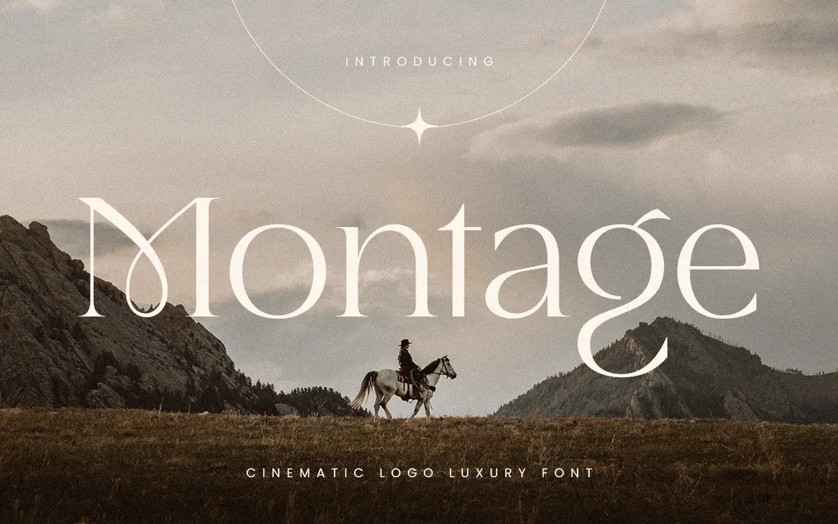
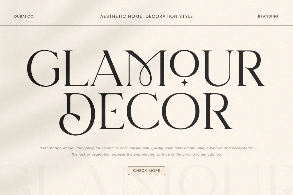
Montage is a display serif built around high-contrast strokes and a narrow, upright rhythm that reads as old-Hollywood title design rather than editorial text setting. The thick-to-thin transitions are pronounced, terminals are sharpened rather than rounded, and the overall proportions run tall and condensed. That combination gives it a marquee feel: letters that look carved rather than written, meant to be seen large and spaced out rather than set in a paragraph.
The vintage cinema reference is legible in the details — a period feel in the curves, a slight formality to the serifs, nothing that tips into pastiche. It sits closer to the lettering on a 1950s film poster or a perfume label than to a workhorse book serif, and that’s clearly the intent. It has a point of view, and it doesn’t try to be neutral.
Character set and features
As a display face, Montage’s job is to hold its shape at large sizes, and the drawing supports that: the contrast is consistent across the alphabet, and the condensed width means words don’t sprawl even when letterforms are tall. The seller notes availability across OTF, TTF, WOFF and WOFF2, which covers both design software and web use without issue.
Where a font like this earns or loses trust is in the fine spacing between characters, especially in all-caps logo lockups, and that’s where a bit of manual kerning attention will likely still be needed — high-contrast condensed serifs tend to need it more than most. There’s no indication of extended language support or a broad range of alternates/ligatures in the brief, so treat it as a solid single-style display font rather than a family with multiple weights or extensive OpenType substitution sets to explore.
Use cases
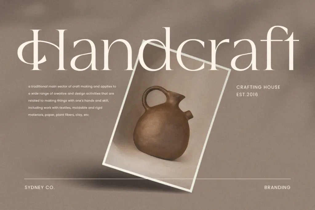
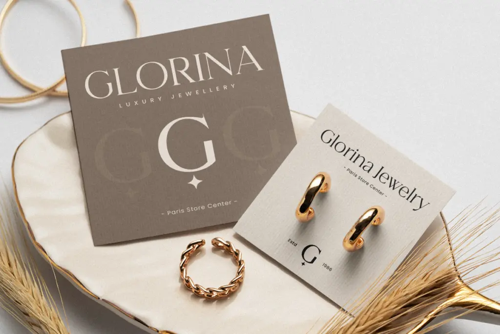
Montage’s natural home is short-form, large-scale text: logotypes, wordmarks, film and event titling, packaging for premium goods, invitation headers. Anywhere a brand wants to borrow a sense of old-world glamour without going full art-deco, this does the job efficiently. A perfume bottle, a boutique hotel sign, a wedding invitation’s opening line — all plausible fits.
It is not a font for body copy, and it shouldn’t be asked to do that job. The contrast that makes it striking at 120pt will fight the reader at 10pt; hairlines thin out, and the condensed set starts to feel cramped in long lines. Pair it with a quieter, lower-contrast typeface for supporting text, and let Montage carry only the headline or wordmark.
Designers working on luxury or heritage branding, or anyone building a one-off cinematic poster or title sequence, will get the most out of it. Anyone needing a flexible workhorse for varied applications — signage systems, UI, multi-weight branding — should look elsewhere, since Montage reads as a single, deliberate gesture rather than a toolkit.
What we liked, and what we didn’t
Strengths
- High-contrast strokes and sharp terminals give it real marquee presence at large sizes
- Condensed proportions keep short wordmarks compact and controlled
- Format coverage (OTF, TTF, WOFF, WOFF2) means it drops into both print and web workflows easily
Trade-offs
- No indication of multiple weights or an extended alternate/ligature set, limiting design flexibility
- High contrast and tight spacing make it unsuitable below display sizes without careful kerning
Montage is a confident, narrow-focus display serif that does old-Hollywood glamour convincingly at large sizes. It's the right tool for a wordmark or poster title, and the wrong one for anything approaching body text.

Tmfonts writes independent reviews of typefaces: what each font does well, where it falls short, what it suits, and where it is sold.