
Oruguitas Font Free Download
Is Oruguitas free to download?
Oruguitas is a commercial font sold on Creative Market, so the full version needs a paid license. Get it from the official listing: Oruguitas font download.
Need something free? These serif fonts from Google Fonts are free for personal and commercial use:
Design style
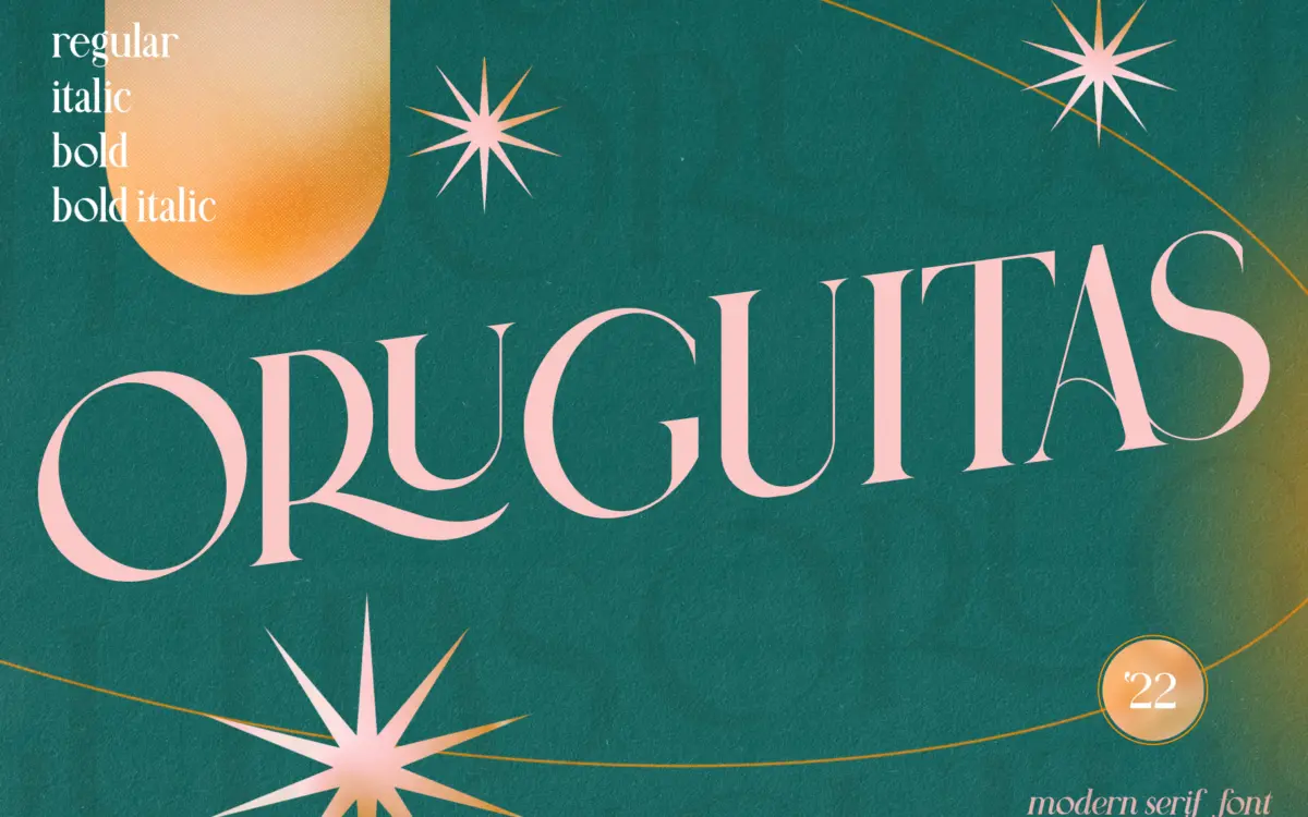
Oruguitas sits in the high-contrast modern serif camp: thin hairlines snap against thick stems, giving the letterforms a sharpened, almost engraved quality. It reads as a descendant of classic serif structures but drawn with a lighter touch and a more decorative finish. The contrast is the whole personality here — take it away and you’d have a fairly ordinary serif skeleton. With it, the font gets a sense of occasion that plain serifs don’t have.
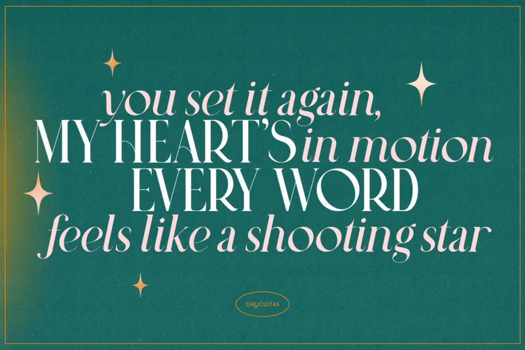
The italic is where the design earns its keep. It’s cut to work alongside the regular rather than as an afterthought, with enough shared DNA in the terminals and curves that switching between the two mid-sentence doesn’t feel like a style clash. That pairing logic is more considered than most single-family serifs bother with.

Character set and features
The headline feature is a set of twenty uppercase ligatures — AS, CO, EE, KI, LA, LE, LI, LO, LS, LU, OS, QU, RA, RE, RI, RO, RS, RU, TS, ZO. These are built for specific letter combinations rather than general use, so they only fire when the right pair shows up, which limits their reach but also means you don’t have to police them once they’re in. They’re clearly aimed at short, curated text — a name, a monogram, a headline — where a designer has time to look at every letter pair rather than an auto-set paragraph.
The thin strokes are the obvious risk. At small sizes or in a low-contrast print run, those hairlines can drop out or thin to invisibility, and the seller’s claim of retained readability at small sizes should be tested against your actual output method before you commit a whole layout to it. This is a font that wants generous point sizes and clean reproduction — screen at low DPI or a cheap photocopy will not flatter it.
There’s no mention of extended language support or a broader weight range, so treat this as a two-style family — regular and italic — rather than a full system with multiple optical sizes. That’s fine for what it’s built to do, but it does mean you won’t be reaching for it to solve a whole brand’s typographic needs on its own.

Use cases
Oruguitas is a display-leaning serif, and it performs best where it’s asked to do a small amount of work at a large size: an invitation headline, a monogram lockup using those ligatures, a logotype, packaging that leans luxury, or an editorial title where a few words carry a lot of visual weight. The regular and italic pairing gives you a built-in way to add emphasis — a name in regular, a date or tagline in italic — without reaching for a second typeface.
It’s a poor fit for body text, long-form editorial copy, or anything that needs to survive small sizes and rough printing. Save it for the moments where a design gets one or two lines to make an impression, and let a plainer companion face carry the rest of the reading.
What we liked, and what we didn’t
Strengths
- The regular and italic styles are drawn to complement each other rather than as separate afterthoughts.
- Twenty targeted uppercase ligatures make monograms and short headlines feel deliberately composed.
- The bold-thin contrast gives it a distinct, occasion-ready character rather than a generic serif look.
Trade-offs
- The thin hairlines are vulnerable to dropping out at small sizes or in low-quality print.
- It's a narrow two-style family with no evidence of extended language support or additional weights.
Oruguitas is a sharp, high-contrast serif with a genuinely useful matching italic and a tidy set of uppercase ligatures for short, decorative text. It's not built for reading at length or at small sizes, so it earns its place as a headline and monogram font rather than a workhorse.

Tmfonts writes independent reviews of typefaces: what each font does well, where it falls short, what it suits, and where it is sold.