
Djore Font Free Download
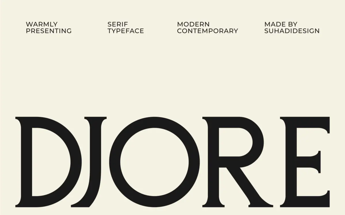
Is Djore free to download?
Djore is a commercial font sold on Creative Market, so the full version needs a paid license. Get it from the official listing: Djore font download.
Need something free? These serif fonts from Google Fonts are free for personal and commercial use:
Design style
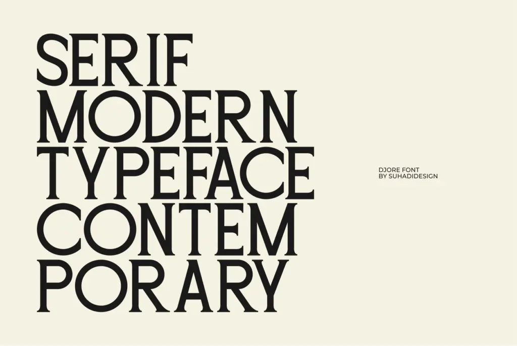
Djore sits in the current wave of high-contrast editorial serifs, the kind you see on fashion mastheads and boutique branding decks. The contrast between thick and thin strokes is pronounced but not extreme, giving the letters a slightly compressed, upright posture rather than the ballet-teacher elegance of a full didone. Terminals are clipped rather than bracketed into flourish, and the serifs themselves are short, flat, and unfussy — which is where the “minimal” claim actually earns its keep. There’s no attempt here at ornament or personality-driven quirks in the letter construction; this is a serif that wants to disappear into the layout rather than announce itself.
The x-height is moderate and the counters are kept open, which helps offset the thin strokes from closing up visually. It reads as confident but restrained, more suited to a quiet luxury brand than a loud one. Where it loses a bit of interest is in the lack of any distinguishing quirk — no unusual apex, no eccentric bowl — so at a glance it can blur into the broader field of similar fashion-serif releases currently crowding marketplace catalogues.
Character set and features
The set covers capitals, lowercase, numerals, and punctuation, with multilingual support extending its reach beyond a single-language market. There’s no mention of alternates, ligatures, or a small caps set, and nothing in the material suggests an extended weight range — this appears to be a single-style release rather than a family. That’s a meaningful limitation for anyone hoping to build a full identity system on it alone, since you won’t get a bold or light companion cut from the same shop to handle hierarchy.
The high-contrast strokes mean the font needs generous point size and careful tracking to hold its shape. At very small sizes the hairlines will thin out and lose definition on lower-resolution screens or cheap print stock, so this is not a body-copy font. It’s built for display and short-form editorial use, where the contrast reads as intentional rather than fragile.
Use cases
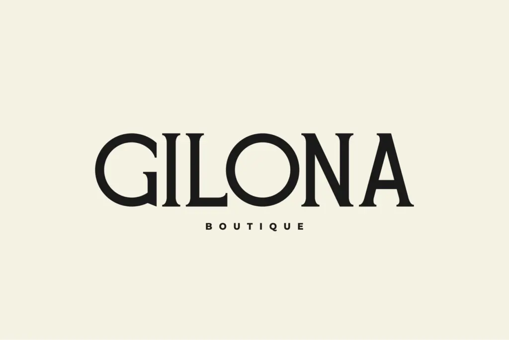
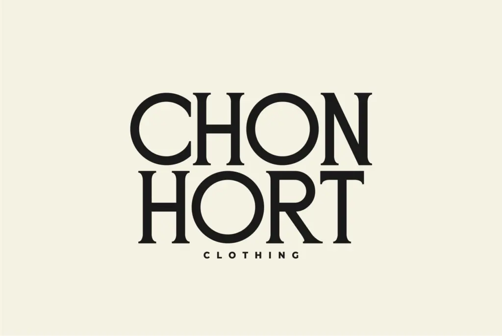
Djore’s natural home is headers: magazine mastheads, section dividers, pull quotes, and the kind of branding work that needs one confident line of type rather than paragraphs of it. It works well for logotypes and wordmarks in fashion, beauty, and lifestyle spaces where a quiet serif signals editorial credibility without shouting luxury. Business cards, invitation suites, and social graphics built around a single strong headline will all suit its proportions.
It’s less useful as a workhorse text face — the contrast and tight spacing make long-form reading tiring, and the absence of a bold or italic companion limits how far you can push it before you need to bring in a second typeface for body copy and supporting text. Treat it as a single, well-drawn accent rather than a full system, and it does its job cleanly.
What we liked, and what we didn’t
Strengths
- Short, flat serifs and open counters give it a restrained, editorial feel without excess ornament.
- Multilingual support extends its use beyond a single market.
- Reads clearly as a display face rather than a generic fashion-serif knockoff.
Trade-offs
- No bold, light, or italic companion, so it can't build a full type hierarchy alone.
- High contrast strokes thin out and lose definition at small sizes or on low-quality print.
Djore is a clean, quietly confident high-contrast serif suited to headers, logotypes, and editorial display work. It lacks the weight range or alternates to function as a full branding system on its own, and its thin strokes limit it firmly to large sizes. A solid single-purpose display face rather than a versatile family.

Tmfonts writes independent reviews of typefaces: what each font does well, where it falls short, what it suits, and where it is sold.