
Stipa Willington Font Free Download
Is Stipa Willington free to download?
Stipa Willington is a commercial font sold on Creative Market, so the full version needs a paid license. Get it from the official listing: Stipa Willington font download.
Need something free? These script fonts from Google Fonts are free for personal and commercial use:
Design style
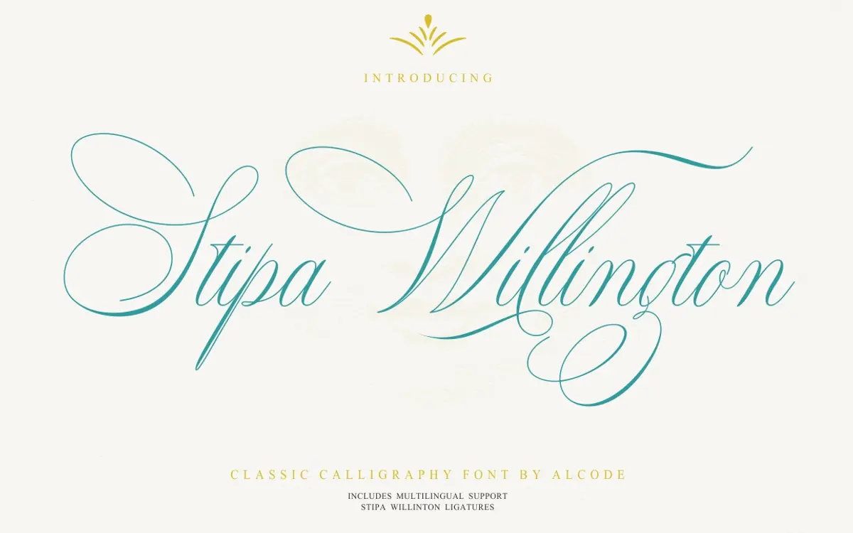
Stipa Willington sits in the crowded field of pointed-pen calligraphic scripts, but it leans more formal than most of its Creative Market peers. The strokes have a clear thick-thin contrast built from a flexible-nib model, with entry strokes that swing wide before settling into the letter. Ascenders and descenders loop generously, and the baseline has a gentle, controlled slant rather than the loose, bouncy angle you see in casual hand-lettered scripts. It reads as a font trying to split the difference between wedding-invitation formality and a slightly looser, more contemporary calligraphic feel, and it mostly succeeds, though the joins between some lowercase pairs can look a touch mechanical up close, betraying the vector origin rather than the hand.
The capitals are the most calligraphic part of the set, with swashed entries and flourished exits that work well as standalone initials but can feel heavy if several appear in the same line. Weight distribution is fairly consistent across the alphabet, which helps it hold together as a text-like script rather than fragmenting into a pile of individually pretty letters.
Character set and features
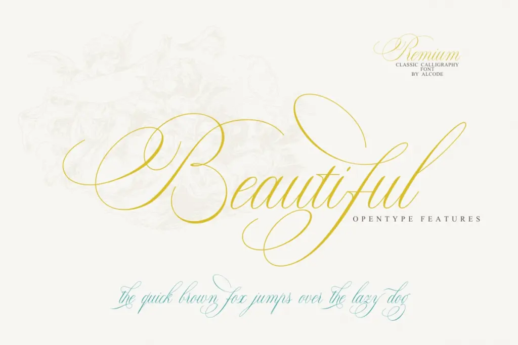
The font ships with a full set of upper and lowercase letters, numerals, and standard punctuation, along with OpenType ligatures and stylistic alternates for varying the more common letter shapes. This is where a script like this earns its keep: single-shape scripts repeat letters awkwardly, and the alternates give a working designer enough variation to break up repeated letters in a word without having to hand-kern swashes in manually. The ligatures cover some of the expected pointed-pen combinations, smoothing over what would otherwise be clunky joins.
Multilingual support is included, which matters for scripts destined for invitation and stationery work where accented characters show up constantly in names. Access to the alternates depends on software that reads OpenType features properly — Illustrator, InDesign, Photoshop, CorelDraw’s newer versions — and the seller notes a fallback through Font Book or Character Map for those without that support, which is worth knowing before you commit a layout to the default glyphs alone.
Use cases
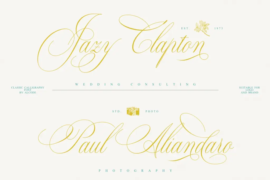
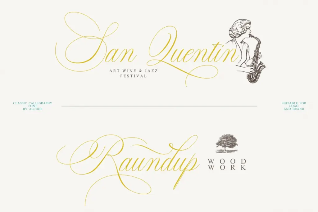
This is a font built for the classic script jobs: wedding invitations and save-the-dates, greeting cards, certificates, monograms, and branding that wants to signal tradition or luxury without going fully ornamental. It works best set large, as a headline or feature word, rather than run as body text, since the flourishes and joins need room to breathe. At small sizes on packaging or labels, some of the finer entry strokes will thin out and lose definition on lower-quality print stock, so test before committing to a small-format application.
For branding work, it pairs naturally with a plain sans or slab for supporting text, since its own personality is strong enough that it shouldn’t be asked to carry paragraphs. Anyone building a stationery suite, a certificate template, or a logotype with a formal, handwritten feel will find this a reasonable, workable choice, provided the software in use can access the alternates that make it feel less repetitive.
What we liked, and what we didn’t
Strengths
- Stylistic alternates and ligatures reduce repeated-letter monotony across a line
- Multilingual support makes it usable for names with accented characters
- Weight is consistent enough across the alphabet to hold together as a display script
Trade-offs
- Some lowercase joins look mechanically smoothed rather than genuinely calligraphic up close
- Fine entry strokes can lose definition at small sizes or on rougher print stock
Stipa Willington is a competent formal script that does what wedding and certificate work needs without reinventing the genre. The alternates and ligatures help it avoid the flat repetition that sinks simpler scripts, but some joins still read as vector-smooth rather than hand-drawn under close inspection. Solid, not remarkable.

Tmfonts writes independent reviews of typefaces: what each font does well, where it falls short, what it suits, and where it is sold.