
Oldforge Font Free Download
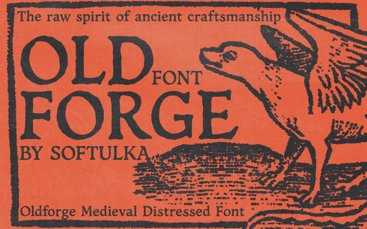
Is Oldforge free to download?
Oldforge is a commercial font sold on Creative Market, so the full version needs a paid license. Get it from the official listing: Oldforge font download.
Need something free? These display fonts from Google Fonts are free for personal and commercial use:
Design style
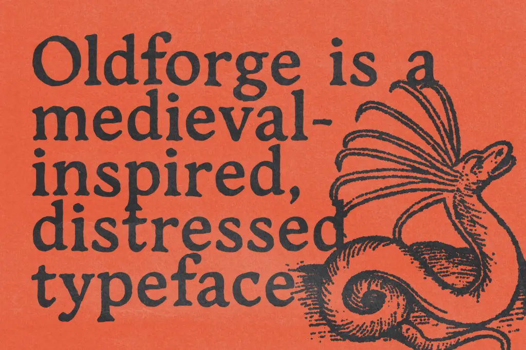
Oldforge belongs to the well-worn category of distressed medieval display faces, the kind meant to evoke hand-forged signage, weathered stone carving, or a manuscript left in a damp cellar for a few centuries. The letterforms lean on irregular strokes and broken edges rather than a consistent stroke model, so there is no real contrast logic here in the type-design sense — the roughness itself is the design idea. Curves wobble slightly off their arcs, corners chip, and the baseline has a deliberate unevenness that reads as handcraft rather than error.
This is a typeface built for one job at a large size, not for a flexible system. The distressing is baked into the outlines, which means every instance of a given letter looks the same — repeated letters in a word will show the identical chips and breaks, which can flatten the handmade illusion once you notice it. That is a common limitation of distressed display fonts generally, and Oldforge does not escape it.
Character set and features
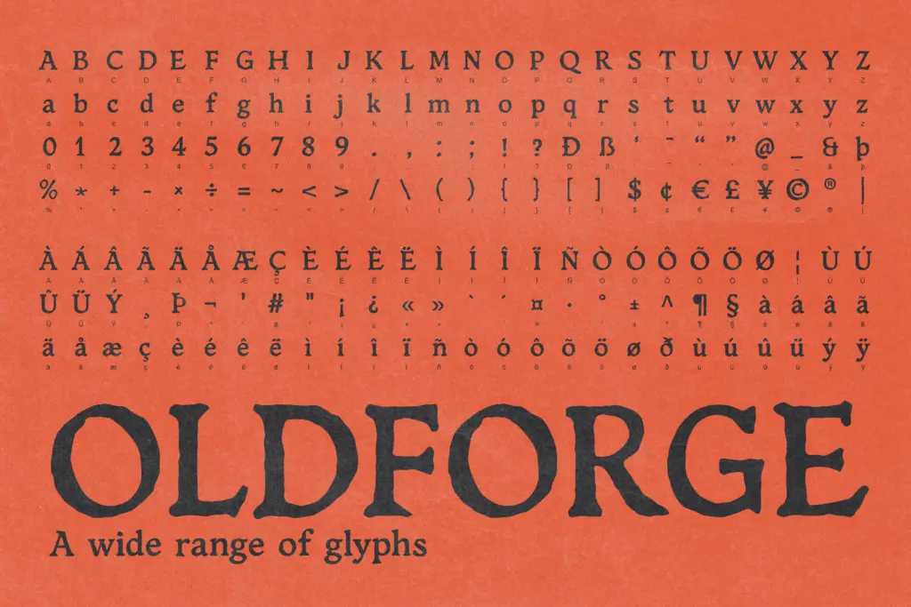
As a script-adjacent medieval display face, Oldforge is built around dramatic, chunky forms rather than fine detail. The letters carry enough irregularity that spacing needs attention — distressed edges can create false gaps or false collisions between neighbouring characters, so setting anything longer than a title or short phrase requires manual kerning checks rather than trusting the metrics as delivered. The seller does not specify ligatures, alternates, or extended language support, so treat this as a display-only Latin set until proven otherwise, and don’t plan on it for anything beyond basic punctuation and numerals.
The format spread (OTF, TTF, WOFF) covers desktop and web use without much fuss, which is useful since this kind of face tends to end up on both a book cover and a landing page banner for the same project.
Use cases
Oldforge is suited to short, loud settings: a game logo, a fantasy novel’s title treatment, a poster headline, a tavern sign in an illustration. It wants to be big. At body text sizes the chipped edges and irregular strokes will muddy legibility fast, so this is not a face for paragraphs, captions, or anything a reader needs to move through quickly.
It pairs naturally with projects already committed to a rustic or ancient aesthetic — parchment textures, ink illustrations, worn leather — where the distressing reinforces a mood the rest of the design has already established. Dropped into a clean, modern layout, it will read as costume rather than character, so the surrounding design needs to meet it halfway.
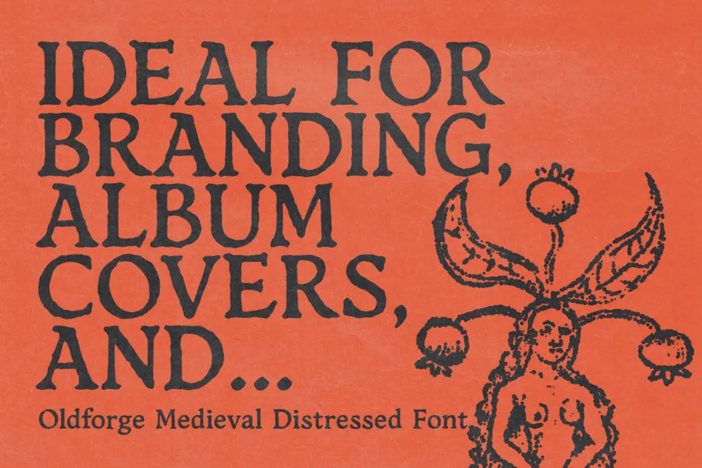
For branding, it works best as a wordmark rather than a full identity system, since the lack of companion weights or a matching text face means someone will need to source a plainer serif or slab for supporting copy. Game studios, indie publishers, and event branding for medieval or fantasy themes are the realistic buyers here — anyone needing a face that also has to behave in a spreadsheet or an annual report should look elsewhere.
What we liked, and what we didn’t
Strengths
- Strong, immediate medieval-carving mood at large display sizes
- Ships in the formats needed for both print and web use
- Distressing is baked in, so no extra texture work is needed for a quick mockup
Trade-offs
- Repeated letters show identical distressing, which can undercut the handmade illusion in longer words
- Legibility drops off fast below display sizes, ruling out body text entirely
Oldforge does one thing — loud, weathered, medieval-flavoured headlines — and does it with conviction. It is not built for body copy, extended language use, or flexible branding systems, so buy it knowing exactly which job it is for.

Tmfonts writes independent reviews of typefaces: what each font does well, where it falls short, what it suits, and where it is sold.