
Hot Rush Font Duo Free Download
Is Hot Rush Font Duo free to download?
Hot Rush Font Duo is a commercial font sold on Creative Market, so the full version needs a paid license. Get it from the official listing: Hot Rush Font Duo download.
Need something free? These sans serif fonts from Google Fonts are free for personal and commercial use:
Design style
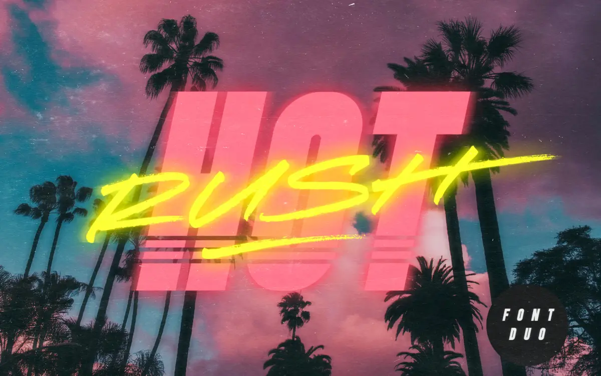
Hot Rush is built for one job: retro impact. The duo pairs a condensed, uppercase-only sans with a marker-drawn script, and the styling leans hard into 80s signage and airbrushed van art rather than anything restrained. The sans is blocky and tight, with squared proportions that give it the kind of poster weight you’d expect from a synthwave flyer or a VHS title card. The striped variant pushes that further, running vertical lines through each letterform for a chrome-and-neon effect that only works at large sizes.
The script half is the more interesting drawing of the two. It reads as genuinely hand-made — the marker texture is visible in the stroke, and the pen angle shifts believably as it moves through ascenders and descenders. It’s fast and loose rather than formal, closer to a skateboard deck logo than a wedding suite. The two halves share a confident, unfussy energy, and the pairing logic is sound: sans for structure, script for flourish.
Character set and features
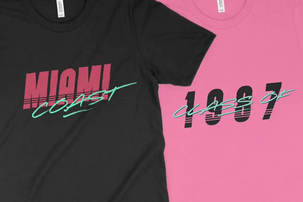
Both families are uppercase-only, which is worth knowing before you commit type to a layout — there’s no lowercase to fall back on for body copy or long headlines. The script gets around this cleverly: switching to lowercase input swaps in an alternate set of uppercase forms, effectively giving you two distinct letter styles within one font file, useful for adding variation across a word or a line without touching OpenType palettes.
Numerals and punctuation are covered across all styles, so dates, prices and short taglines are usable. The script also includes end forms for ten letters — A, C, E, F, G, H, K, L, R and T — which stretch into elongated horizontal strokes. These are clearly designed as word-finishers, and they do the job of adding a bit of swagger to a sign-off letter without needing a separate ligature system to trigger them.
Italic versions ship for both the plain and striped sans, which is a practical inclusion — it means you get some typographic contrast within the sans family itself, rather than relying on the script for every secondary element. There’s no mention of extended language support, so treat this as a Latin-alphabet, English-market tool rather than something with broader multilingual reach.
Use cases
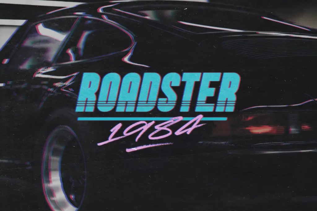
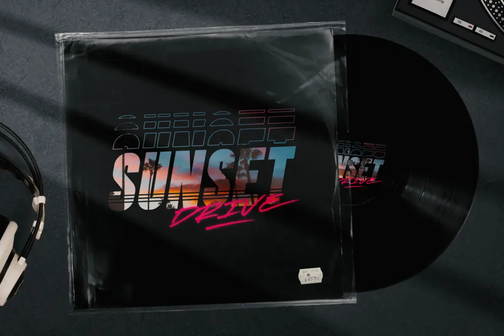
This is a display duo, not a text system, and it knows it. The sans handles short headlines, badges and logotypes where condensed width and bold presence matter. The striped version is a novelty layer best used sparingly — a single word on a poster, not a paragraph. The script is where the personality lives, and it’s suited to signatures, product names, and the kind of one-line statement that needs energy over legibility.
Put together, Hot Rush suits retro branding, band merchandise, packaging with a nostalgic angle, and social graphics chasing an 80s aesthetic. It’s not built for editorial layouts, long-form headlines, or anything needing lowercase reading text — ask it to do that and the uppercase-only constraint will show quickly. Within its lane, though, the sans-and-script combination does exactly what it promises.
What we liked, and what we didn’t
Strengths
- The marker-drawn script has convincing hand-made texture and stroke variation
- Lowercase input on the script unlocks a genuinely useful second set of alternate capitals
- End forms on ten script letters add flourish to word endings without extra setup
Trade-offs
- Both families are uppercase-only, ruling out any lowercase reading text
- The striped sans variant is a novelty effect that only holds up at large display sizes
Hot Rush is a confidently drawn retro duo that does one thing well: loud, nostalgic display text. It's not built for reading text or multilingual work, but for logos, merch and packaging chasing an 80s look, it delivers exactly what it advertises.

Tmfonts writes independent reviews of typefaces: what each font does well, where it falls short, what it suits, and where it is sold.