
Vena Amoris Font Free Download
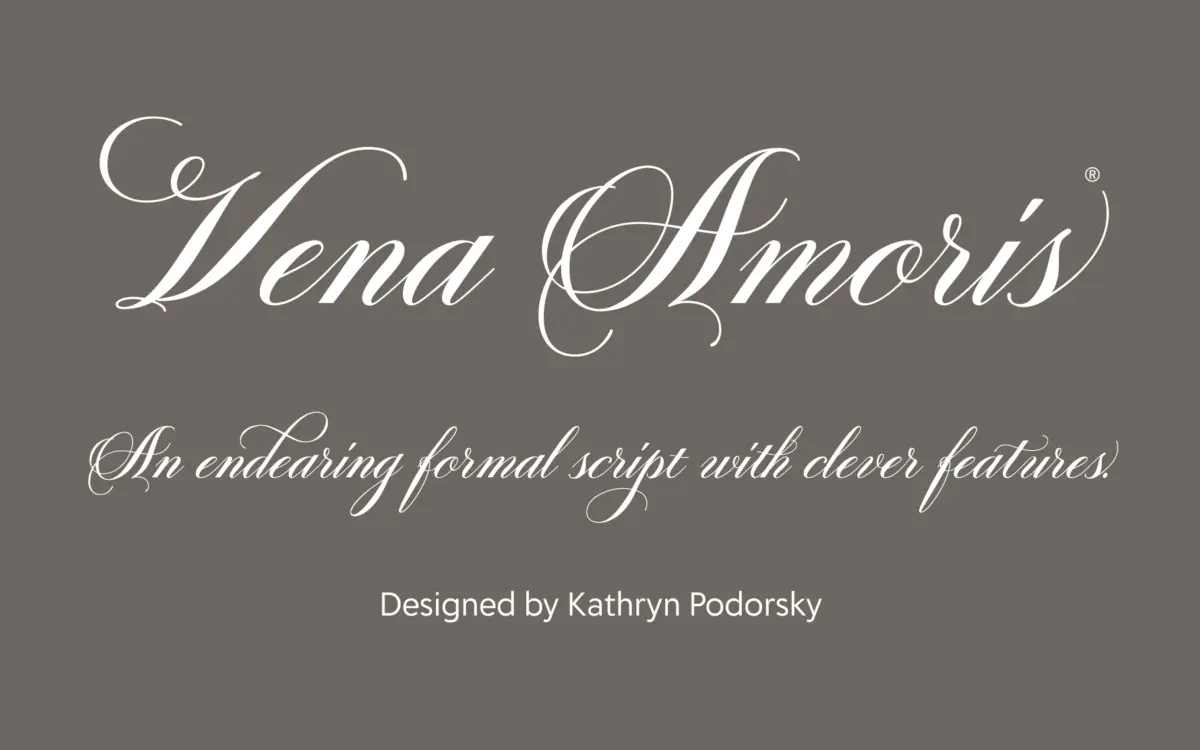
Is Vena Amoris free to download?
Vena Amoris is a commercial font sold on Creative Market, so the full version needs a paid license. Get it from the official listing: Vena Amoris font download.
Need something free? These script fonts from Google Fonts are free for personal and commercial use:
Design style
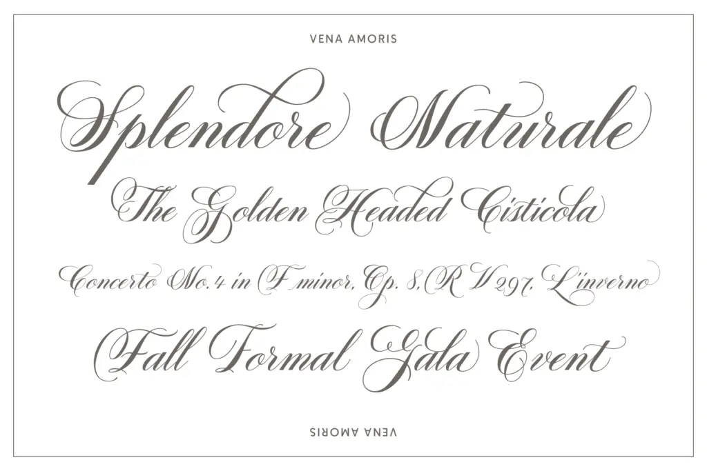
Vena Amoris sits in the copperplate tradition: high contrast strokes, a pronounced slant, and the kind of pointed-pen flourish you’d expect from a 19th-century correspondence hand. The brief cites a love letter as its reference, and that shows in the way the connections between letters loop and thin out rather than snap to a grid. It’s romantic without tipping into fussy — the baseline stays disciplined even when the swashes above and below it get busy.
What separates it from a generic script is the swash system. Capitals carry long entry and exit strokes that can extend well past the letter’s own width, and the lowercase has enough calligraphic variation between contextual forms that a repeated letter, say a double ‘l’ or ‘ss’, doesn’t look mechanically duplicated. The slant is consistent throughout, which keeps the whole thing from feeling assembled from mismatched parts, a common failure in scripts that pile on alternates without controlling the skeleton underneath.
Character set and features
The OpenType feature set is where this font earns its keep. Stylistic alternates and contextual alternates work together so that letterforms shift based on what precedes or follows them, which is the only way a connected script avoids collisions at certain letter pairings. Positional forms — initial, isolated, and final — reinforce this, giving the font a legitimate claim to reading as handwriting rather than a font that merely looks like handwriting.
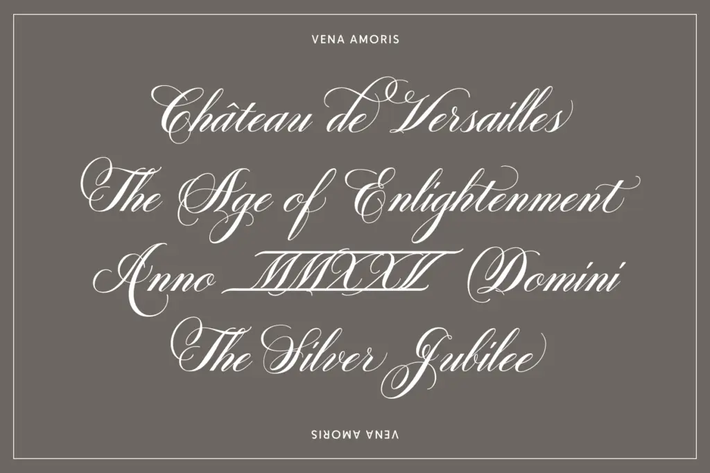
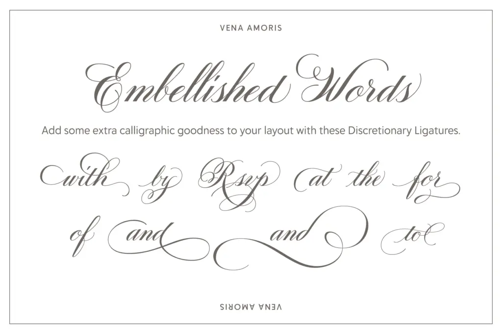
Standard and discretionary ligatures, catch words, and calligraphic word presets extend the set further; these are pre-built combinations designed to look like a single confident pen stroke rather than two letters glued together. Oldstyle figures and roman numerals round out the numeral set, both useful for dates on invitations and anniversary pieces. Language support is broad — the seller notes coverage across a large range of Latin-script languages — which matters more than it sounds for anyone setting names with diacritics.
None of this is automatic, though. A script this dependent on OpenType features will look flat and slightly awkward in software that doesn’t support ligatures, alternates, and contextual substitution. Anyone setting type in a stripped-down tool, or exporting to a format that ignores OpenType, will get a much plainer result than the specimen promises.
Use cases
This is a script built for occasions, not paragraphs. Wedding invitations are the obvious home — the swash caps and catch words are clearly designed with a bride’s or groom’s initials in mind — but it works equally well for anniversary announcements, formal branding marks, and any place a single word or short phrase needs to carry warmth and formality at once. Logotypes for boutique businesses, perfumeries, and stationery brands would all suit its register.
It is not a body text font and shouldn’t be asked to be one; copperplate scripts lose all their charm and most of their legibility below display sizes or in dense settings. Keep it to headlines, monograms, and short-form copy, paired with a plainer typeface for anything that needs to be read quickly, and it does exactly the job it was drawn for.
What we liked, and what we didn’t
Strengths
- Contextual and positional alternates make repeated letters look genuinely handwritten rather than duplicated
- Swash caps and catch words give strong options for monograms and short branding phrases
- Broad language support with diacritics handled cleanly
Trade-offs
- Requires OpenType-aware software to show its alternates and ligatures, or it reads flat
- Not suited to anything beyond short headlines and display use — legibility drops fast at small sizes
Vena Amoris delivers a genuinely well-drawn copperplate script with a feature set that rewards anyone willing to use OpenType properly. It's a strong pick for wedding stationery, monograms, and short branding marks, but it needs the right software to show its full range and it has no ambition to be anything but a display script.

Tmfonts writes independent reviews of typefaces: what each font does well, where it falls short, what it suits, and where it is sold.