
Suite Home Font Free Download
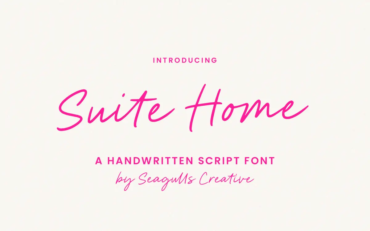
Is Suite Home free to download?
Suite Home is a commercial font sold on Creative Market, so the full version needs a paid license. Get it from the official listing: Suite Home font download.
Need something free? These handwritten fonts from Google Fonts are free for personal and commercial use:
Design style
Suite Home sits in the casual end of the handwritten script category, the kind of lettering that reads as a quick, confident pen stroke rather than a formal calligraphic hand. The letters lean slightly, joins are loose rather than continuous, and there’s a bounce to the baseline that keeps lines of text from feeling stiff. It doesn’t chase the polished, high-contrast look of a pointed-brush script; the strokes stay fairly even in weight throughout, which is part of what makes it feel more like handwriting and less like lettering art.
That evenness is a trade-off. Scripts with more contrast between thick downstrokes and thin upstrokes tend to carry a sense of occasion — think wedding stationery, formal invitations. Suite Home reads more relaxed than that, closer to a note scrawled on packaging or a quick signature under a logo mark. It has personality, but it’s an informal one, and it won’t stretch convincingly into anything that needs gravitas.
Character set and features
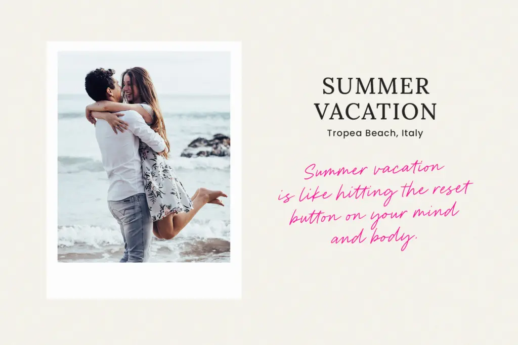
The font includes a full set of letters, numbers, punctuation and symbols, along with ligatures for common letter pairings. The ligatures matter more than they might in a straighter script, since the joining strokes are what sell the handwritten illusion — without them, some pairings would look stitched together rather than written in one pass. Multilingual character support is included, which extends the font’s usefulness beyond English-only projects without requiring a separate purchase.
It’s built as a single-weight OTF rather than a family with multiple weights or an accompanying sans, so there’s no built-in hierarchy tool here. If you need a heavier version for emphasis or a lighter one for body copy, you’ll be sourcing that from elsewhere. What you do get works reliably across the standard design applications and, notably, in Word — a small thing, but it matters for anyone handing files off to non-designers.
Use cases
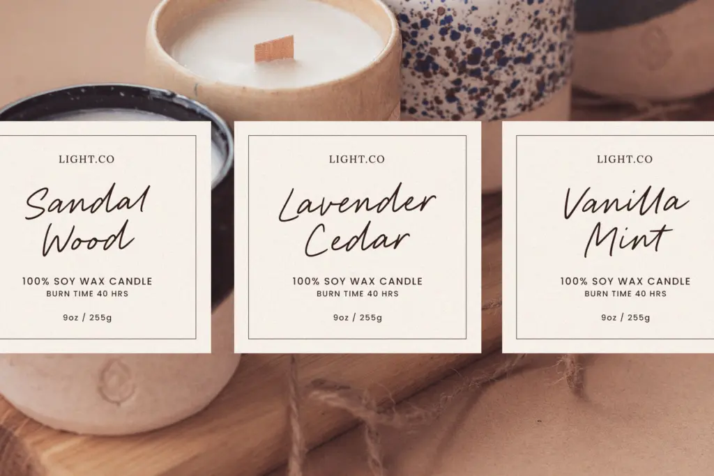
This is a font for short bursts of text: a product name on packaging, a signature line, a headline on a social post, a logotype for a small business that wants to feel personal rather than corporate. It’s well suited to branding work where the brand voice is warm and approachable — bakeries, home goods, boutique studios, the kind of business the name itself suggests.
It’s less suited to paragraph-length copy. Like most handwritten scripts, legibility drops as the text block grows; readers tolerate a script for a headline or a few words, not for a caption of three sentences. Keep it to short phrases and let a companion sans or serif carry the reading text, and it does its job well. Push it further than that and the casual charm starts working against comprehension.

What we liked, and what we didn’t
Strengths
- Loose, even-stroke joins give it a genuine handwritten feel rather than a lettered one.
- Ligatures are included and do real work holding the illusion together.
- Multilingual character support extends its use beyond English-only branding.
Trade-offs
- Single weight with no companion family limits its use for hierarchy.
- Legibility falls off quickly beyond short phrases or headlines.
Suite Home is a competent casual script that does one job well: short, warm, handwritten-feeling text for branding and social use. It doesn't offer the range or refinement to carry bigger projects on its own, but for what it's built for, it delivers cleanly.

Tmfonts writes independent reviews of typefaces: what each font does well, where it falls short, what it suits, and where it is sold.