
Cammron Font Free Download
Is Cammron free to download?
Cammron is a commercial font sold on Creative Market, so the full version needs a paid license. Get it from the official listing: Cammron font download.
Need something free? These serif fonts from Google Fonts are free for personal and commercial use:
Design style
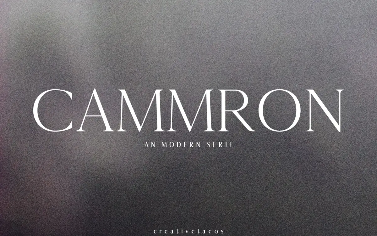
Cammron is a display serif built around tall, narrow proportions and a fairly even stroke contrast — nothing dramatic in the thick-thin relationship, which keeps it from tipping into the fashion-editorial territory some serifs chase. The terminals are cut cleanly, mostly flat with a few soft tapers on the lowercase, and the overall impression is tidy rather than expressive. It reads as a font drawn for headline duty first: capitals carry most of the personality, with slightly flared serifs that give it a bit of formality without going ornamental.
The four weights on offer — Regular, Light, Round and Bold — don’t behave like a true optical family so much as four related but distinct moods. Round softens the serif terminals into something closer to a slab-lite feel, which is a useful variant but also signals that this isn’t a rigorously interpolated system. Designers who need weights to sit on a single consistent grid for, say, a multi-level type hierarchy should test them side by side before committing, since the shifts between styles are more stylistic than mechanical.
Character set and features
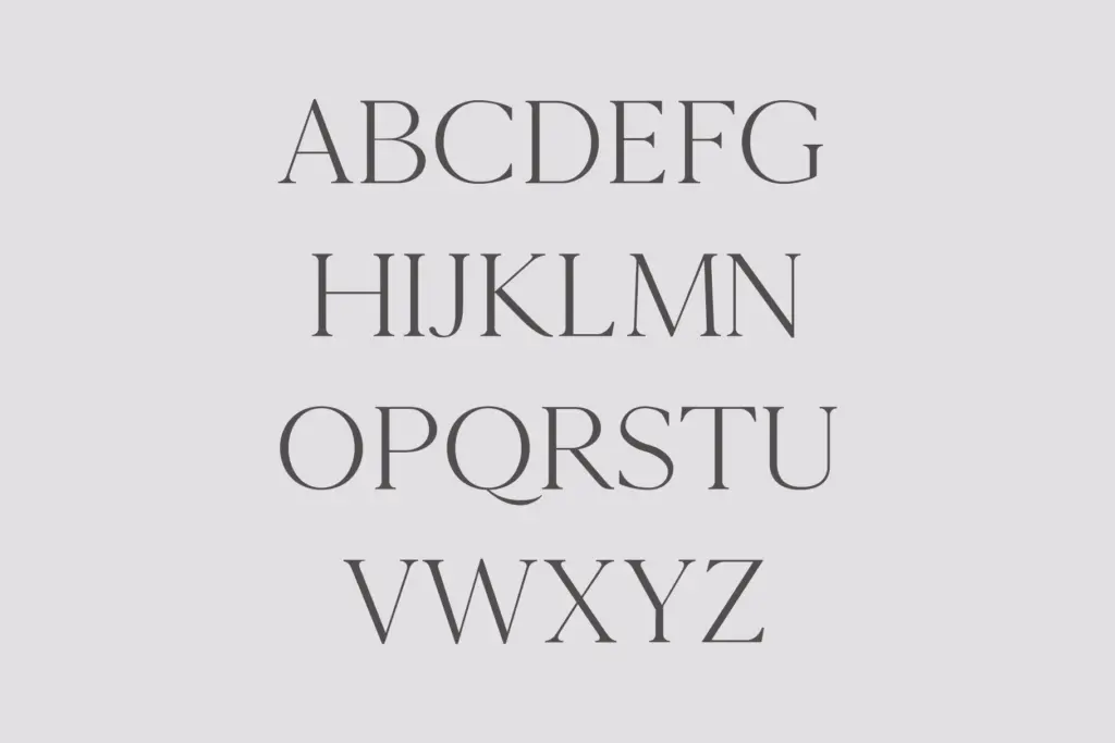
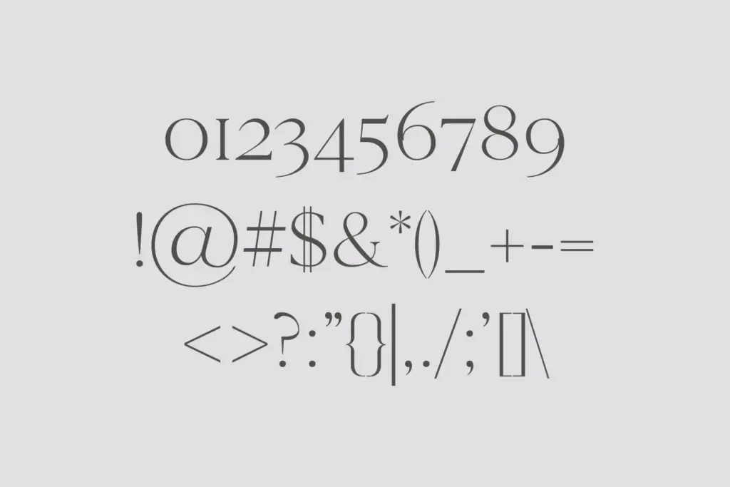
The set covers uppercase and lowercase Latin, numerals, basic punctuation, and Latin Extended-A characters for broader European language support. That’s a workable range for branding and editorial headline work, but it stops short of small caps, old-style figures, ligatures, or alternate character sets — features that would matter if you’re setting anything beyond a few words at a time. There’s no mention of extensive OpenType substitution, so treat this as a font for short strings: names, titles, product labels, not paragraphs.
At smaller sizes the narrow letterforms start to feel cramped, particularly in the Bold weight where strokes thicken but the width doesn’t open up to compensate. This isn’t unusual for a headline serif, but it does mean Cammron belongs above body-copy size — think 24pt and up rather than running text. The Light weight is the most legible of the four at moderate sizes; Bold is the one to reach for only when you need real visual weight in a single word or short phrase.
Use cases
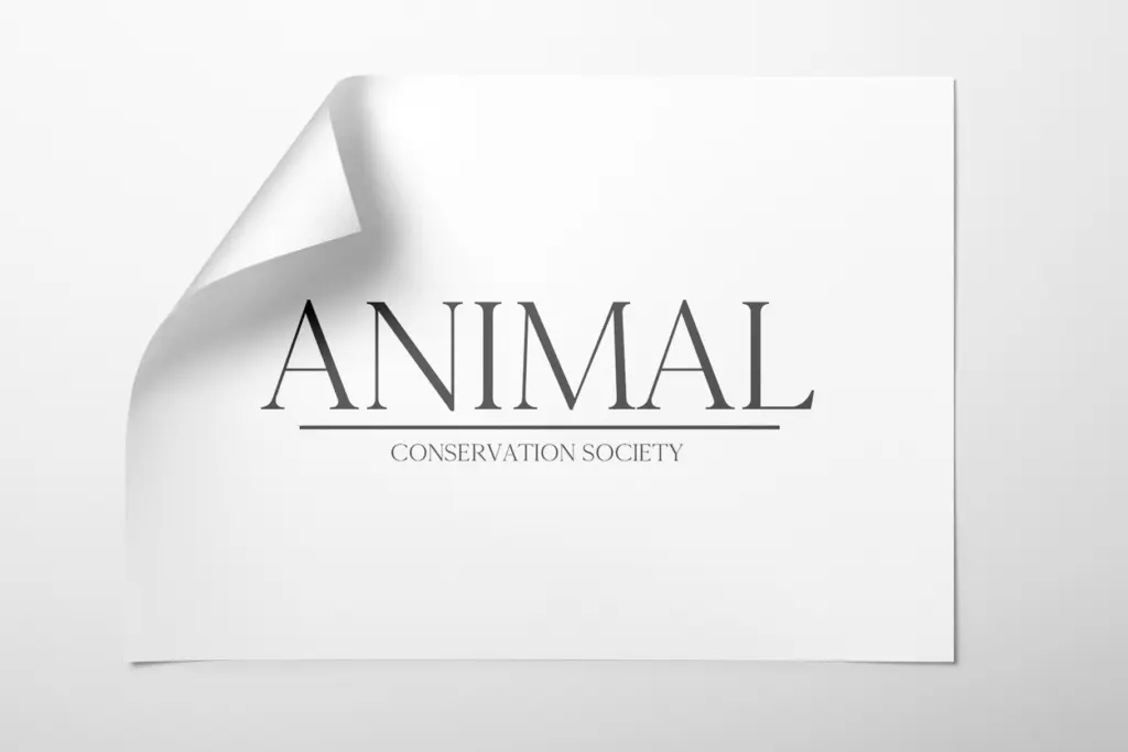
Cammron is suited to the jobs its narrow, formal serif shapes naturally support: logotypes, magazine mastheads, poster headlines, packaging labels, and invitation typesetting where the copy is short and the emphasis is on tone rather than density. The seller’s suggestion to pair it with a script or handwriting face for contrast is sound advice — Cammron’s straight-laced formality benefits from something looser alongside it to avoid feeling stiff on its own.
It’s less suited to long-form editorial layouts, UI text, or anything requiring nuanced typographic control through OpenType features. Buyers looking for a flexible workhorse serif with a deep feature set should look elsewhere; buyers looking for a no-fuss, slightly formal display serif for branding and short-copy design work will find Cammron does that job without complication.
What we liked, and what we didn’t
Strengths
- Clean, formal serif shapes that read well in short headline strings.
- Four distinct weights, including a softened Round variant with slab-like terminals.
- Latin Extended-A support broadens usability across European languages.
Trade-offs
- No small caps, ligatures or alternate characters limit typographic flexibility.
- Narrow letterforms feel cramped at smaller sizes, especially in the Bold weight.
Cammron is a competent, slightly formal display serif that does headline and branding work without fuss. It's narrow feature set and lack of true optical interpolation across weights limit it to short-copy jobs, but within that lane it performs reliably.

Tmfonts writes independent reviews of typefaces: what each font does well, where it falls short, what it suits, and where it is sold.