
Winner Sans Font Free Download
Is Winner Sans free to download?
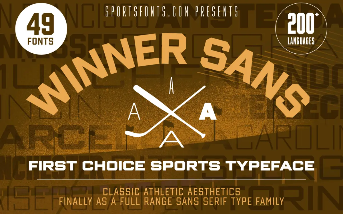
Winner Sans is a commercial font sold on Creative Market, so the full version needs a paid license. Get it from the official listing: Winner Sans font download.
Need something free? These sans serif fonts from Google Fonts are free for personal and commercial use:
Design style
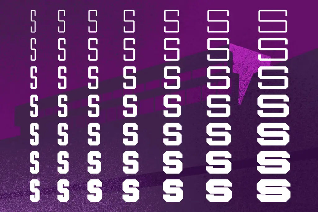
Winner Sans belongs to the family of collegiate, jersey-block letterforms — the kind of shapes you’d expect stitched across a chest number or stamped on a varsity crest. But this isn’t a single stencil-style display face; it’s a full system of seven weights across seven widths, engineered with the geometric squareness and even stroke modulation that defines athletic branding. The counters are open, the terminals mostly blunt and confident, and the overall skeleton reads as unmistakably ‘sport’ without tipping into pastiche. What sets it apart from a one-off jersey font is the range: at the condensed end it compresses into tight column widths for stat tables and rosters, while the extended widths widen out into something closer to a bold poster face. A serif companion sits alongside the sans, sharing the same proportions, which means designers can move between the two without breaking the visual system.
Character set and features
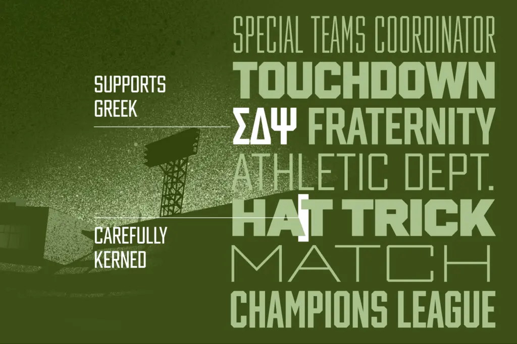
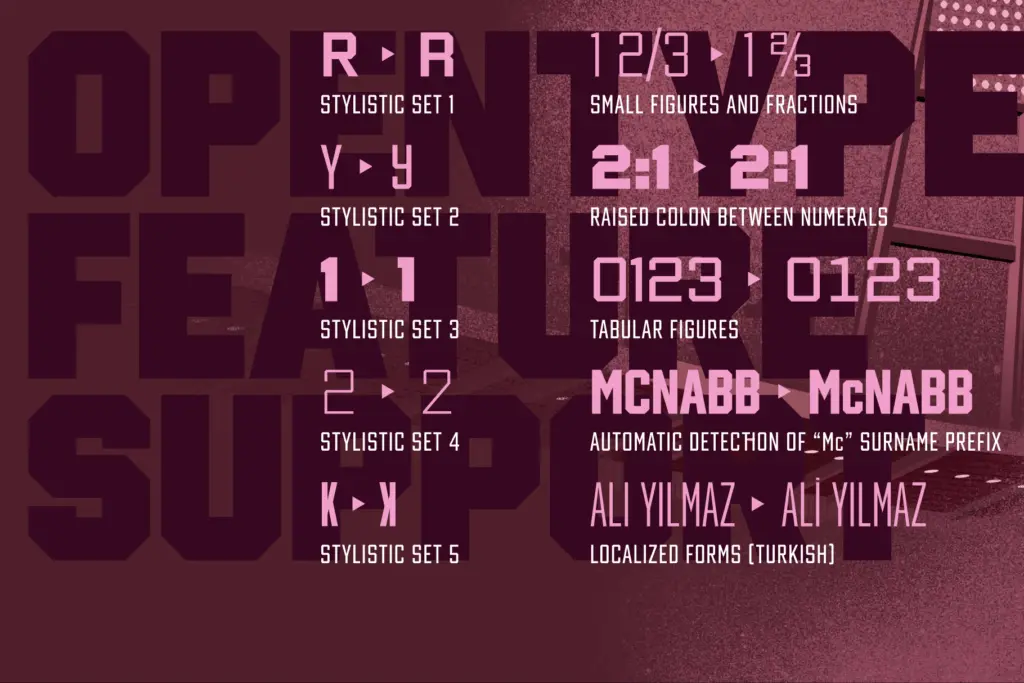
The technical scope here is considerable — more than 24,000 glyphs spread across 49 fonts is not a boast most display families can make. Latin language coverage is broad, and Greek is included too, which matters if a project needs to hold multilingual sports content without swapping typefaces mid-layout. Numerals get particular attention: small figures, tabular figures for scoreboards and standings, and a set of Roman numerals for anniversary marks or championship years. Currency signs and arrows round out the practical symbol set, useful for merchandise pricing or directional signage in stadium environments. OpenType support includes alternate letterforms, fractions, and contextual alternates, so the family isn’t just wide in weight and width but also flexible in texture — a designer can dial in a slightly different personality for a logotype versus a body of running text without leaving the family. The trade-off with a set this large is that no single style feels handpicked for a singular mood; everything here is built for combinatorial use, which rewards someone willing to actually explore the matrix rather than defaulting to the first bold condensed cut.
Use cases
This is squarely a branding and identity tool for anything with an athletic or collegiate register: team crests, kit numbering, sports apparel, league branding, scoreboard graphics, and merchandise. The width range makes it genuinely useful for editorial sports pages too — condensed cuts for headline stacks in narrow columns, extended cuts for splash pages and posters. The serif companion opens up secondary applications: certificates, retro varsity badges, or anywhere a text companion to the sans is needed without introducing an unrelated typeface. It is less suited to quiet, neutral interface work — the shapes carry too much sporting connotation to disappear into a UI — and less useful for anyone who only needs a single weight for a one-off logo, since the value of the family lies in its full range rather than any individual cut.
What we liked, and what we didn’t
Strengths
- Seven weights across seven widths gives real range from scoreboard tables to poster headlines
- Matching serif companion shares proportions for consistent secondary use
- Extensive numeral sets, including tabular and Roman figures, suit real sports data work
Trade-offs
- The jersey-block aesthetic is strongly typed and won't suit neutral or non-sporting branding
- With 49 fonts to sort through, finding the right cut takes more deliberate exploration than a smaller family
Winner Sans is a well-engineered athletic type system rather than a single characterful face — its strength is breadth of weight, width, and glyph coverage rather than any one standout cut. It suits sports, collegiate, and merchandise branding extremely well, and less so anyone needing a quiet, neutral workhorse.

Tmfonts writes independent reviews of typefaces: what each font does well, where it falls short, what it suits, and where it is sold.