Sans Serif
3.9
PressBox Font Combo: a letterpress-style trio for vintage poster work
Design style PressBox is built around the look of old metal type shops: wood-block posters, hand-set job printing, the kind…
 Tmfonts

Design style PressBox is built around the look of old metal type shops: wood-block posters, hand-set job printing, the kind…
Tmfonts
Design style Butter And Crumb is a two-part set built around deliberate imperfection. The caps face is a rough, wobbly…
Tmfonts
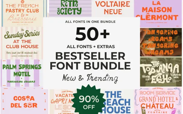
Design style This isn’t a single typeface so much as a shelf of them. The bundle gathers more than fifty…
Tmfonts
Design style Officially Funky bills itself as a font duo but arrives as a single character set: a plain, geometric-leaning…
Tmfonts
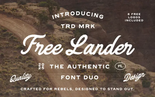
Design style Free Lander pairs two typefaces built to work as a set rather than stand alone. The script half…
Tmfonts
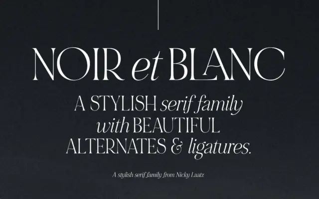
Design style NOIR et BLANC is built as a contrast pair rather than a single alphabet. The upright serif carries…
Tmfonts
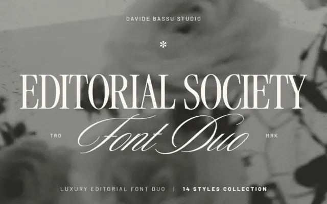
Design style Editorial Society pairs a restrained serif with a handwritten script, and the pairing is the point. The serif…
Tmfonts
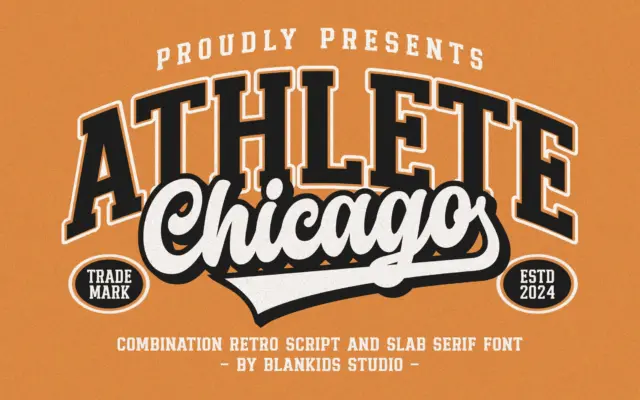
Design style Chicago Athlete pulls from collegiate athletic lettering: the block-letter jerseys, the stitched patches, the varsity jacket chest logo.…
Tmfonts
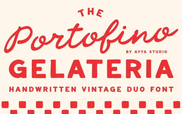
Design style Portofino Gelateria is built around a familiar but well-executed idea: a loose, handwritten script paired with a plainer…
Tmfonts