
VINTAGEST: a flat-pen retro script for signatures and short lines
Design style
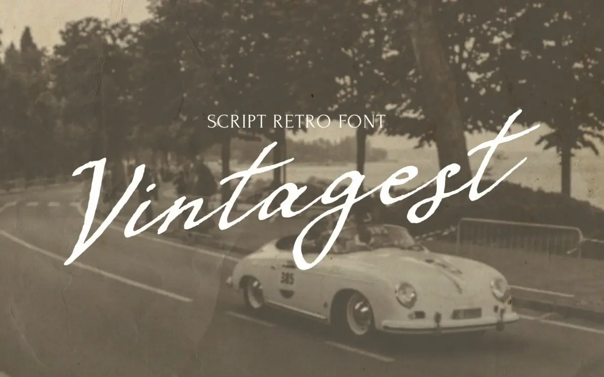
VINTAGEST reads as a flat-pen script rather than a brush or a ballpoint one. The strokes carry a consistent, slightly angular contrast that comes from the chisel edge of the nib, not from pressure — you can see the pen rotate through joins rather than swell and taper the way a brush script does. That gives it a stiffer, more deliberate feel than most retro scripts on the market, closer to a careful hand at a writing desk than a flourish. The letters lean forward moderately, joins are tight, and the baseline wanders just enough to read as handwritten without looking sloppy. It’s a font with a mood — formal, a little old-fashioned, not playful.
Character set and features
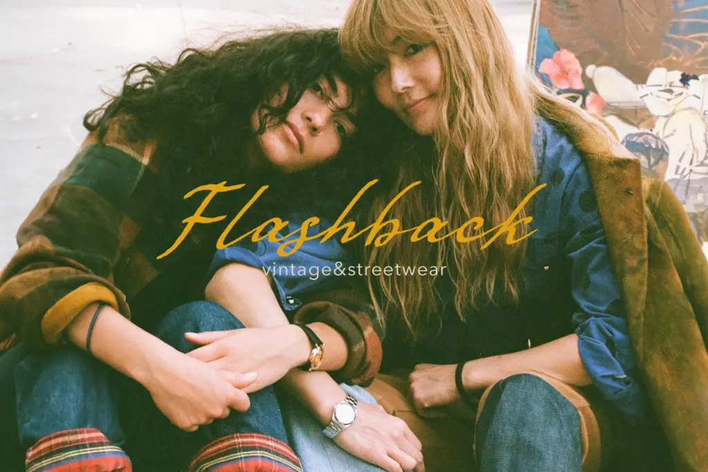
The face is built around ligatures and alternate characters, which is the right call for a connecting script: without them, awkward letter pairs would break the illusion of a continuous hand. In practice this means the font rewards use in an application that supports OpenType features (Illustrator, InDesign, most modern web setups) rather than a plain text box, where you’ll only get the default glyphs and the joins will look flatter and more mechanical. Cyrillic support is included alongside a solid range of Latin-based European languages, which is worth noting if your work spans those markets — scripts with full Cyrillic sets are still less common than they should be. There’s no indication of a companion sans or serif, so pairing decisions are left to the user; a plain, quiet sans is the safer bet given how busy the script already is.
Use cases
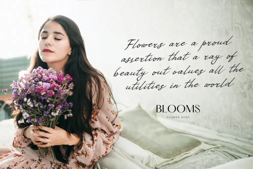
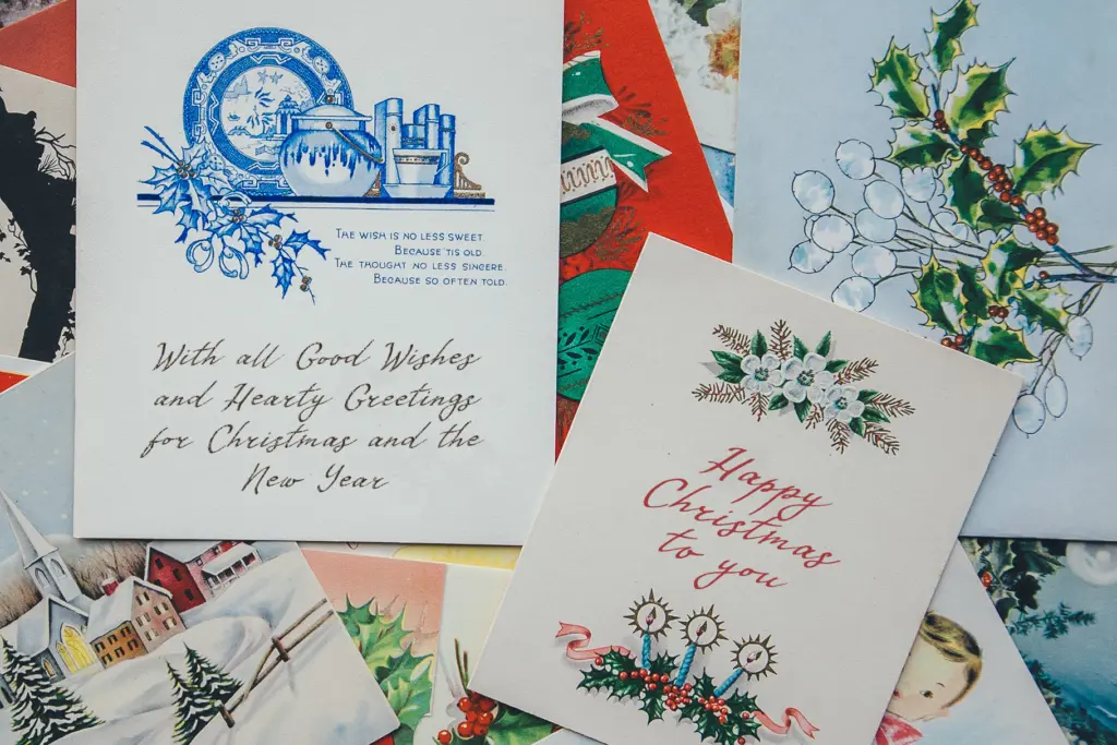
This is a font for short bursts of text, not paragraphs: logotypes, monograms, packaging flourishes, greeting card sentiments, invitation headers, a signature line at the bottom of a letterhead. The retro character works well anywhere a brand wants to suggest nostalgia — a bakery, a barbershop, a heritage product relaunch — without going full vintage-poster pastiche. At small sizes the tight joins and moderate stroke contrast start to clot, so it needs generous point size and leading; this is not a script for body copy or long headlines. Because the letterforms carry real texture and slope, watch tracking and kerning on longer words — the built-in ligatures help, but manual nudging is still often needed once you get past a name or a short phrase. Digital use on busy backgrounds should be tested, since the strokes are fine enough to lose definition against low-contrast imagery. Overall it’s a well-drawn, single-purpose script: convincing as handwriting, disciplined rather than loose, and best treated as an accent rather than a workhorse.
What we liked, and what we didn’t
Strengths
- Flat-pen stroke gives it a distinct, less common retro character than typical brush scripts
- Extensive ligature and alternate set smooths awkward letter joins
- Includes full Cyrillic support alongside several European Latin languages
Trade-offs
- Tight joins and moderate contrast clot at small sizes, limiting it to display use
- Without OpenType feature support the default glyphs look noticeably flatter and less convincing
VINTAGEST is a disciplined, well-drawn flat-pen script suited to short, decorative text rather than long-form use. It needs OpenType support to look its best and struggles at small sizes, but the retro character and Cyrillic support give it a genuine niche.
Verdict

Tmfonts reviews typefaces in depth — every font is tested in real branding, editorial and screen layouts before a word gets written. 555+ fonts reviewed and counting.