
Activica: a neo-grotesque with a graphic dot-and-symbol system built in
Design style
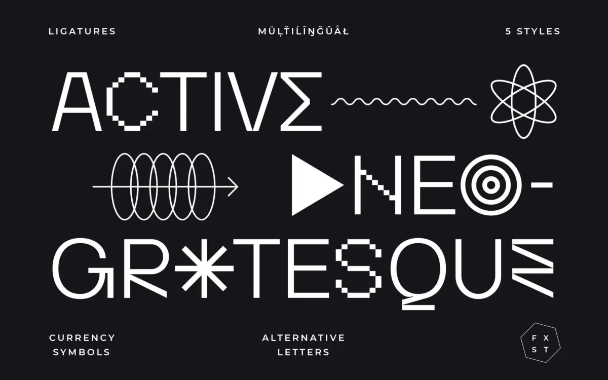
Activica sits in neo-grotesque territory, but it doesn’t stay quiet about it. The skeleton is the familiar calm sans: even stroke weight, restrained curves, apertures that stay open enough to read at small sizes. Where it departs from the grotesque template is in the extras — a set of shapes, symbols and dot-based marks that sit alongside the letters like a companion graphic language. That’s an unusual pitch for a text face, and it shows the designer thinking about the typeface as a system rather than just an alphabet.
The lowercase is fairly plain on its own terms: no exaggerated ink traps, no eccentric terminals, nothing that would read as characterful in a paragraph of body text. The personality lives in the accompanying glyphs and alternates, which is a deliberate split — you get a workhorse skeleton and a decorative layer you can switch on when the project calls for it. It’s a sensible way to give a grotesque some range without compromising the letters themselves.
Character set and features
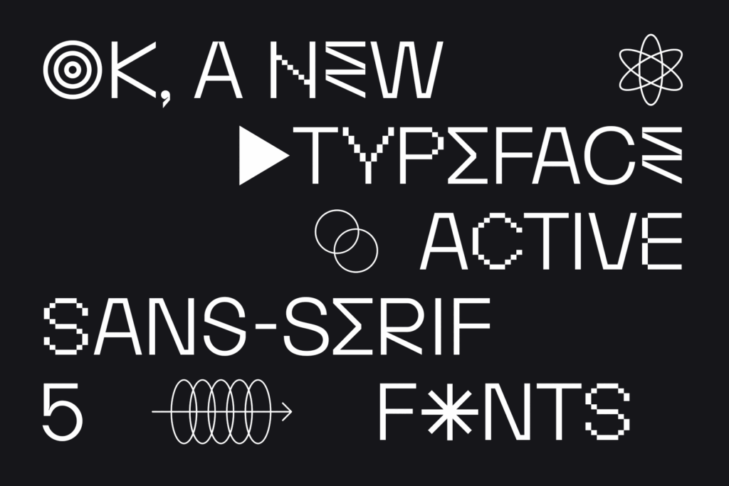
Activica includes ligatures, alternate letters and currency symbols, accessed through OpenType features in applications that support the Glyphs panel — Illustrator, Photoshop, InDesign, that sort of workflow. If your tools don’t expose OpenType features, most of what makes this typeface interesting will stay locked away, so it’s worth checking your pipeline before committing to it for a project that depends on the ligatures or alternates.
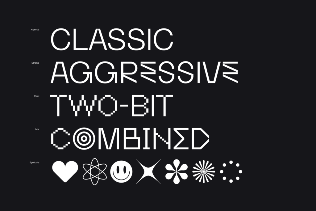
Latin language coverage is broad, described as supporting most Latin-based languages, which should be enough for the majority of European-market branding and editorial work. The dot-based symbols and shapes are the more distinctive part of the set: they’re not just diacritics or punctuation dressed up, they read as a small icon or pattern system that could be pulled into a layout independently of the text. That’s a genuinely different offer from most sans-serif families on the market, which tend to treat extra glyphs as an afterthought.
Use cases
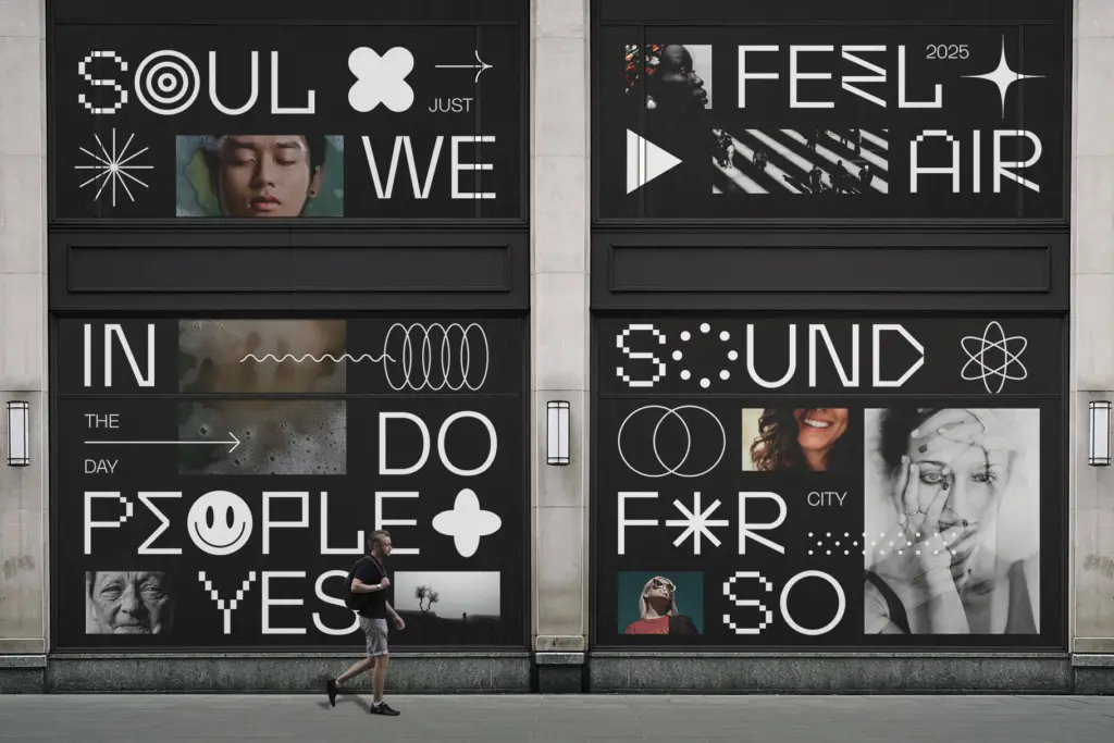
The plain grotesque base makes Activica usable for headlines, posters and branding where you want something calm and contemporary rather than loud. The symbol and dot system is the real reason to pick it over a more conventional grotesque — if a brand identity needs a secondary graphic language that shares DNA with its logotype, Activica gives you that without reaching for a separate icon set. Packaging, editorial covers and poster work that wants a bit of graphic texture alongside clean type all suit it well.
It’s a harder sell for long-form body text. The letterforms are competent but not distinctive enough to carry paragraphs on their own charm, and the features that make the typeface interesting are exactly the ones that don’t show up in dense text settings. Treat it as a display and branding tool with a graphic bonus, not a do-everything text family, and it earns its place.
What we liked, and what we didn’t
Strengths
- The dot-based symbol system gives it a genuine graphic identity beyond the alphabet.
- The grotesque skeleton is clean enough to work as a calm headline or branding sans.
- Broad Latin-based language support suits most European branding and editorial work.
Trade-offs
- The special glyphs and ligatures depend on OpenType support, so plain-text environments lose most of the personality.
- The lowercase alone is plain enough that it won't carry long paragraphs with much distinction.
Activica is a plain, competent neo-grotesque dressed up with an unusual symbol and dot system that gives it a graphic identity beyond the letterforms. It's best suited to branding and poster work where that extra layer can be used, less so as a long-form text face. Worth a look for designers who want a grotesque that doubles as a small icon language.
Verdict

Tmfonts reviews typefaces in depth — every font is tested in real branding, editorial and screen layouts before a word gets written. 555+ fonts reviewed and counting.