
Akira Expanded Font Free Download
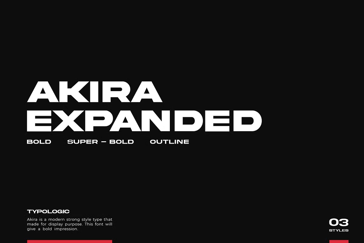
An Akira Expanded free download does exist, but it is a cut-down demo for personal projects, not the font family designers license for client work. Typologic, the foundry behind the font, posts the demo on its own DaFont page and sells the full Bold, Super Bold and Outline set on Creative Market.
Akira Expanded free download: demo file vs. paid family
The free file. On Typologic’s DaFont profile, the Akira Expanded entry is marked “Free for personal use”. The download holds one file, Akira Expanded Demo.otf. DaFont counts 105 glyphs in it, compared with 232 in the licensed font our specimens were rendered from, so a good part of the character set is missing. Check the demo’s character map on DaFont before you rely on a particular accent or symbol.
Free download: official Akira Expanded demo Labelled 'Free for personal use' on Typologic's DaFont page; author note points to the full version on Creative Market f
The paid family. A licence adds all three styles, the complete 232-glyph set and the right to use the font commercially. The Creative Market listing, created 27 April 2020, supplies OTF, TTF and WOFF files. In October 2026 a Desktop licence cost $20 per seat. Webfont ($20), E-pub ($30) and App ($160) licences were also listed, each showing a small discount.
Get Akira Expanded — official listing
Akira Expanded specimen and verified specs
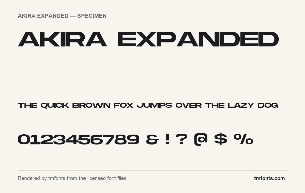
- Styles: 3 (Bold, Outline, Super Bold)
- File formats: OTF, TTF
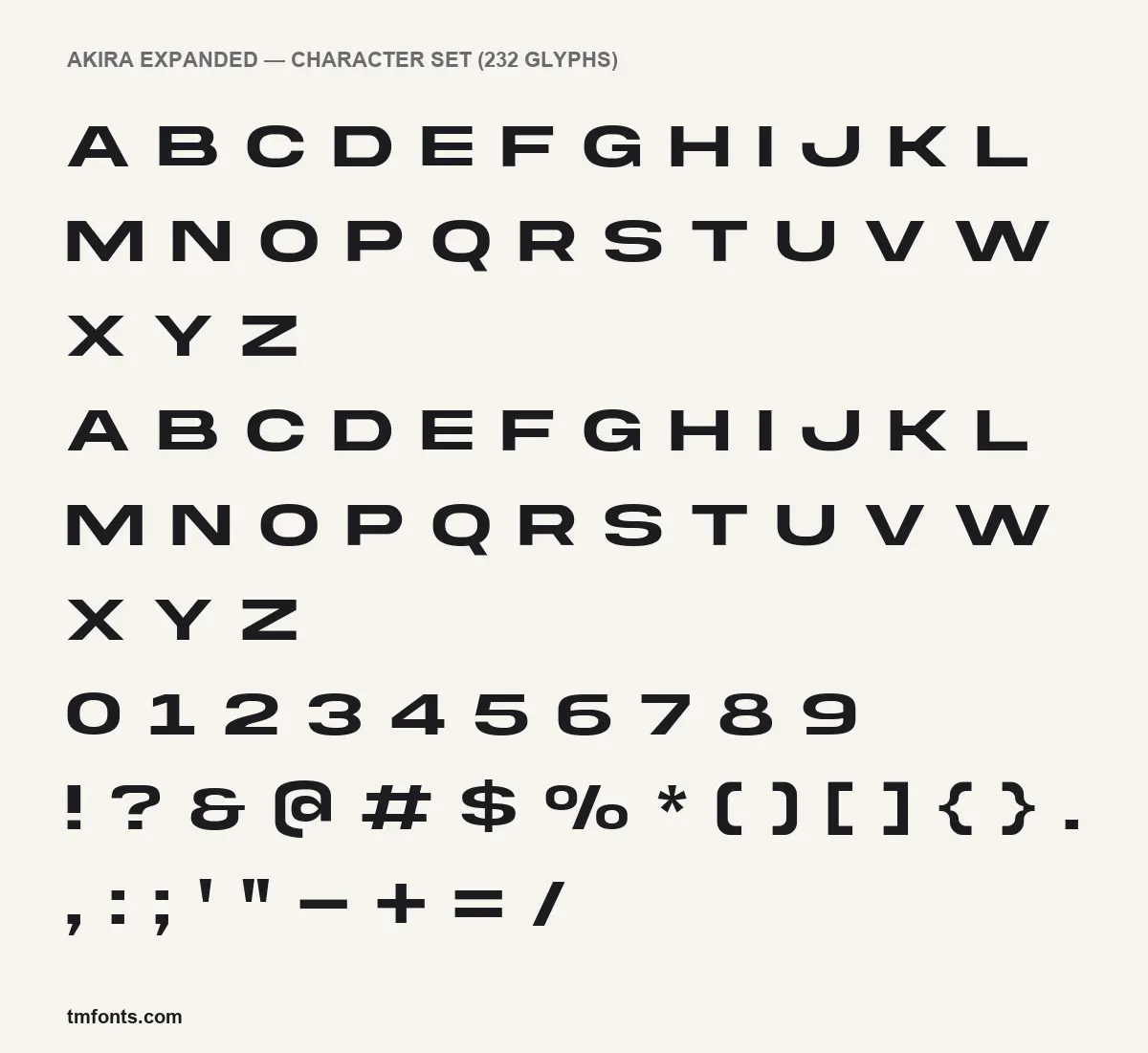
- Glyphs: 232
- Language support: Basic Latin (English), Western European
- OpenType features: stylistic alternates, kerning
- Case: All caps (lowercase keys type capitals)
Checked by tmfonts from the licensed font files.
How wide is wide? The Akira Expanded design
Typologic says Akira Expanded was “made for text display purposes” and suggests it for main and header text on websites and layouts. In the specimen above, the two words of the name stretch across almost the whole image at a modest height. The letters are heavy, squared off and much wider than they are tall. The O is a stretched oval with nearly flat top and bottom, and C, G and S follow the same flattened outline.
Details that separate it from other wide grotesques:
- The M has straight vertical sides, which keeps it as blocky as the H and N beside it.
- The Q’s tail is a short angled stroke that drops just below the baseline.
- The G is an open oval with a flat bar and no spur.
- Parentheses and braces have softened corners, and the @ is closer to a rounded rectangle than a circle, a shape that suits gaming and tech graphics.
- Lowercase keys produce the same capital shapes, so in practice the font sets in caps only.
Three styles in the box
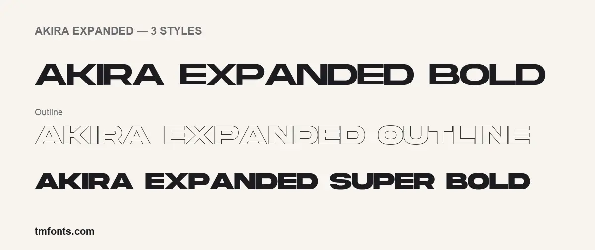
The licensed download contains three styles, all shown in the styles image above:
- Bold, the standard heavy weight used in most samples.
- Super Bold, a notch heavier, with smaller counters.
- Outline, a single thin contour with an empty centre, made for layering over a solid style or over a photo.
Our files are OTF and TTF, version 1.00, dated April 24, 2020 inside the files. The listing adds WOFF for websites. The font is not variable, and the listing mentions no extras such as mockups. The designer field in the files is blank; the storefront credits Typologic.
Characters, accents and alternates
The 232 glyphs cover Basic Latin and Western European languages: English plus the accented letters used in French, Spanish, German, Italian and Portuguese, among others. Central and Eastern European letters are not part of the verified coverage, so test Polish or Czech text before you commit.
The font has two OpenType features:
- Stylistic alternates are the “alternative glyphs” the listing mentions: second versions of some letters for a custom wordmark. In Illustrator, InDesign or Photoshop, highlight a letter and choose a variant in the Glyphs panel. Affinity apps list them in the Typography panel.
- Kerning evens out the gaps between awkward pairs like A and V. It runs automatically in almost every app.
The alternates are not mapped to Private Use Area code points. Canva and Cricut Design Space will show the default letters only; to reach the alternates you need an app with OpenType or glyph controls.
Jobs Akira Expanded does well, and partner fonts
The listing names website headers, marketing materials, branding and social graphics. Its proportions also fit product launch banners, conference slides, apparel tags, album covers and short logotypes. Width is the constraint. A ten-letter word fills a line quickly, so plan headlines around short words, and give the Outline style a little extra letter-spacing so the thin contours don’t touch.
Because Akira has no real lowercase, pair it with a face that does:
- Manrope for body text: modern and neutral, with enough character to sit under a loud heading.
- Archivo for subheads. Its wider settings echo Akira’s stretch at a calmer weight.
- DM Mono for captions, dates and specs in tech or streetwear layouts.
Personal demo vs. commercial licence
The DaFont demo is labelled for personal use, so keep it to mockups, school work and projects that don’t earn money. Anything for a client, a product or a monetised channel needs a licence. Creative Market’s font licence terms say the Desktop licence covers “unlimited commercial and personal projects”, provided the font appears as an image when used online or in apps. Embedding the font on a website needs the Webfont licence; e-books and apps need E-pub and App licences. Seats should match the number of people using the font, and the files may not be shared. Logos are allowed if the font is modified and not the dominant element. This is a summary, not legal advice.
Installing Akira Expanded on Windows and Mac
Download Akira Expanded, unzip it, and install either the OTF or the TTF set, not both.
- Windows: select the font files, right-click and choose Install.
- Mac: double-click each file and click Install in Font Book.
Canva users can upload the files in Brand Kit; Canva’s help page says custom font uploads need a paid plan.
Raleway, Inter and Outfit as free stand-ins
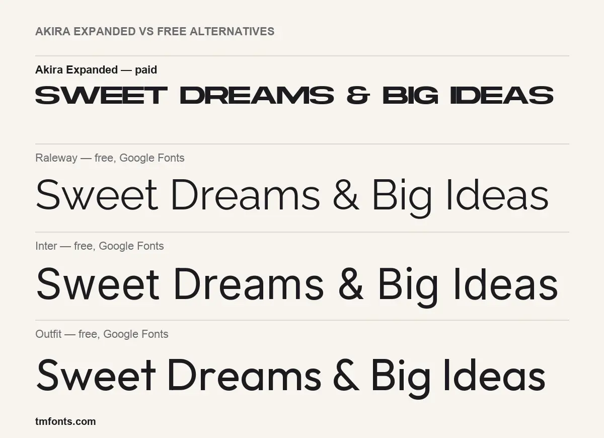
If the personal-use limit on the Akira Expanded free download rules it out, these three are free on Google Fonts, including for commercial use. None of them is expanded. As the comparison image shows, each one sets the sample line in mixed case at normal width. They replace Akira’s role, not its look.
- Raleway is an elegant sans with a wide weight range. Its Black weight in capitals, tracked out, gets closest to Akira’s poster feel.
- Inter is a neutral screen font built for interfaces. Choose it when legibility matters more than attitude.
- Outfit is a geometric sans with round, friendly shapes. It suits brands that want something modern but softer than Akira.
Akira Expanded FAQ
Can I use the DaFont version of Akira Expanded for a client job?
No. The Akira Expanded free download on DaFont is for personal use only. Client work needs a paid licence.
How much does the full font cost?
A Desktop licence was $20 per seat on Creative Market when we checked in October 2026.
Why does my lowercase text come out in capitals?
Akira Expanded is an all-caps design. The lowercase keys map to the same capital shapes.
Can I reach the alternates in Canva?
No. They are not PUA-encoded, so you need an OpenType-capable app such as Illustrator or Affinity Designer.
Who makes Akira Expanded?
Typologic, which sells it on Creative Market and publishes the demo on DaFont.

Tmfonts writes independent reviews of typefaces: what each font does well, where it falls short, what it suits, and where it is sold.