
Amber Dawn: a hand-painted brush script for loud, retro-leaning branding
Design style
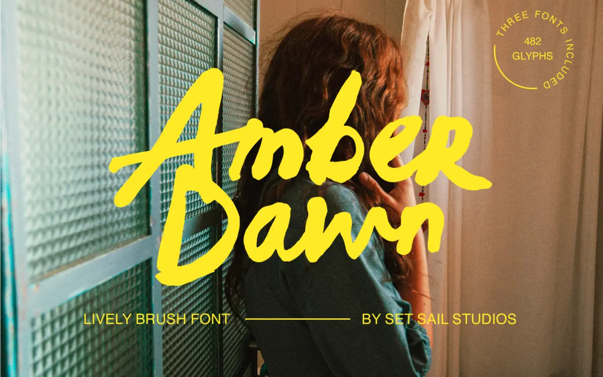
Amber Dawn is a brush script built from actual paint, not a vector approximation of one. Sam Parrett worked with a real brush and acrylic ink, and it shows in the way strokes taper unevenly, edges fray, and some letters look like they were laid down a little faster than others. This is not a polished, calligraphic brush face — it leans rough, thick and a bit reckless, closer to sign-painting than formal script.
The letterforms sit heavy on the baseline, with wide, confident brushstrokes that vary in pressure from letter to letter. That variation is the point: it reads as handmade rather than templated. Ascenders and descenders swing out with some flourish, but the overall posture stays upright and blocky rather than cursive-elegant, which keeps it from tipping into wedding-invite territory. It’s a font with attitude, built for headlines that want to shout a bit.
Character set and features
The set ships as three separate fonts, each with its own upper and lowercase, so you get three distinct renderings of every letter. That’s a meaningful amount of variation for a brush script — typing the same word in each of the three fonts will genuinely give you three different-looking results, which helps a lot with the repeated-letter problem that plagues most script typefaces. Twenty-nine ligatures add further variety for common letter pairings, and with Standard Ligatures switched on they should trigger automatically in OpenType-savvy software.
There are two sets of numerals split across two of the fonts, a decent punctuation range, and PUA encoding so glyphs remain reachable in apps that don’t support OpenType features properly. Language support covers most Western and Central European diacritics, which is worth noting if the job needs French accents or Nordic characters. At 482 glyphs total across the three fonts, there’s real depth here — this isn’t a font that runs out of ideas after the alphabet.
The trade-off is that getting the best out of Amber Dawn takes some manual work. Mixing fonts, hand-picking ligatures, and swapping in PUA characters for awkward repeats is not a one-click process, and anyone expecting a script that just types itself into good kerning will be disappointed. This is a font for someone willing to build the word rather than just set it.
Use cases
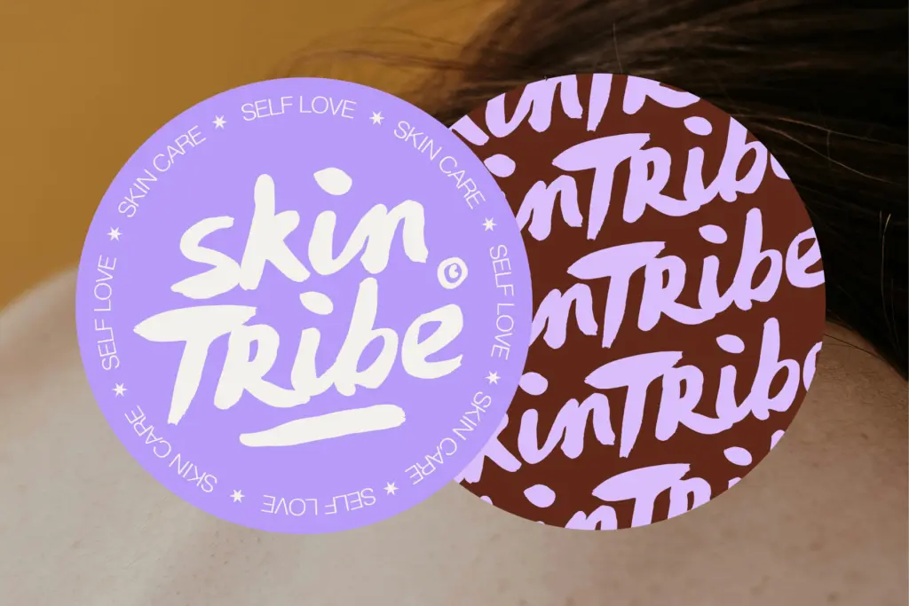
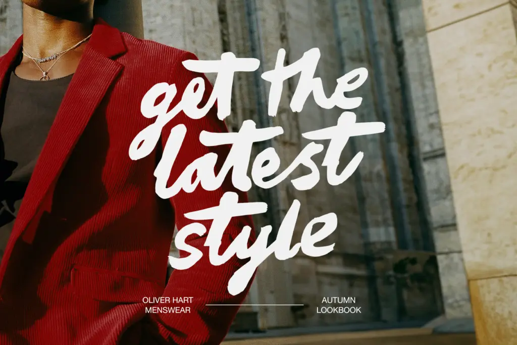
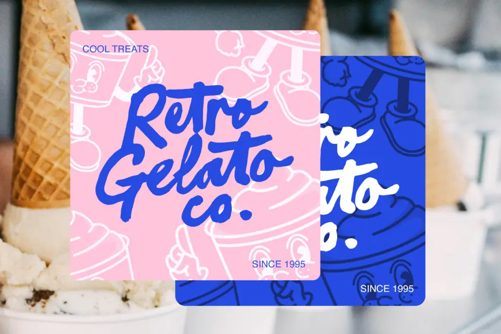
Amber Dawn suits playful, retro-tinged branding: packaging for small-batch food and drink, logotypes for businesses that want a hand-crafted, slightly gritty personality, gig posters, and display text where a bit of imperfection reads as authenticity rather than sloppiness. It’s less suited to anything that needs to feel refined or formal — the roughness that makes it charismatic at large sizes will look messy if pushed into body copy or small print. Wedding stationery looking for elegance should look elsewhere, but wedding stationery going for a rustic, hand-lettered feel could work. Given the three-font structure and ligature set, it rewards designers who’ll spend time building a wordmark rather than those wanting a fast, generic script fix.
What we liked, and what we didn’t
Strengths
- Three full alphabets plus ligatures give real variation across repeated letters
- Genuine hand-painted texture rather than a smoothed-over digital brush effect
- Broad glyph count and European language support add practical depth
Trade-offs
- Getting the best results means manually mixing fonts and ligatures rather than just typing
- The rough, heavy strokes lose clarity at small sizes or in dense text
Amber Dawn delivers genuine hand-painted texture and enough built-in variation to avoid the repeated-letter problem that sinks most script fonts. It takes manual effort to look its best, and it's not built for small sizes or formal contexts, but for rough-edged retro branding it has real character.
Verdict

Tmfonts reviews typefaces in depth — every font is tested in real branding, editorial and screen layouts before a word gets written. 555+ fonts reviewed and counting.